We are Proud Creative. We create work that makes our clients and everyone at the studio proud. It’s the reason for our name. Below is a case study of a rebrand project for interior design company, Basha-Franklin.
The company
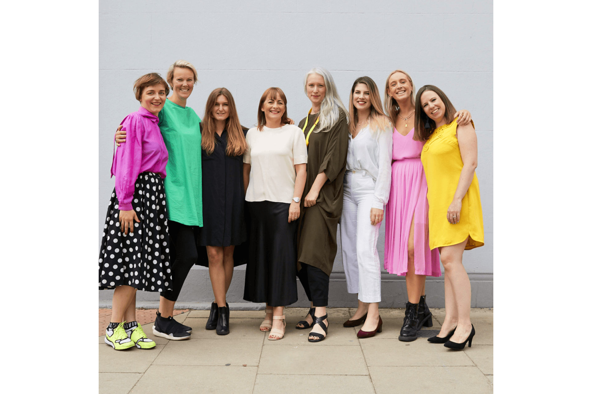
Basha-Franklin is a multidisciplinary team of interior designers, architects and creatives. They work collaboratively to deliver high quality, creative environments and develop trusted relationships with some of the most experienced property managers, investors and occupiers in the UK.
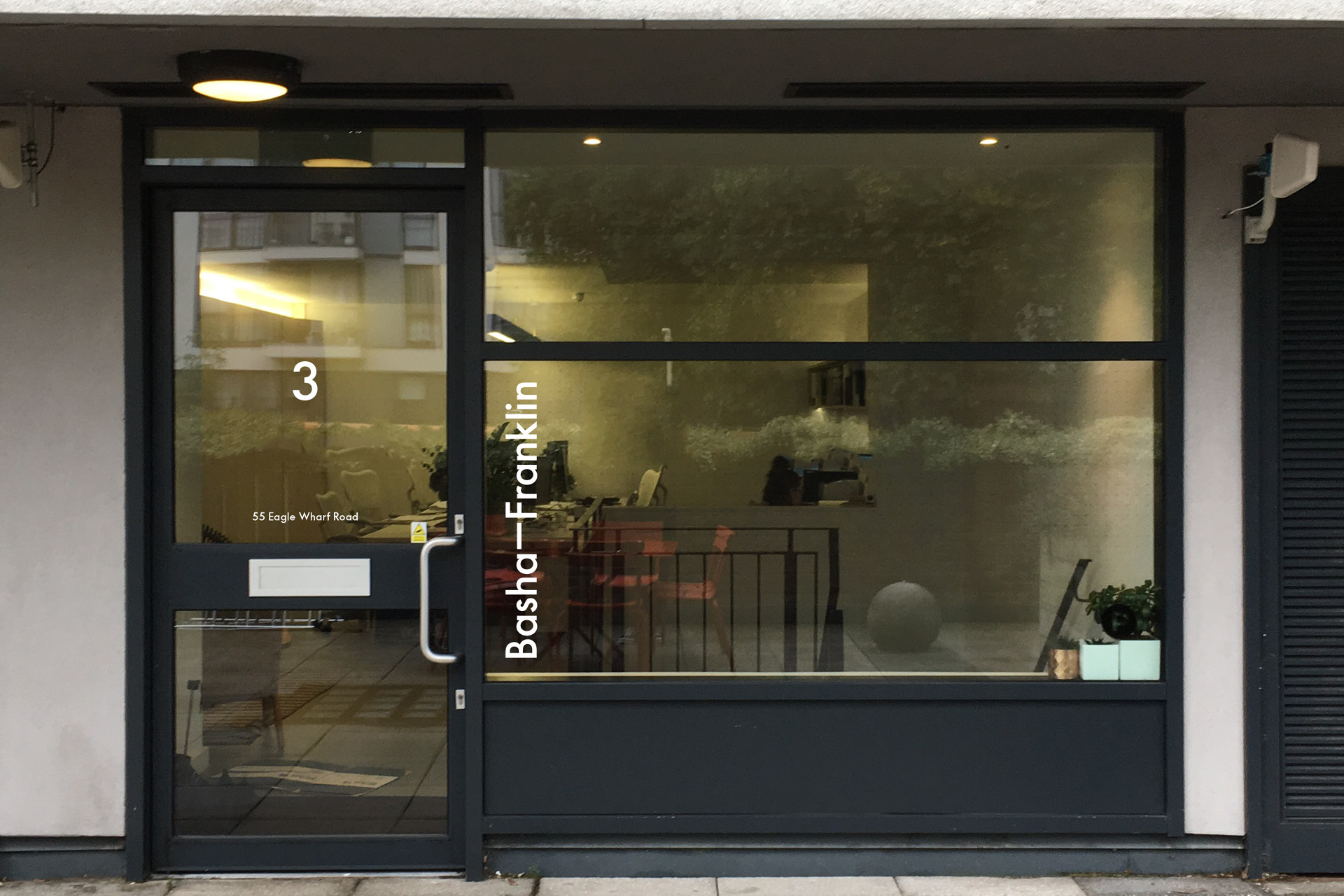
The logo
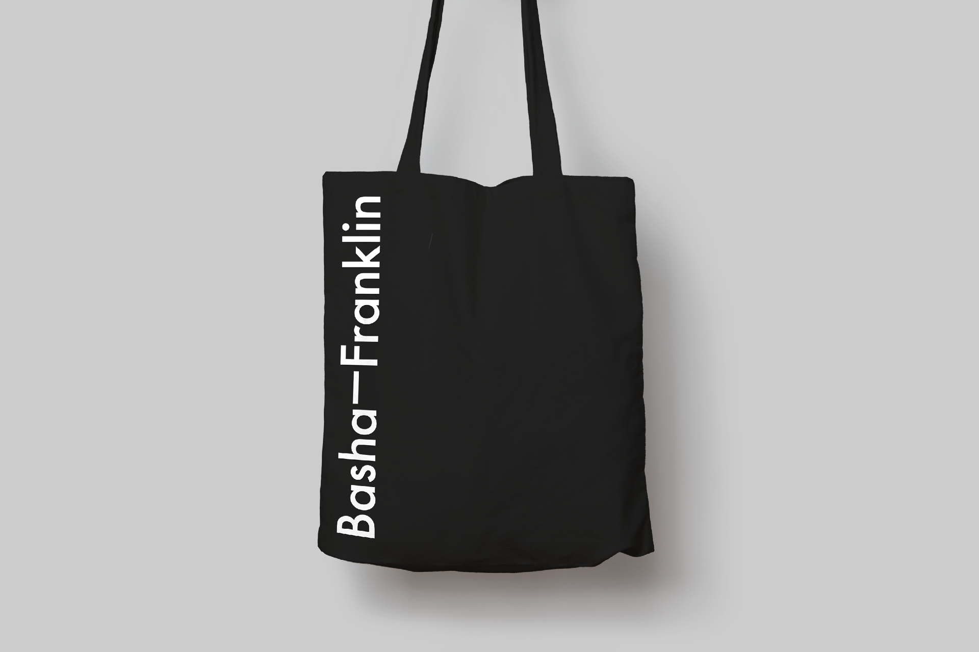
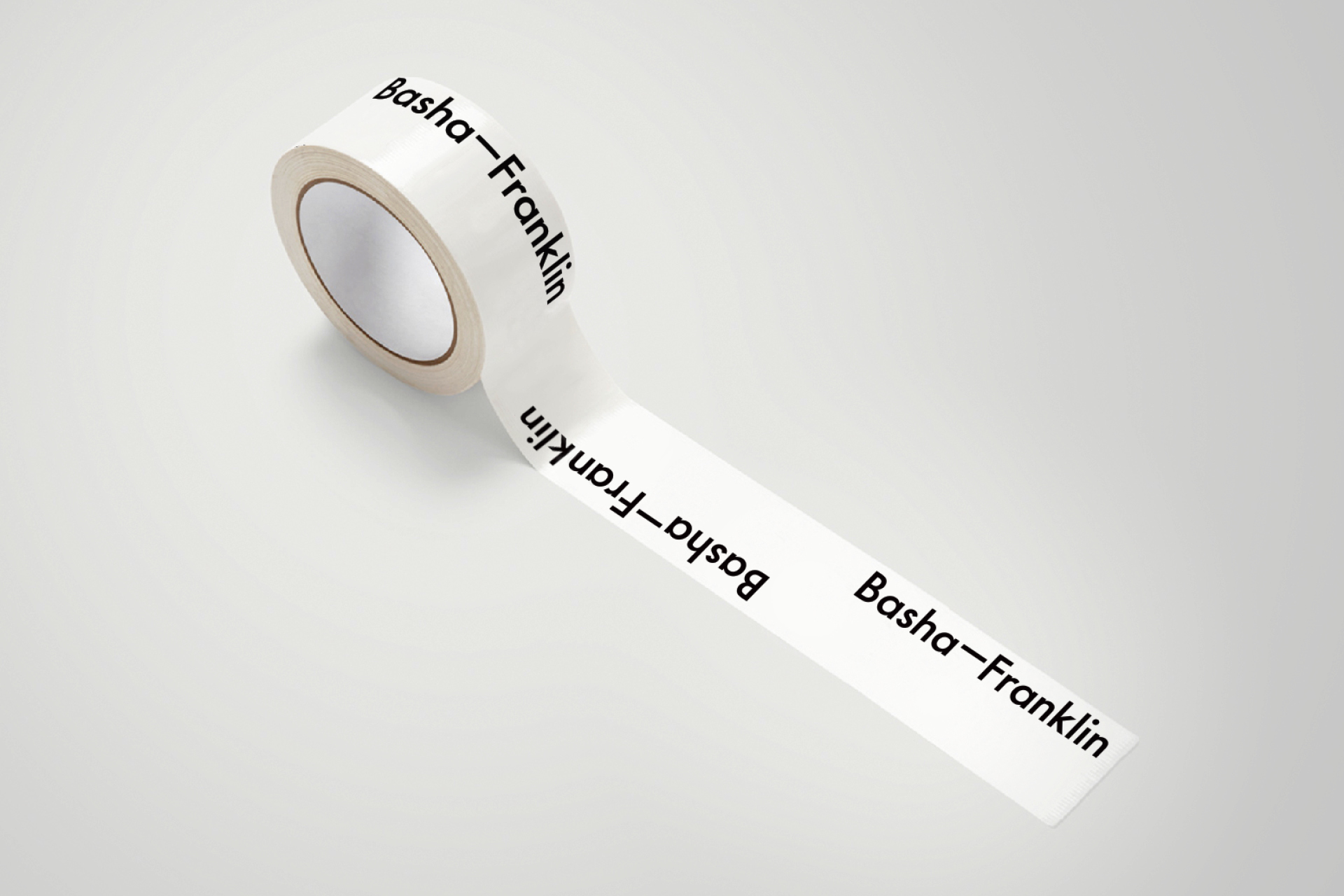
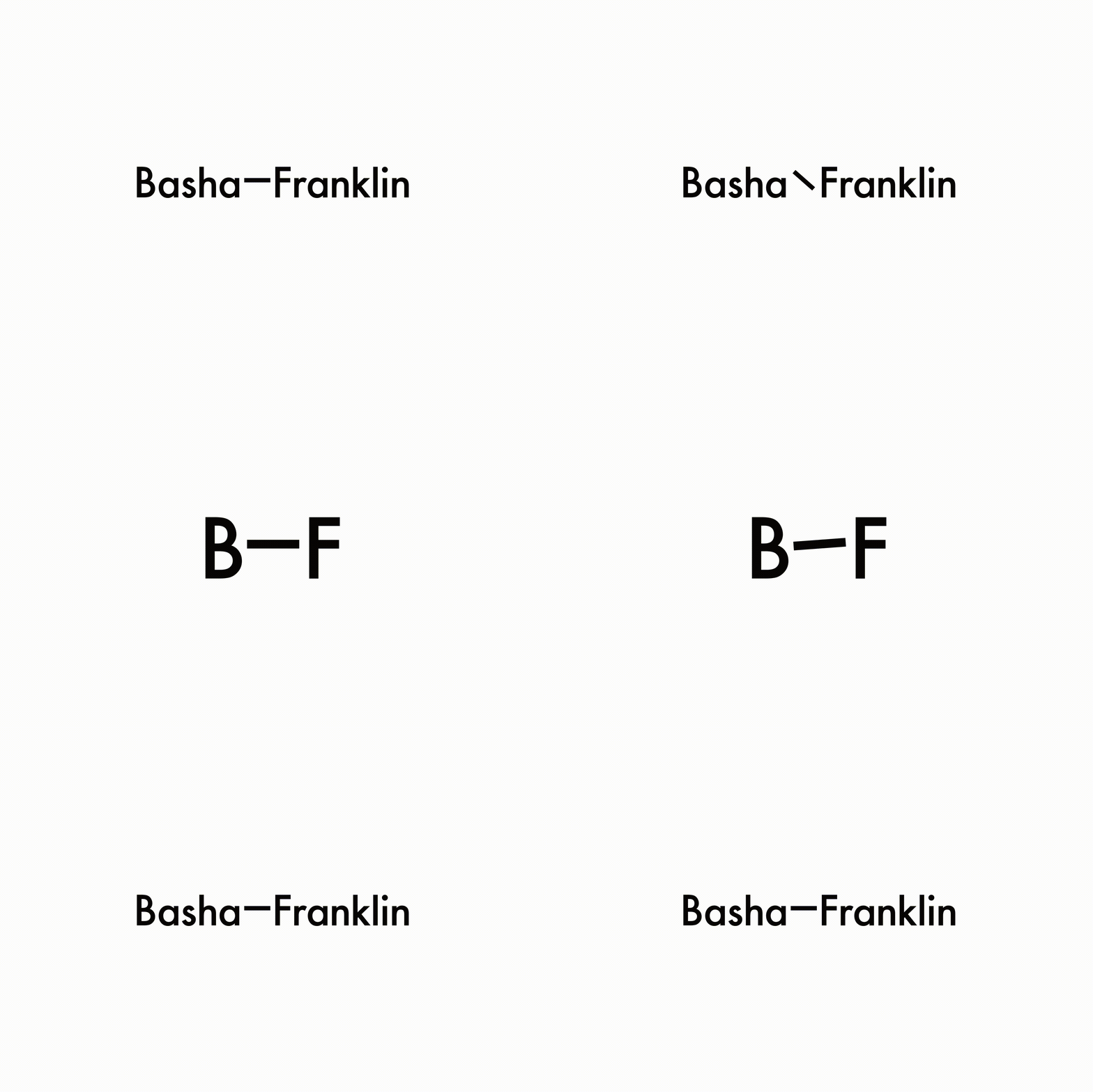
The brief was for a logo and identity that is modern and timeless, with a slight twist.
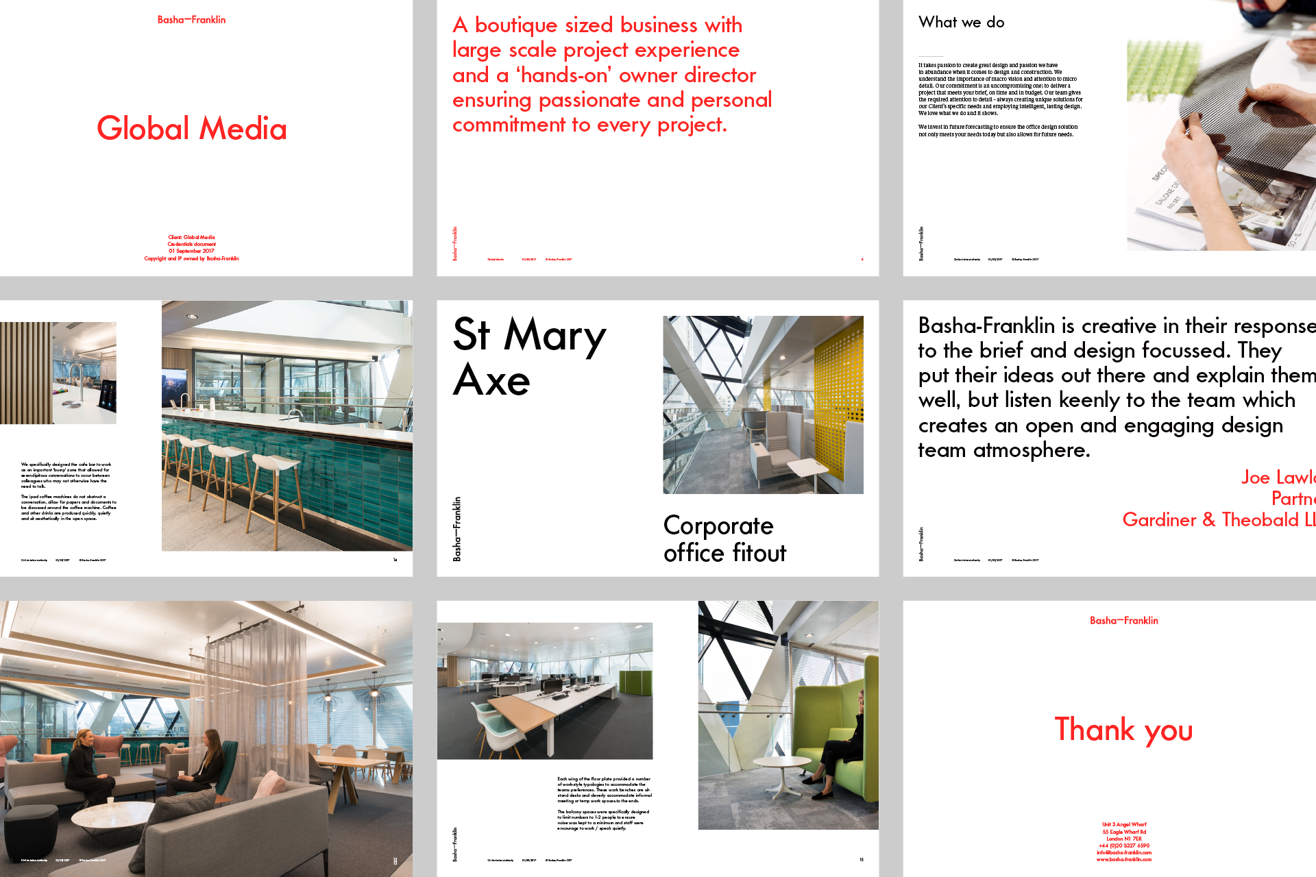
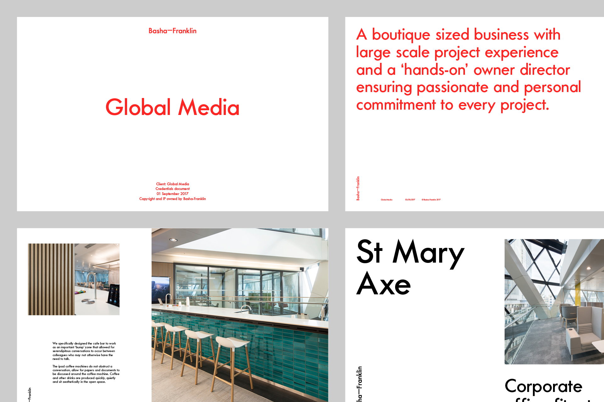
Presentation
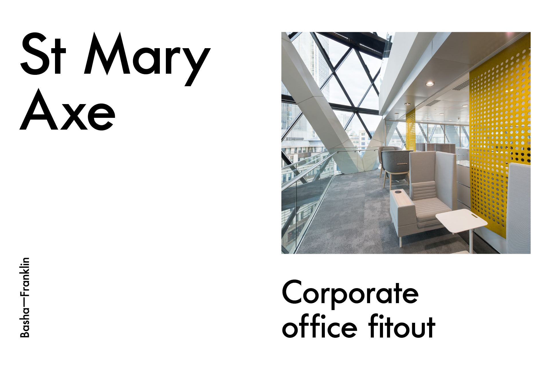
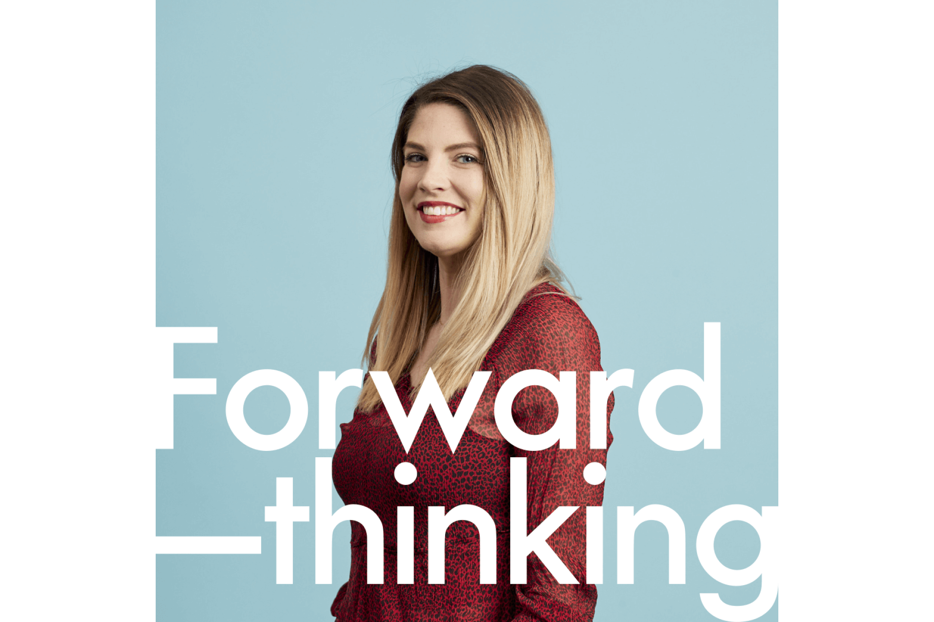
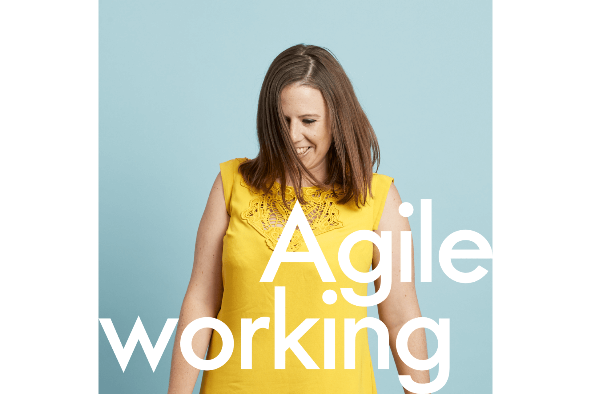
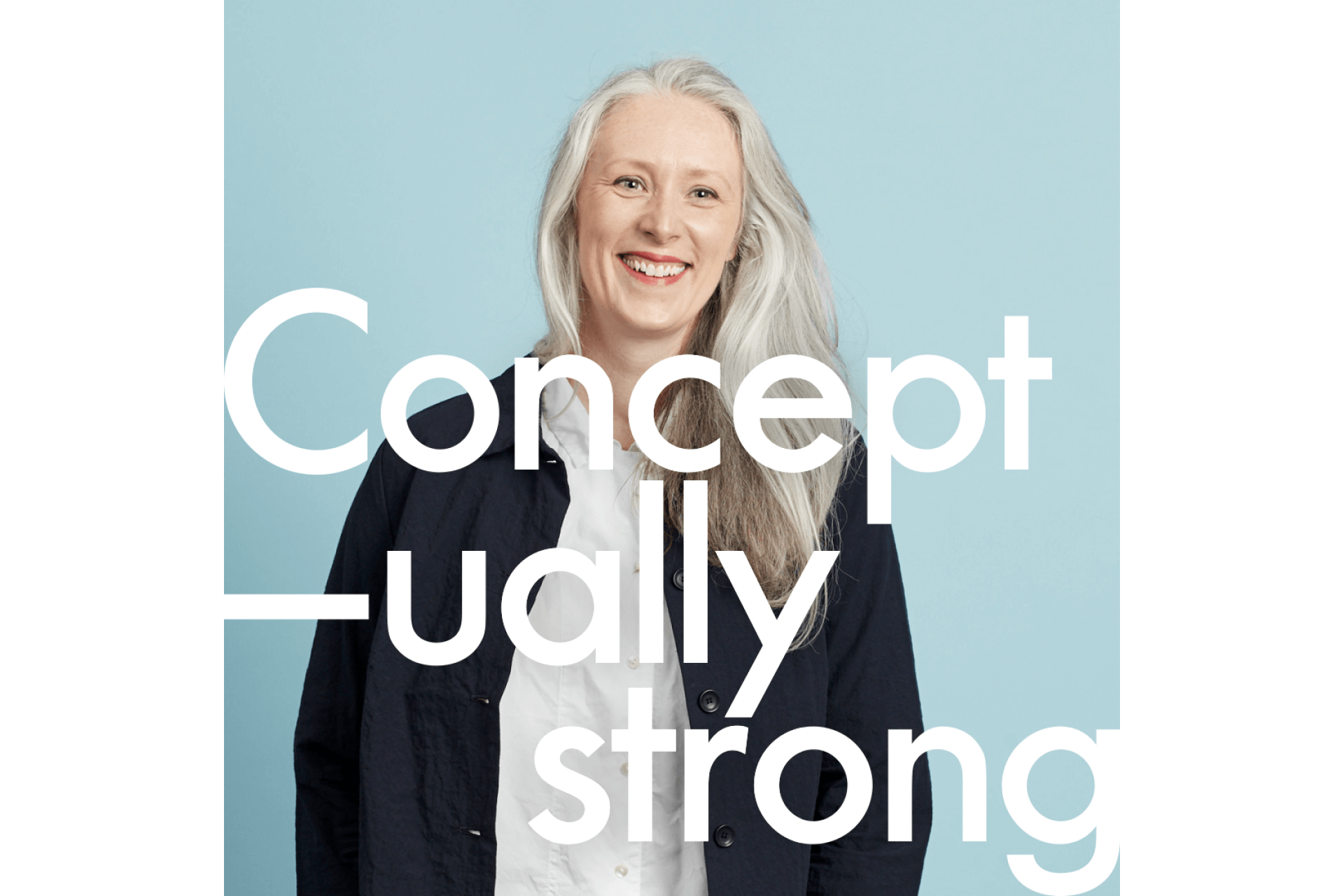
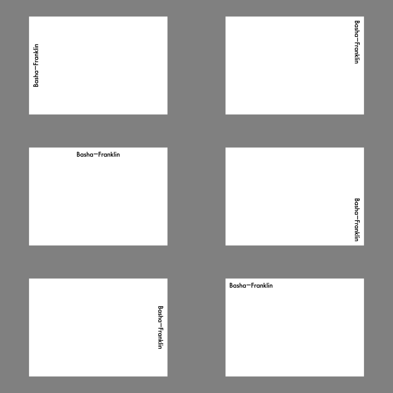
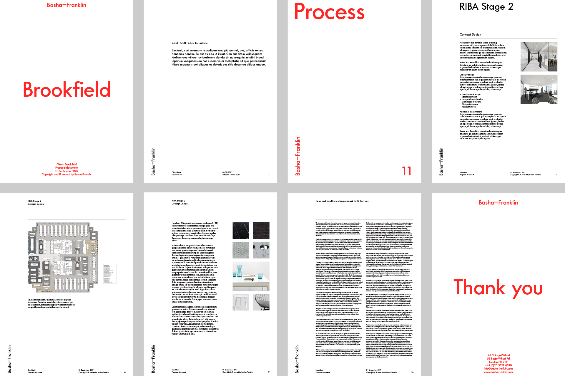
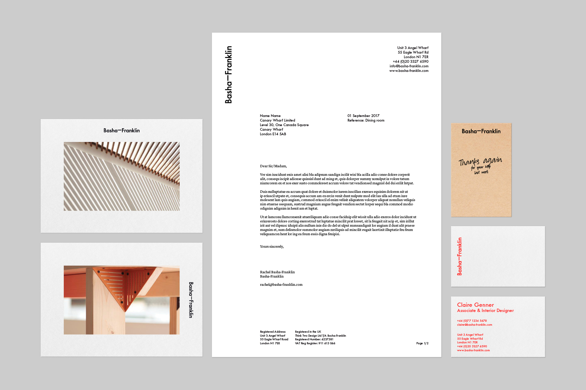
Bold use of typography combines with a respect for great images. The result is a confident presentation style that gives due prominence for key messaging, whilst allowing creative images and technical illustrations to shine throughout.
Typography
Futura No2 is a geometric sans that balances good legibility with a lovely contemporary twist. This adaptation to the historic type gives wonderful contrast to Lyon Text's elegant body copy.
Look and feel
The overall identity has a quiet confidence that doesn't overshadow the work Basha-Franklin does for its clients. Materials are considered for their clever use, rather than trying to wow with their by opulence or luxury. Much like the work of the Basha-Franklin studio.
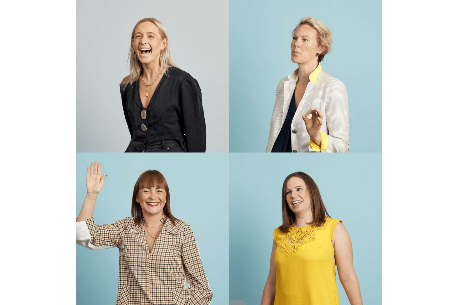
Photography

