We are Proud Creative. We create work that makes our clients and everyone at the studio proud. It’s the reason for our name. Below is a branding project for Green Rock.
The company
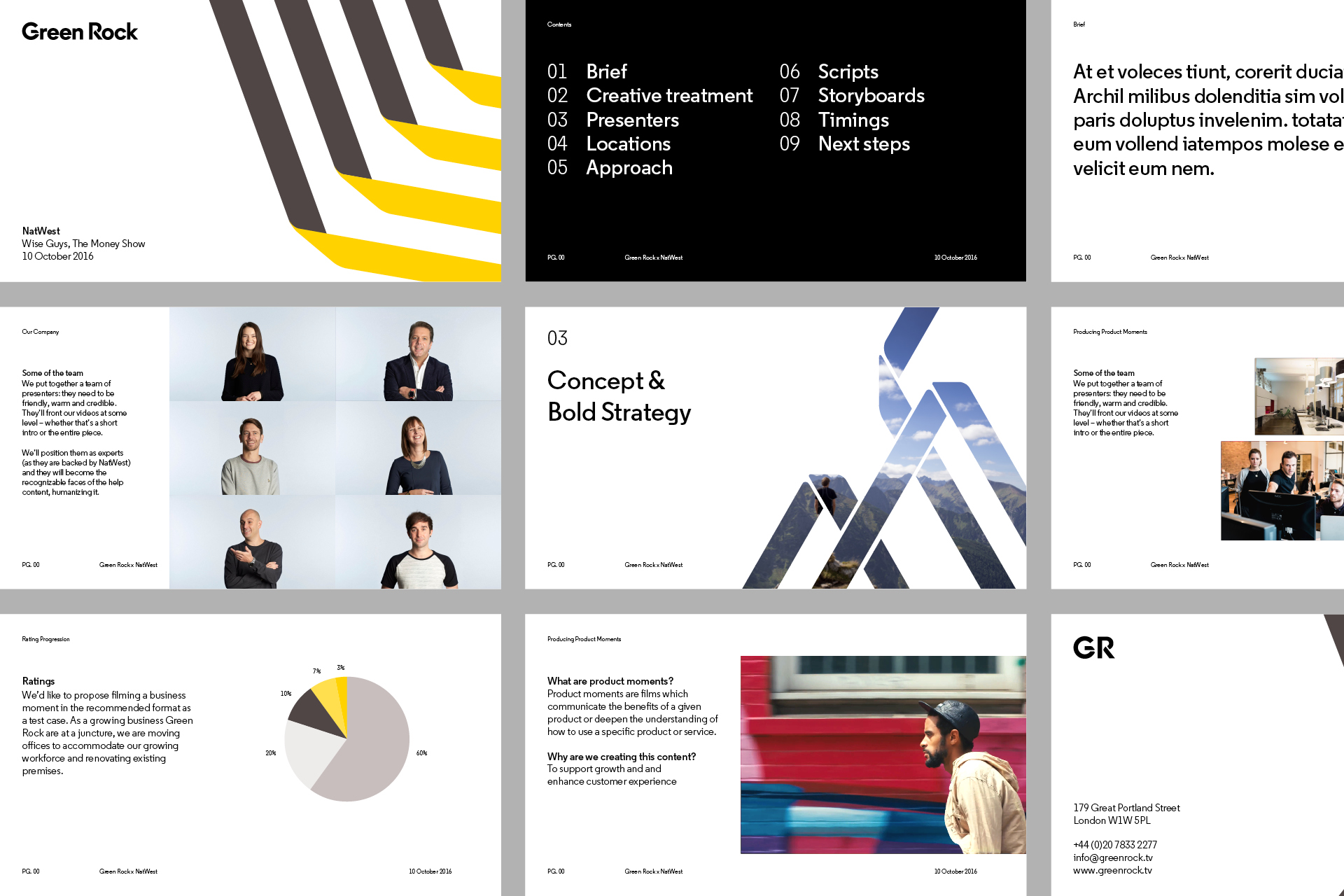
Green Rock is a content creation company — working with broadcasters, advertising agencies, as well as direct to client — for people as varied as NatWest, M&C Saatchi, The British Museum and Netflix. Creative; production; post production; and distribution — working both end-to-end, and more flexibly.

The thinking
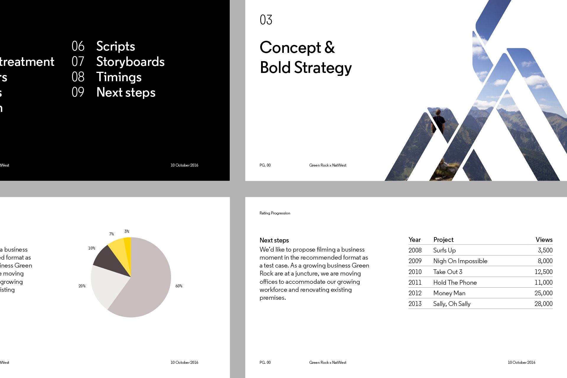
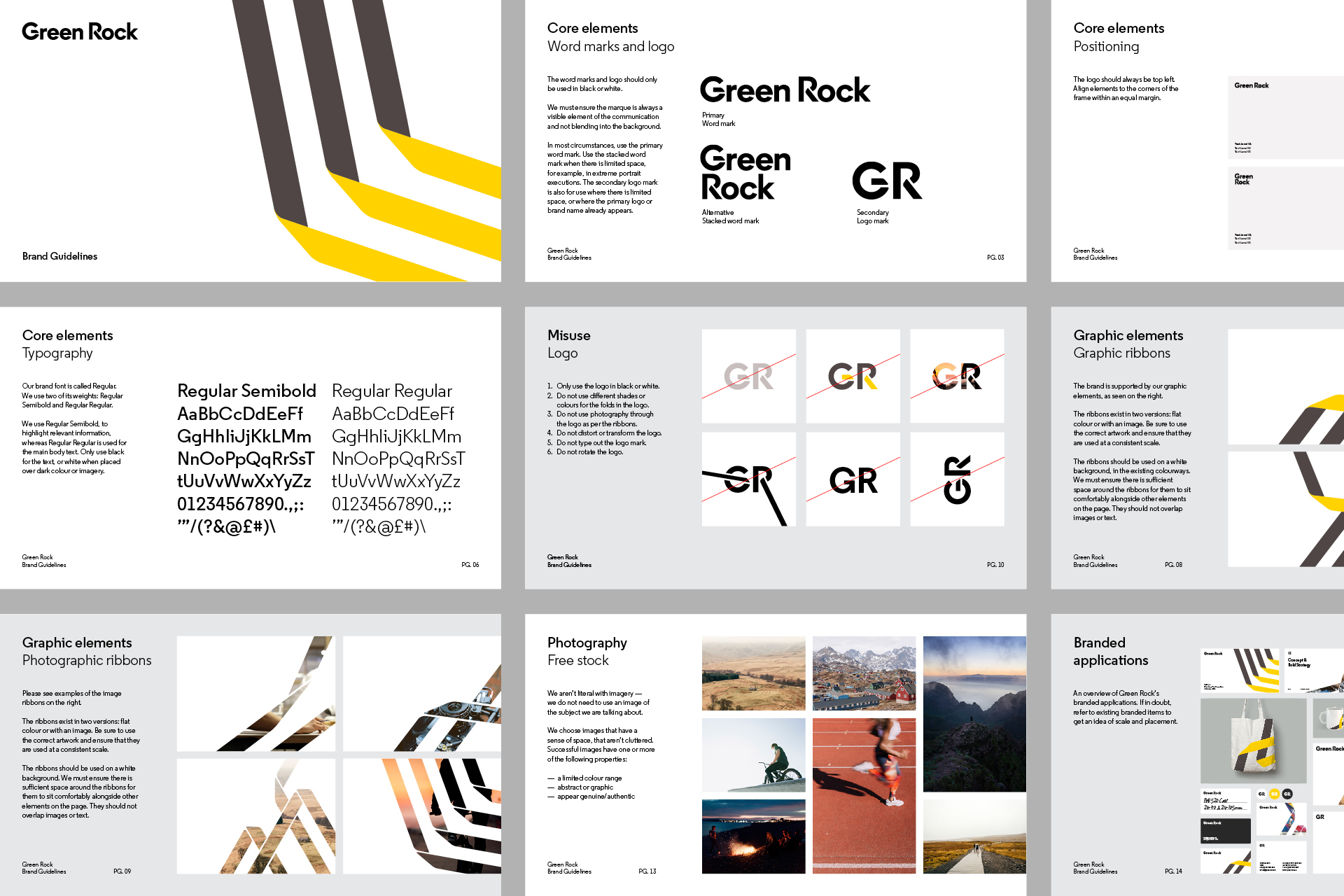
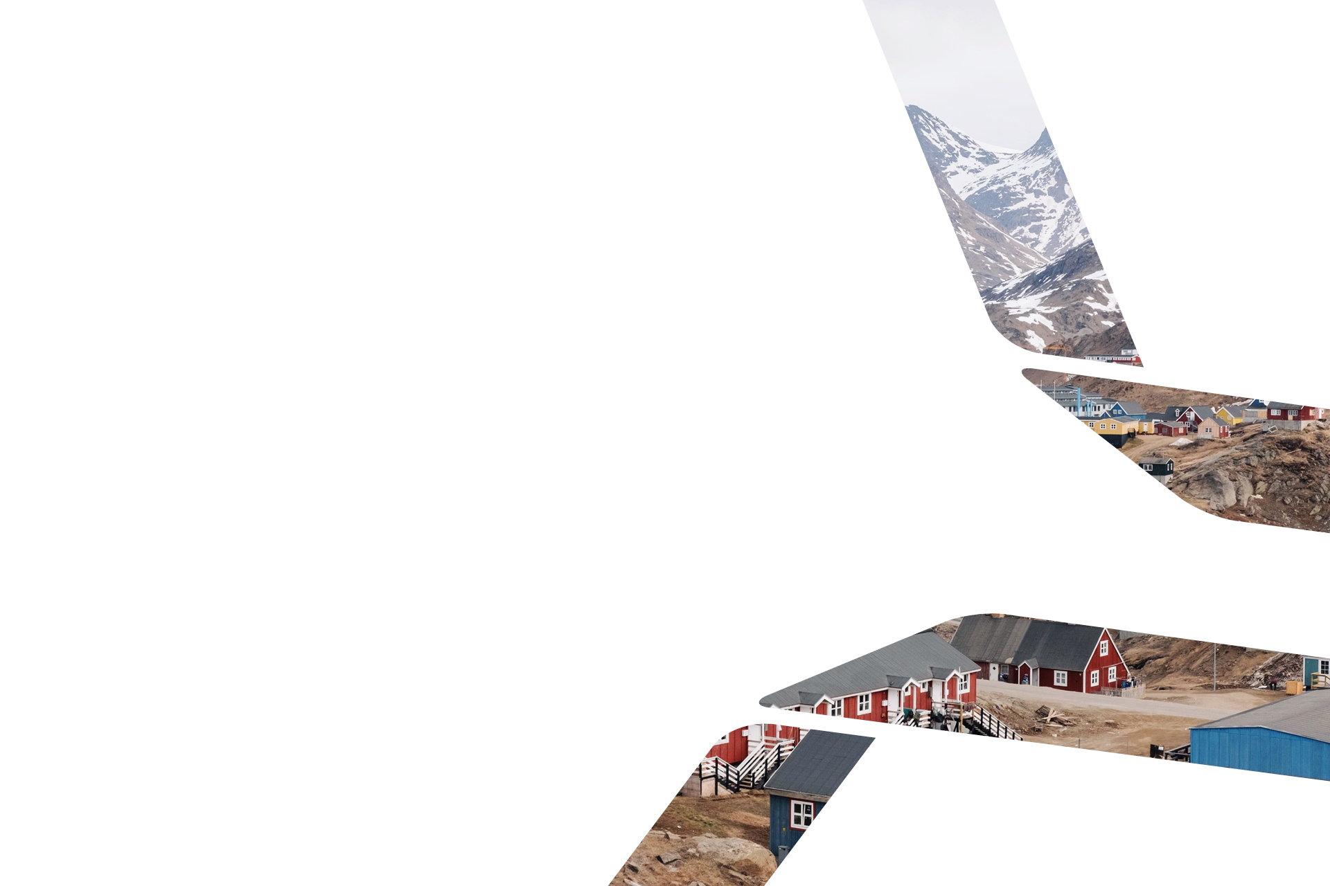
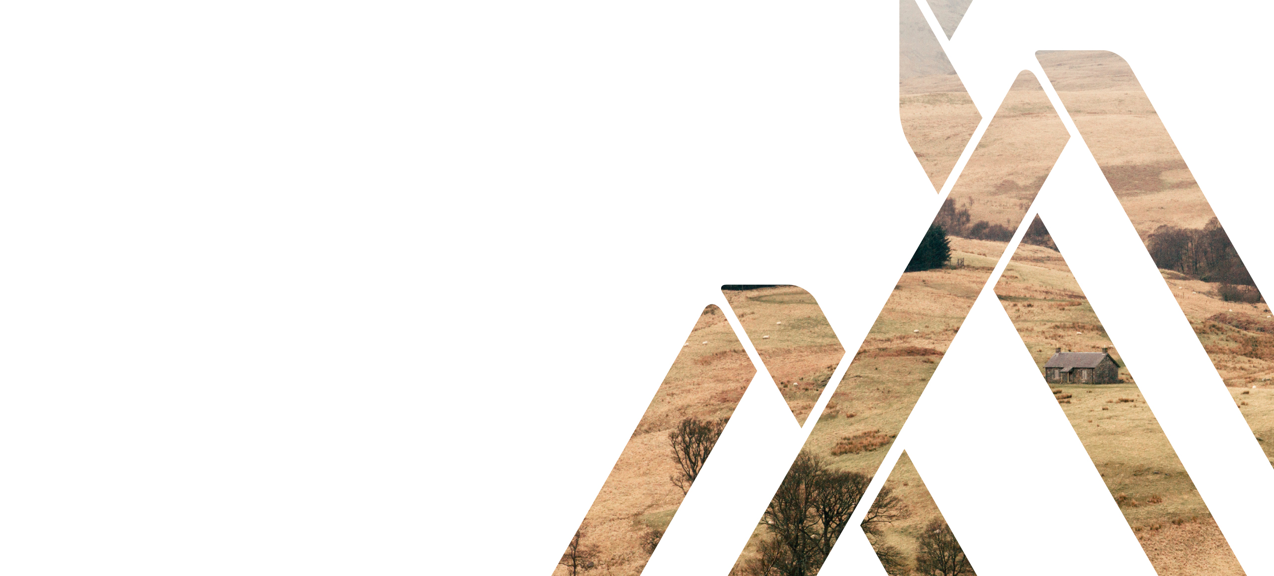
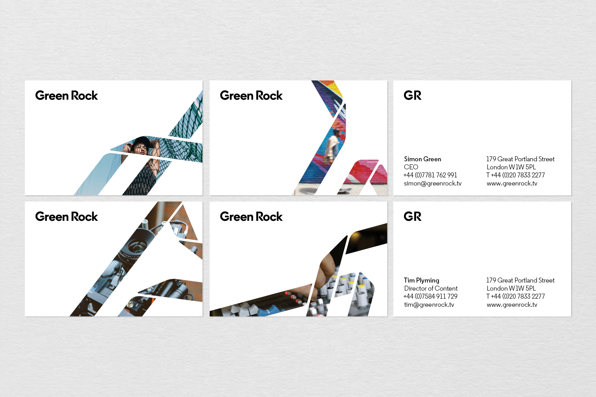
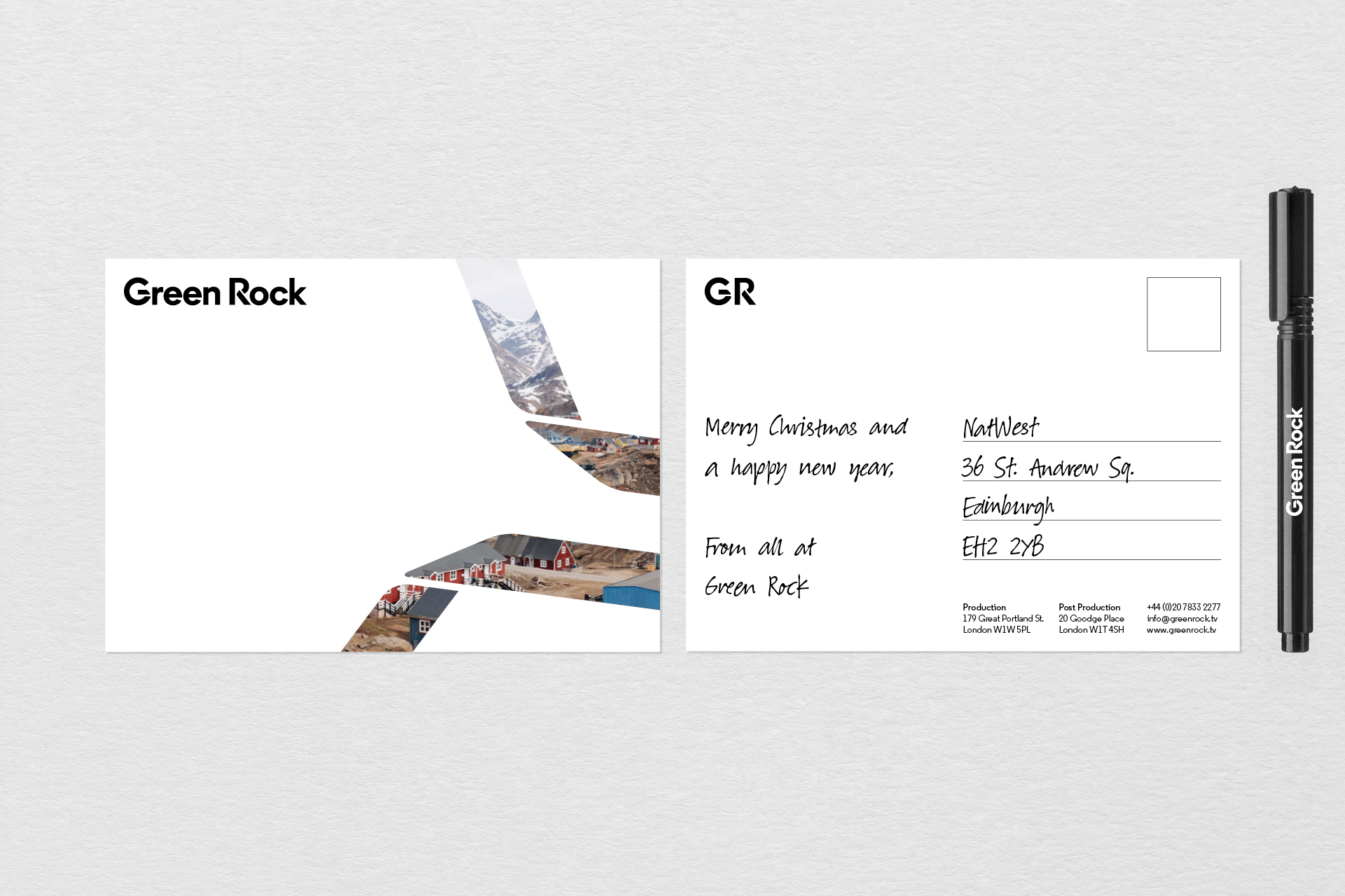
The identity immediately communicates that content is king. The concept is born out of the idea of a tapestry — the coming together of different talents — cross disciplinary, collaborative and diverse. The device works as both a pure graphic treatment, but really comes alive by showing content through the graphic element.


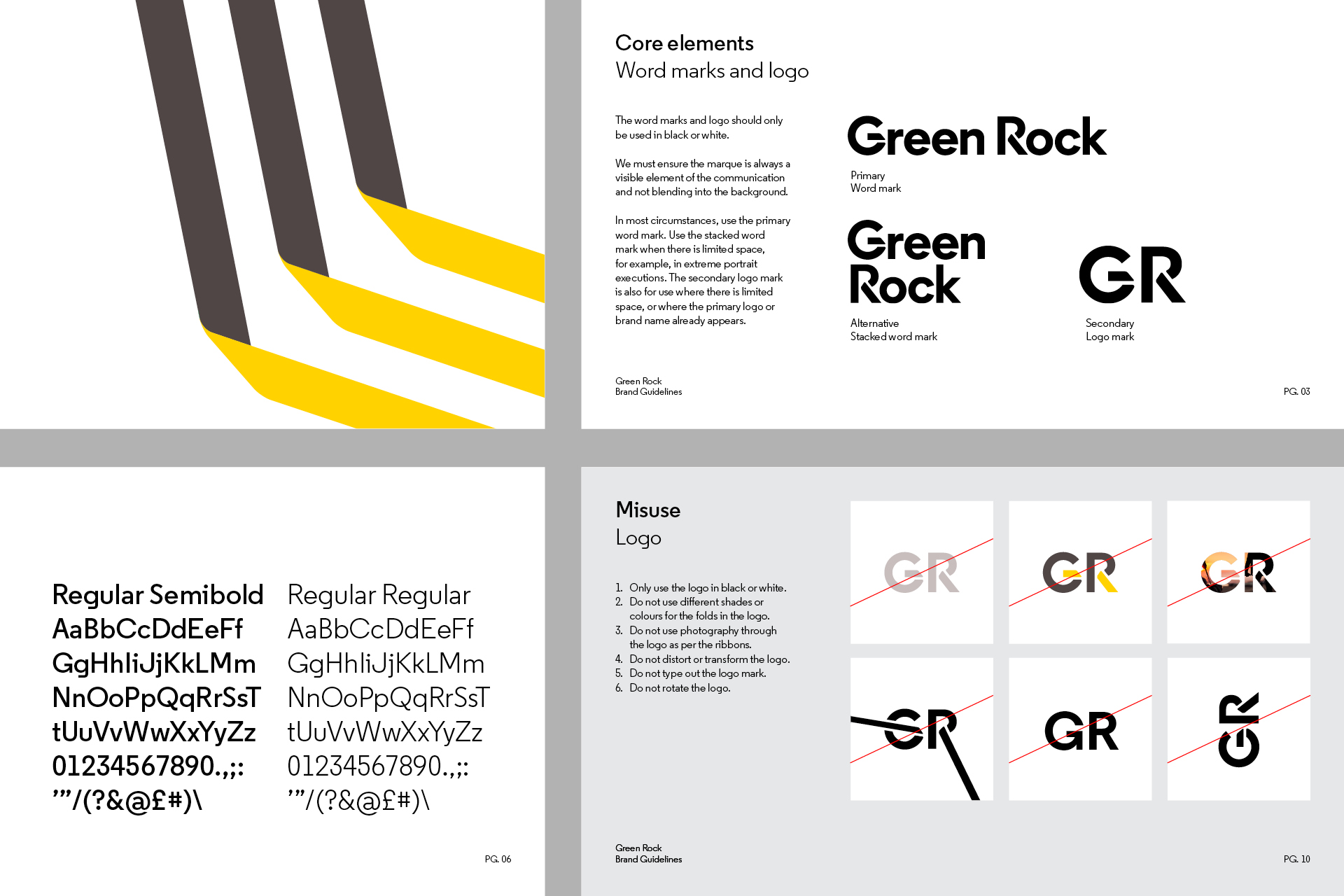
The logo
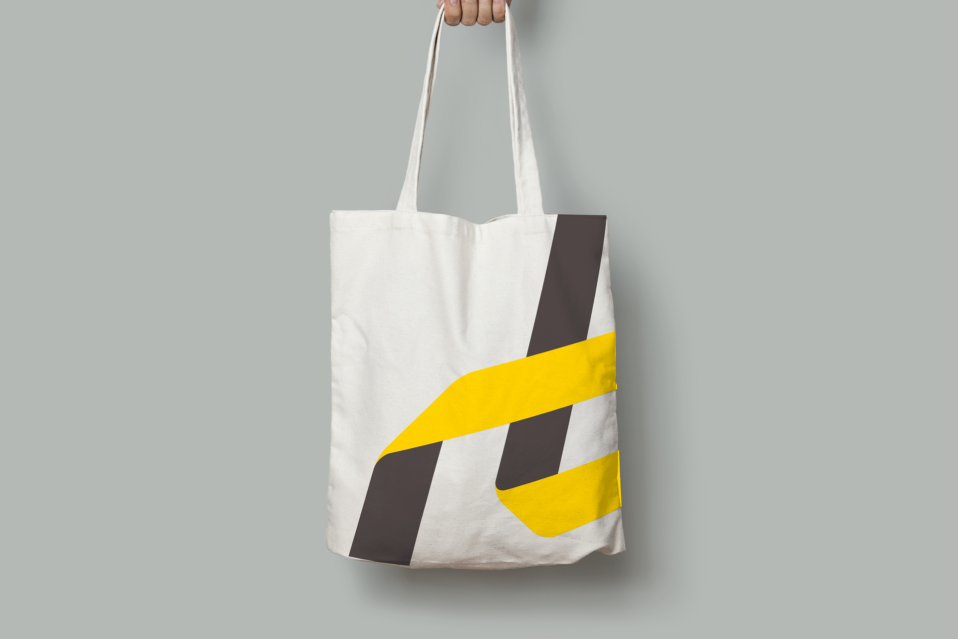
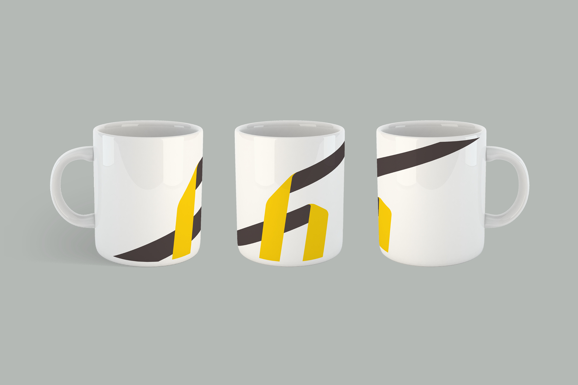
The logo takes it’s visual cues from the wider identity — introducing the same fold in the G and the R as we use in the tapestry elements, with the same soft curves. The result is ownable, dynamic and connected.

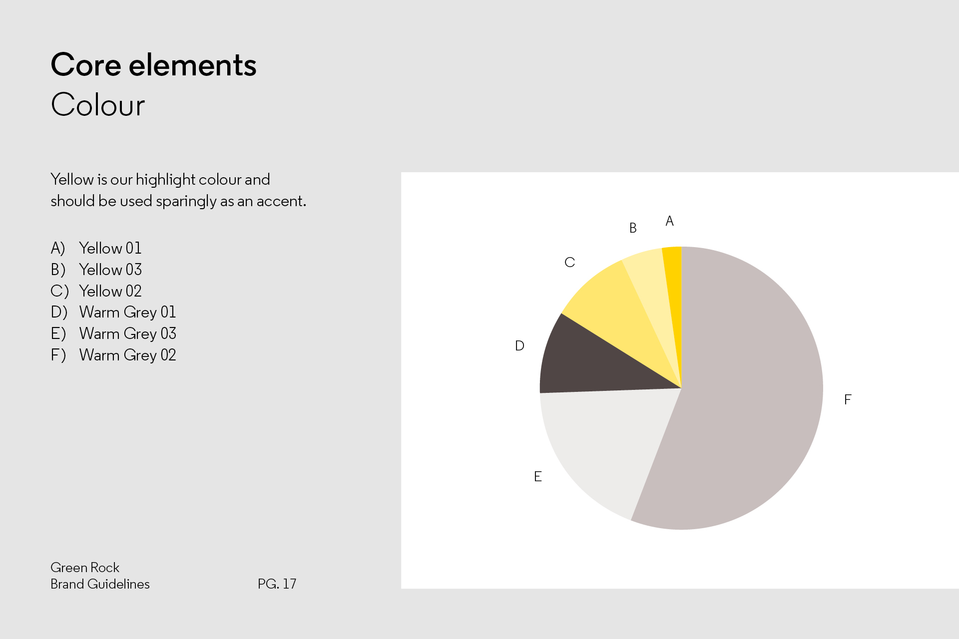
Colour
Much of our colour comes from content. The tapestry ribbons allow us to adjust the mood and attitude of the brand, dependant on context. We provide guidance for image selection, with the ability to tailor creds and pitch decks to a particular style or sector. Our hero colour is a bold, optimistic yellow, paired with a set of warm greys.
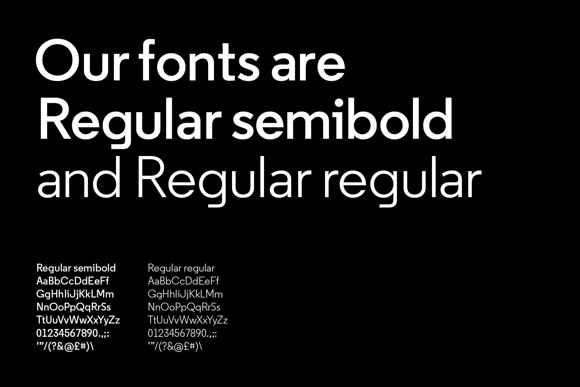
Typography
Regular is a geometric sans that balances good legibility with a lovely contemporary twist. The odd letterform has something wonderfully characterful about it, with the lowercase g a thing of real beauty.
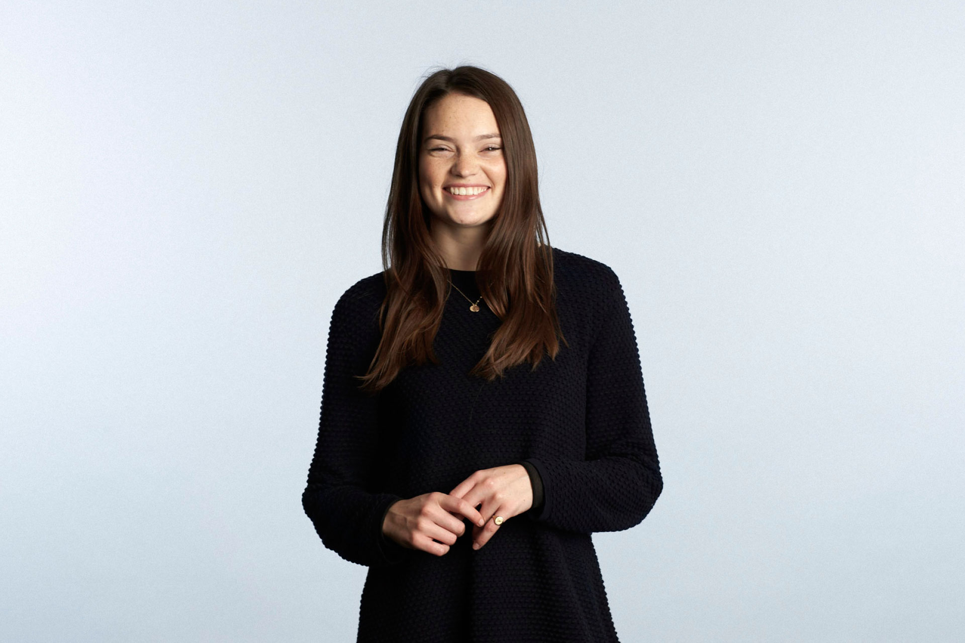
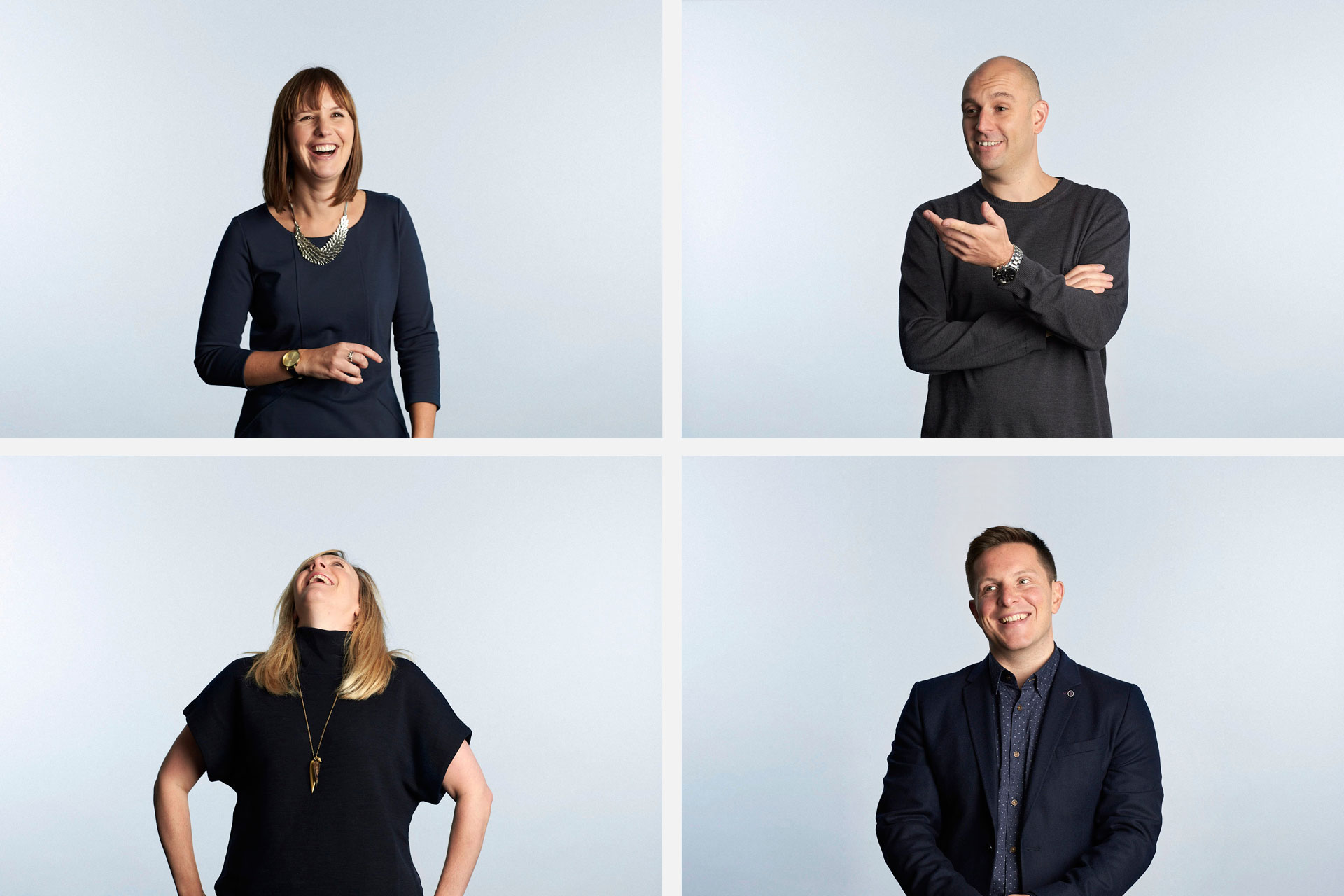
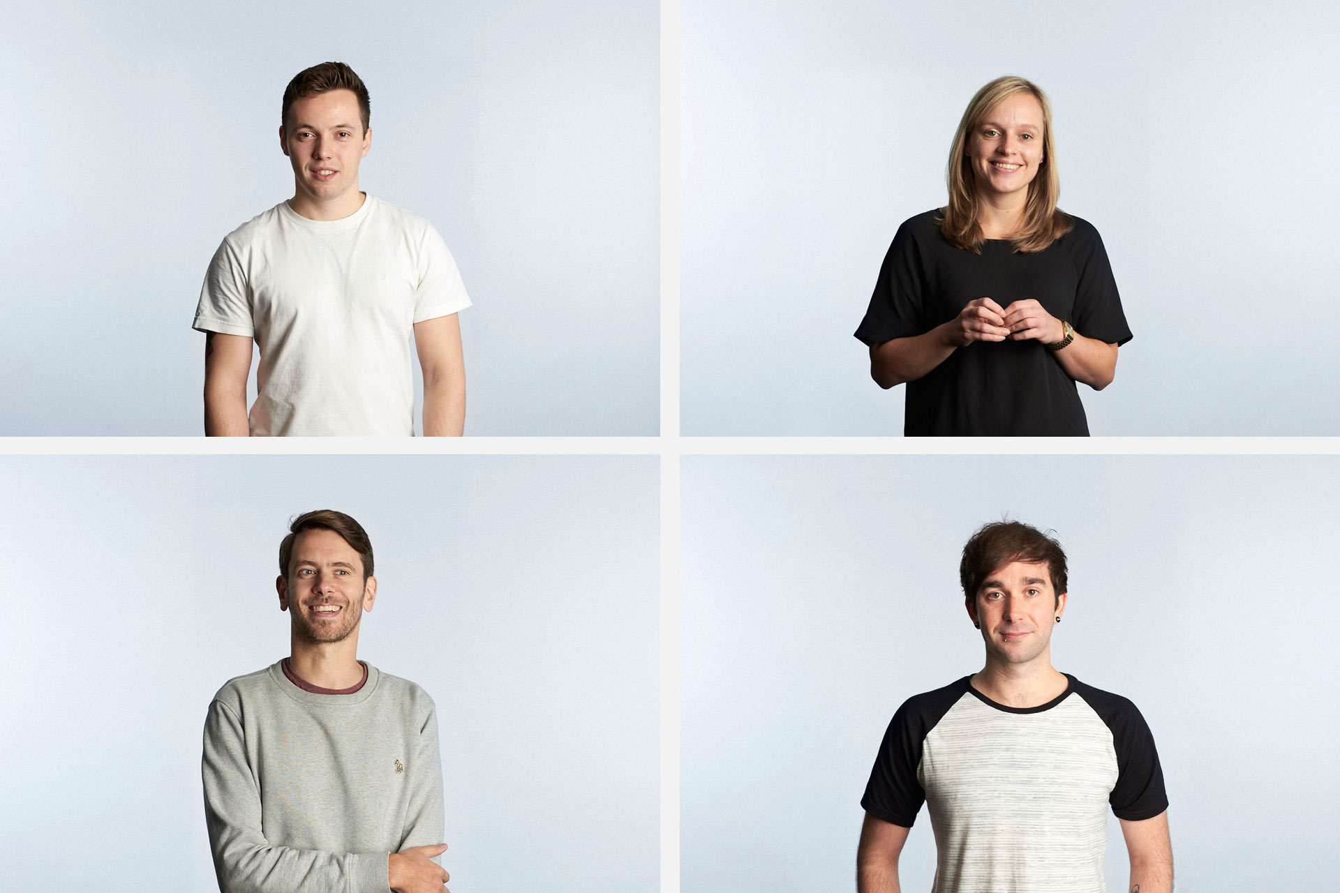
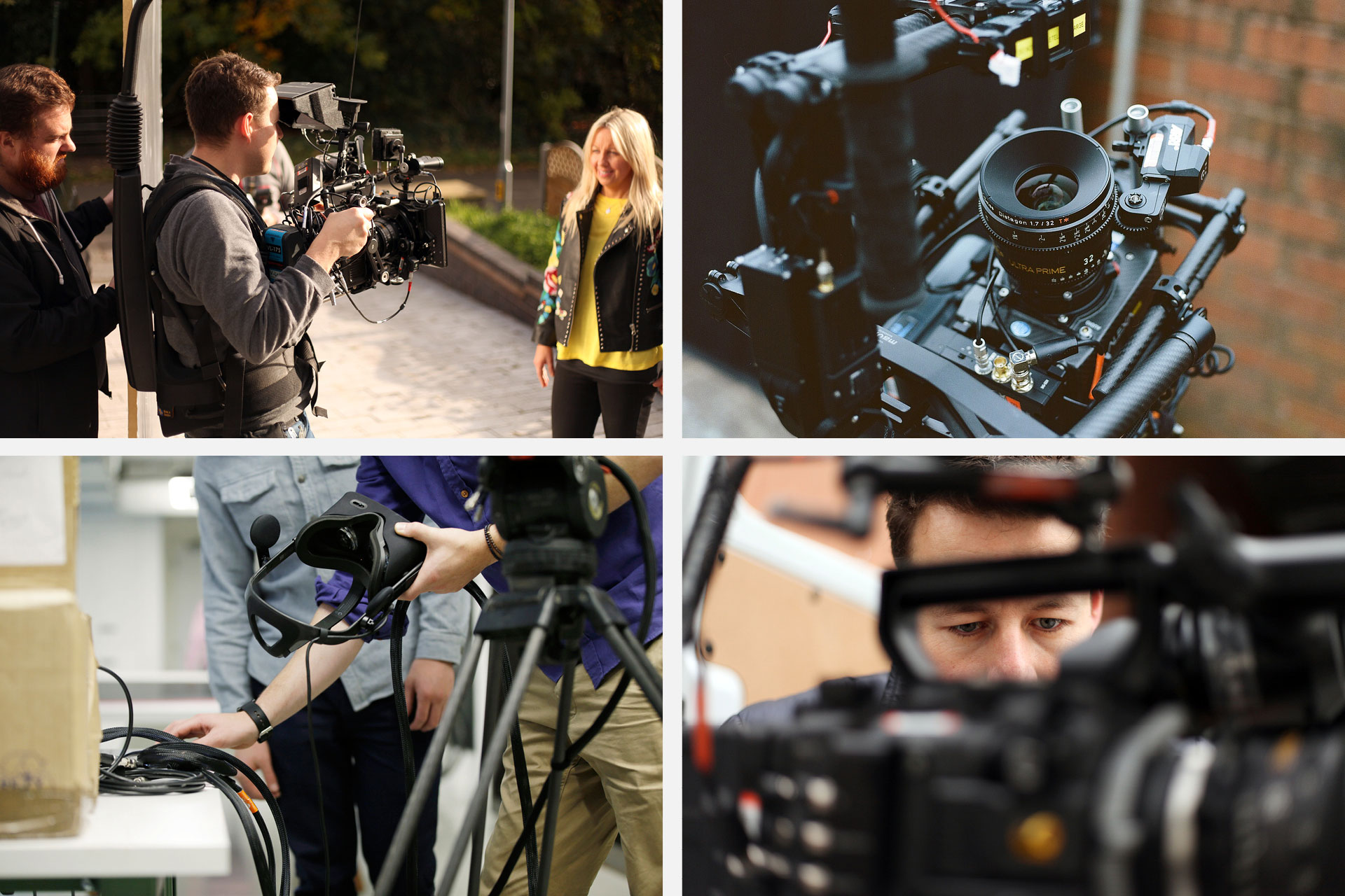
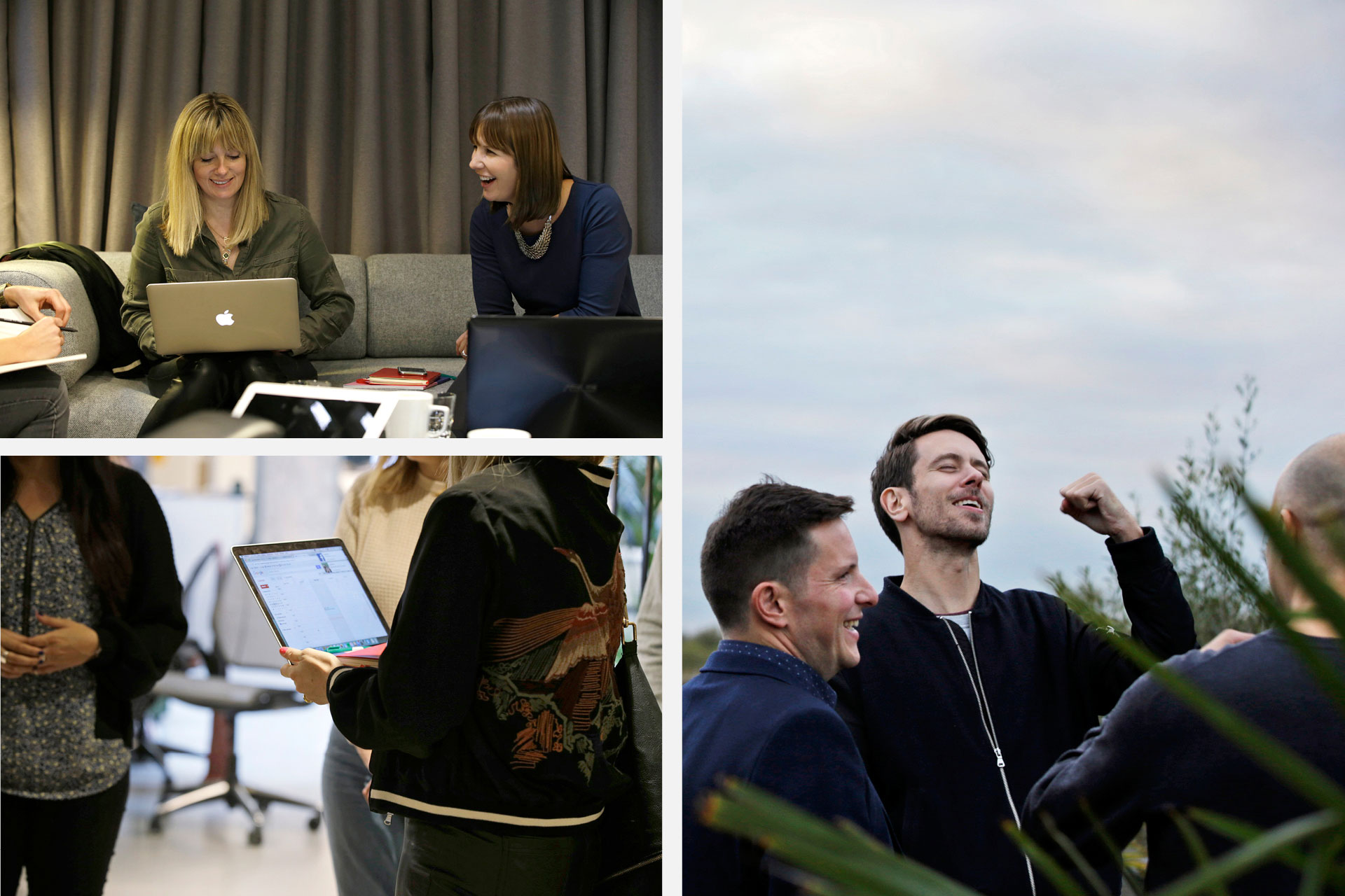
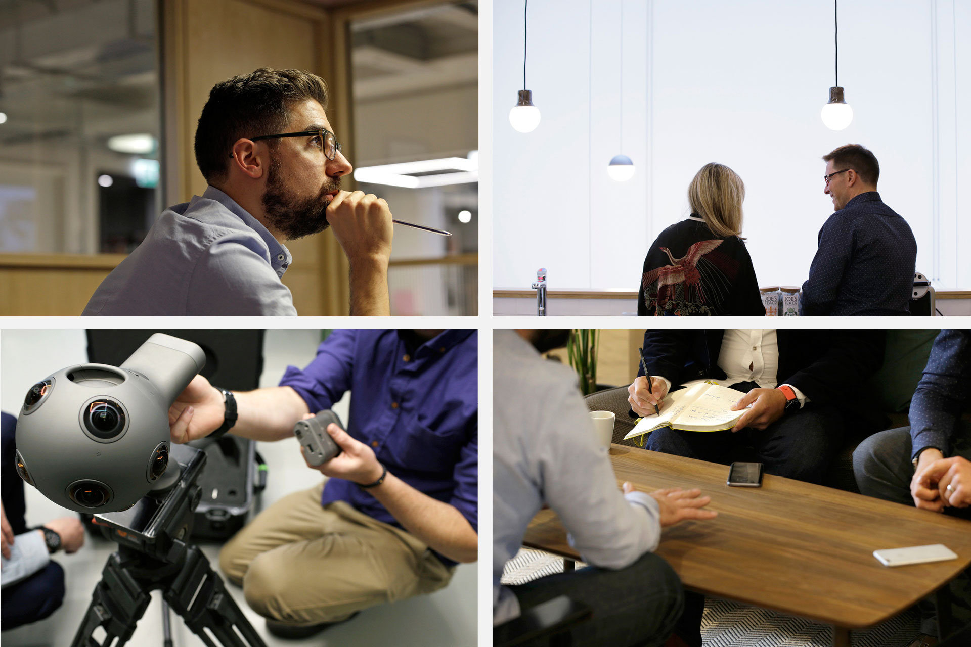
Photography
We’ve worked with Patrick Harrison for informal staff portraits and an image library of process photography. We’ve also sourced some really great stock, from places like Death to Stock, to give variety and scale.

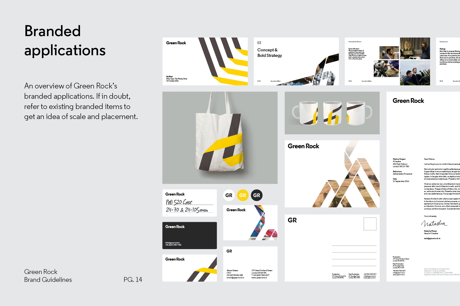
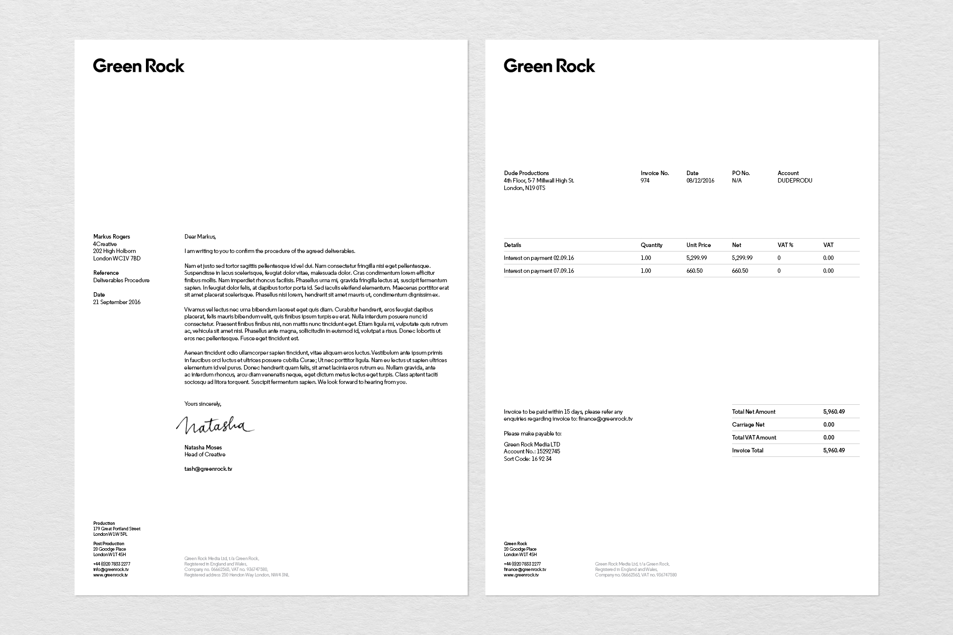
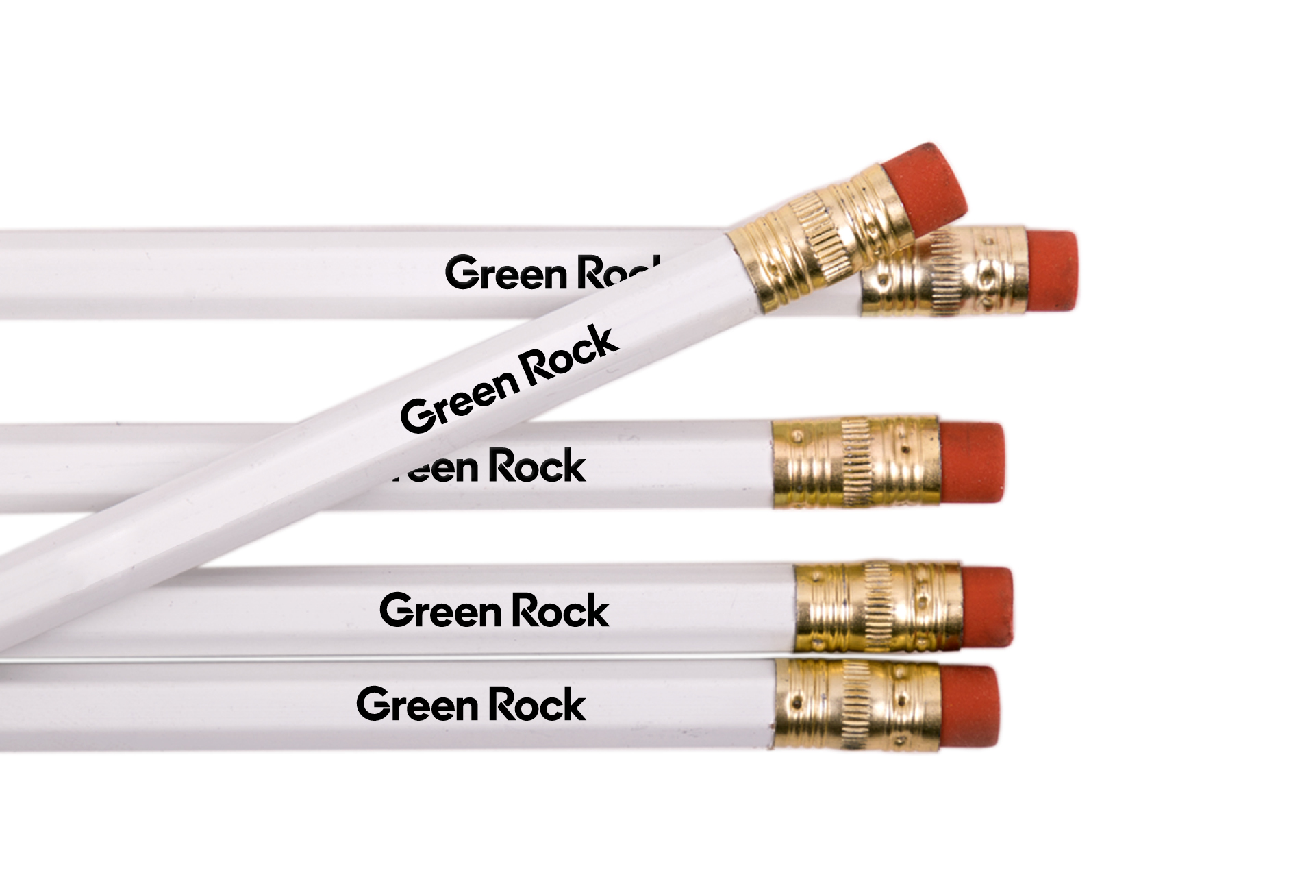
Stationery and apparel
PowerPoint and guidelines