We are Proud Creative. We create work that makes our clients and everyone at the studio proud. It’s the reason for our name. Below is a case study of a branding project for Egyptian street food company Koshari Street.
The company
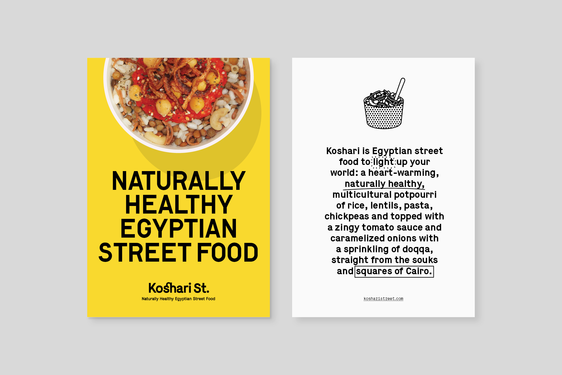
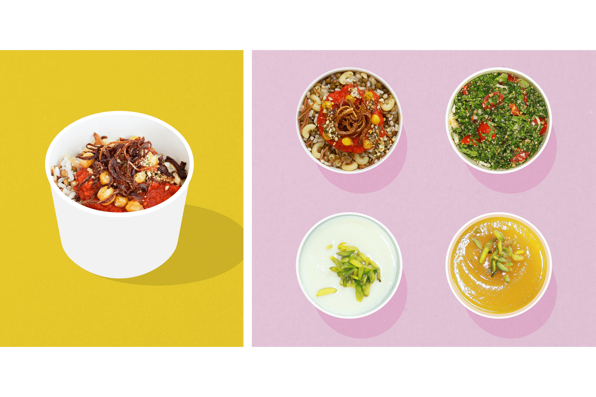
Koshari is a naturally healthy Egyptian street food. We worked closely with the founders and with food writer and consultant, Anissa Helou, to define a new positioning and tone for the brand. The first bricks and mortar outlet is in St. Martins Lane, London.

The identity
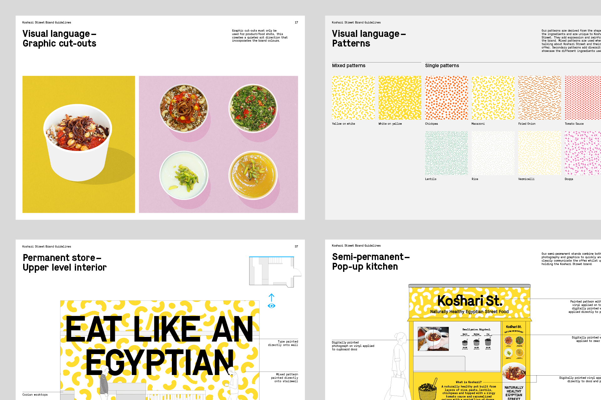
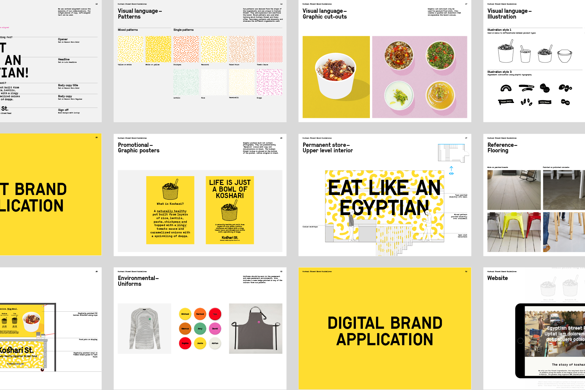
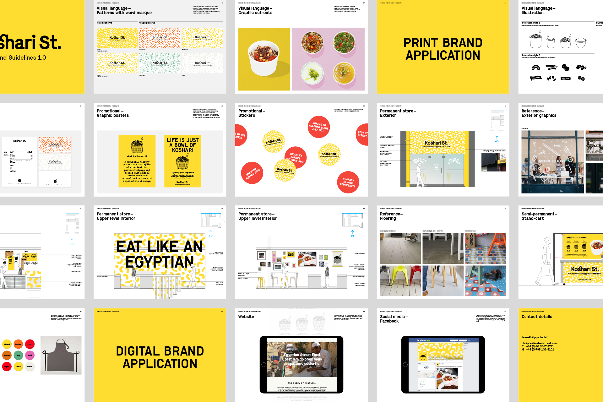
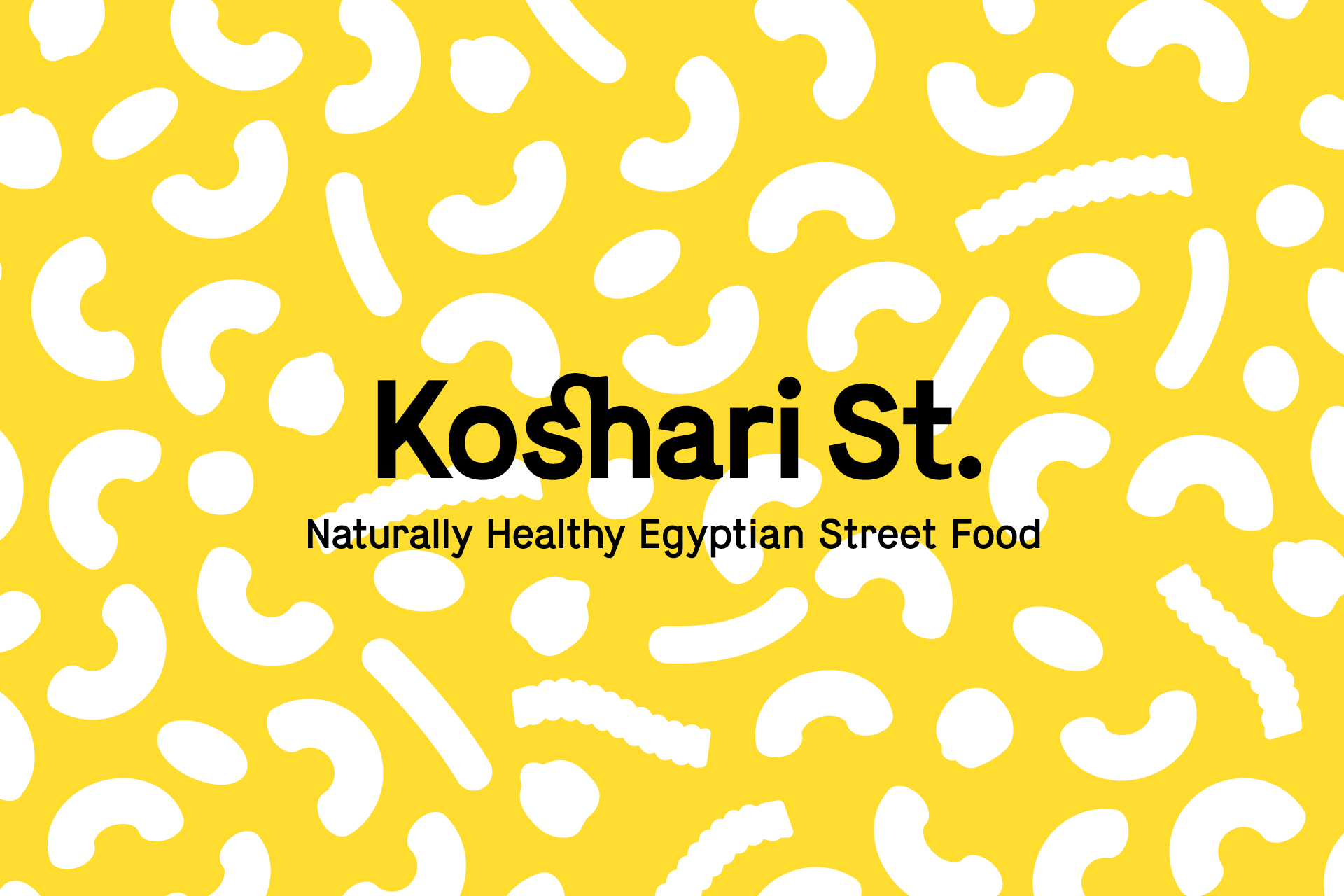
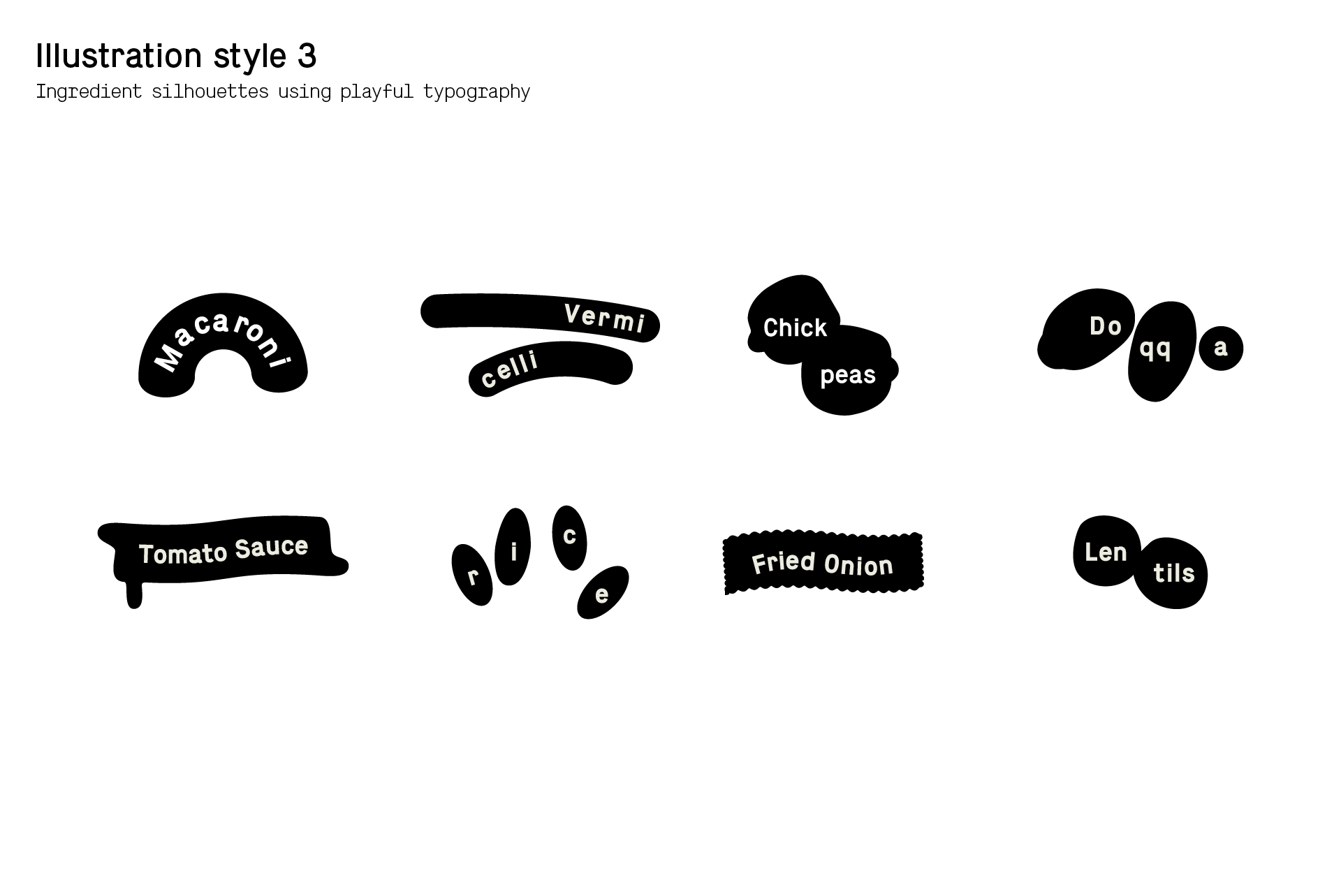
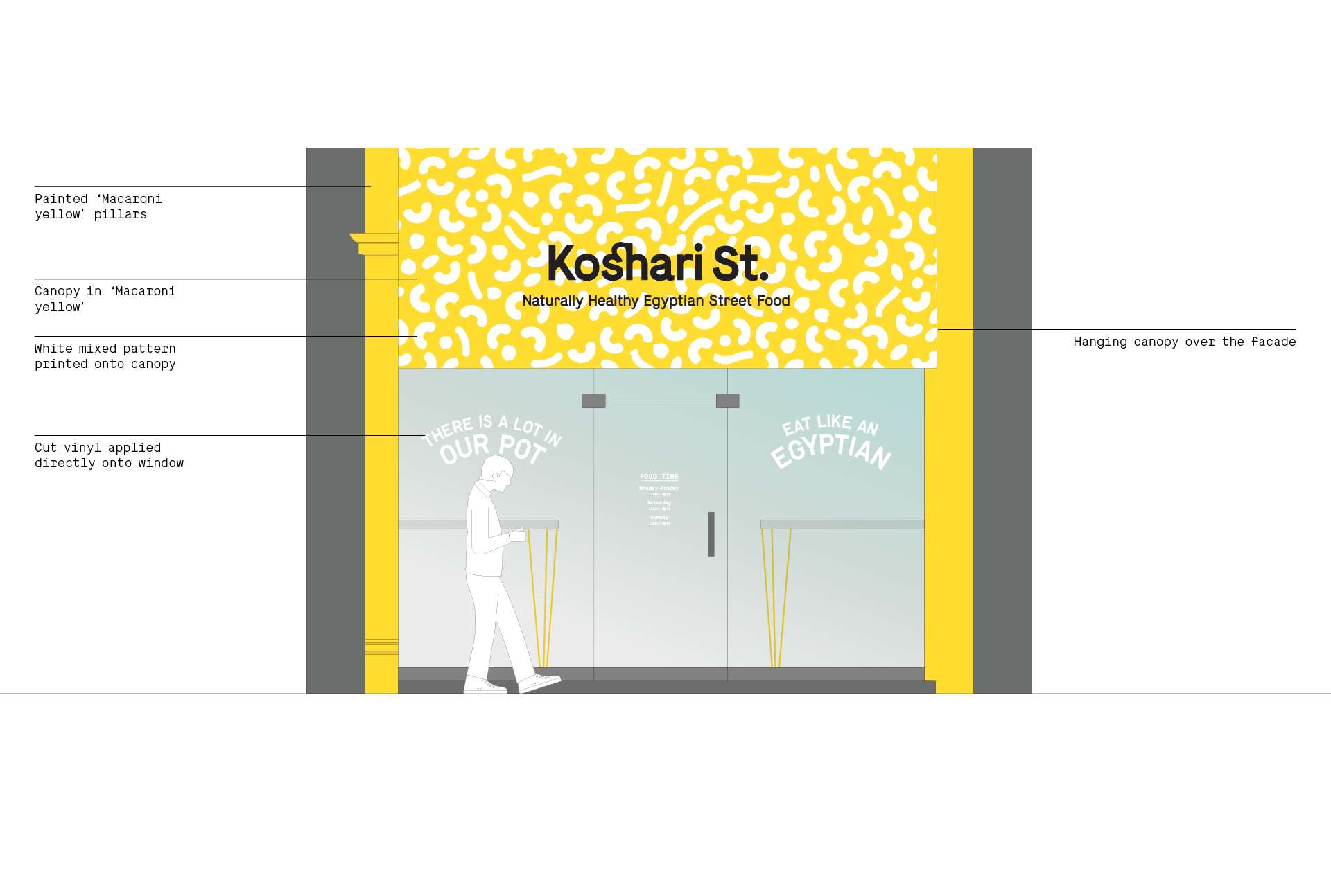
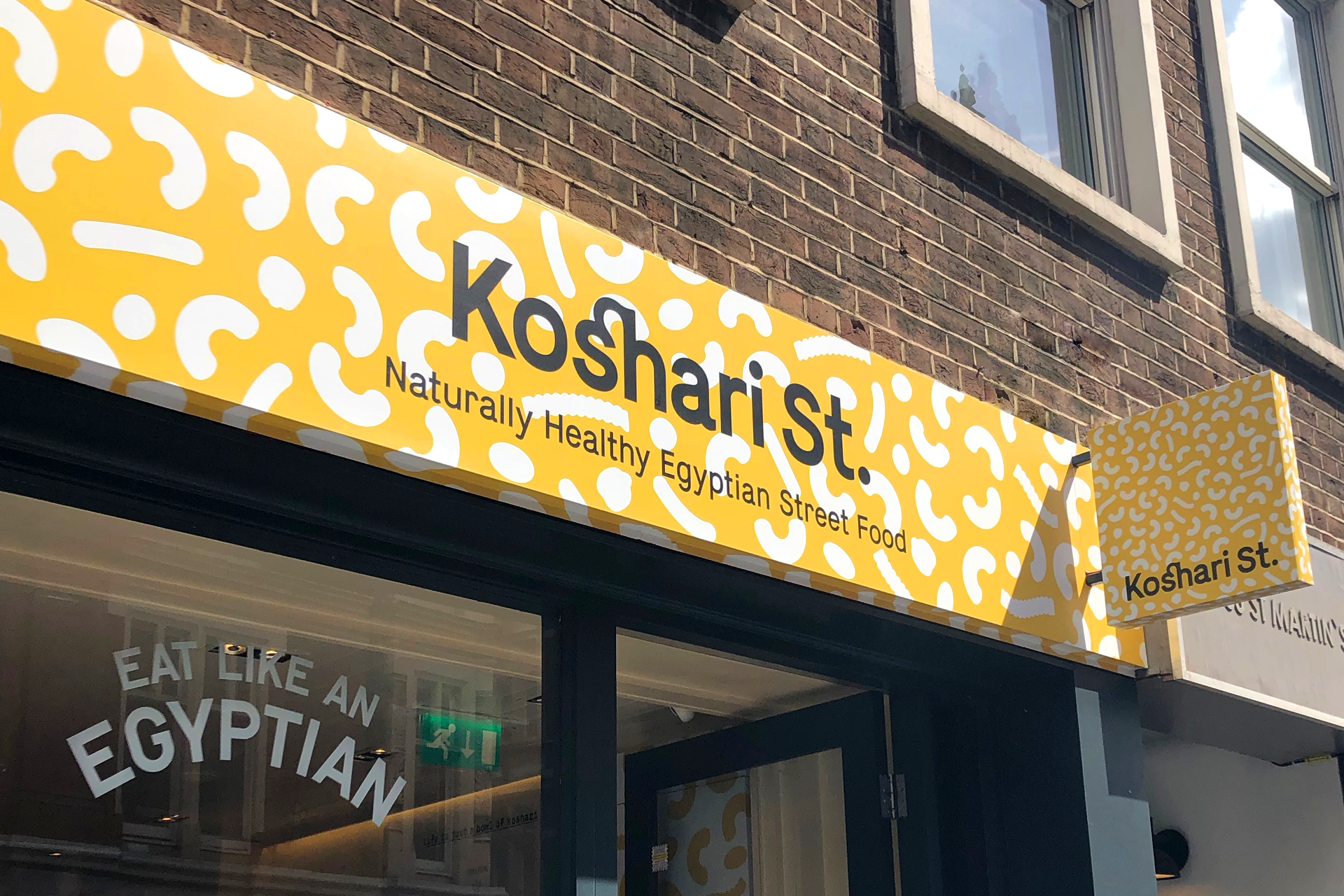
The visual language is playful, confident and full of colour. We created a series of patterns based on the ingredients, which work with a vibrant palette and provide a background for the logo and messaging.
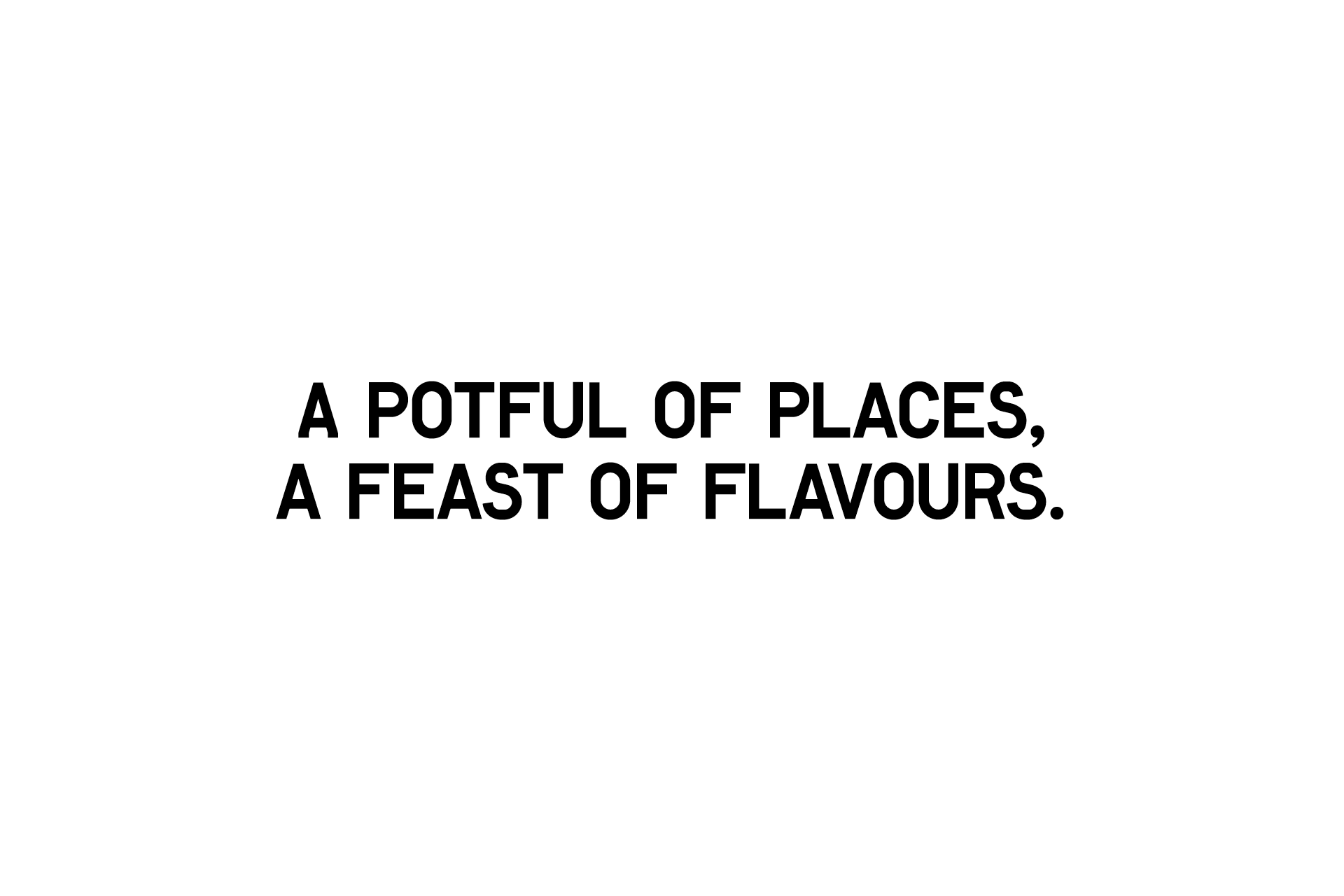
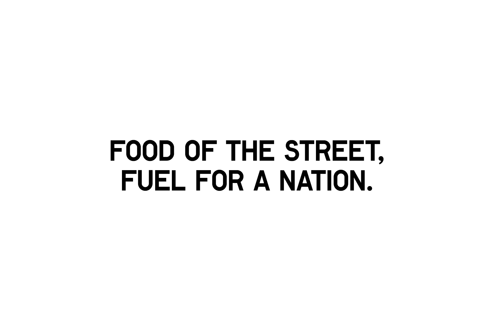
Tone of voice
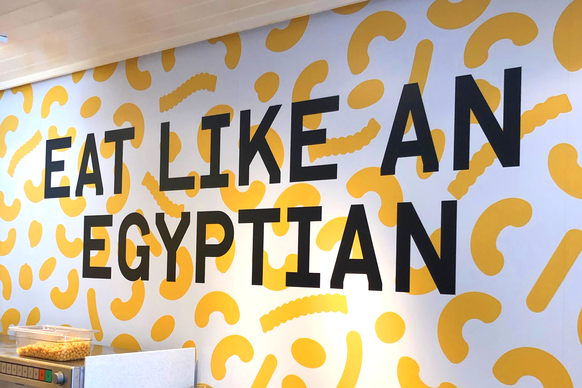
The tone of voice is honest, progressive and playful. We worked with copywriter Michael Evamy on messaging that is approachable and fun.


Typography
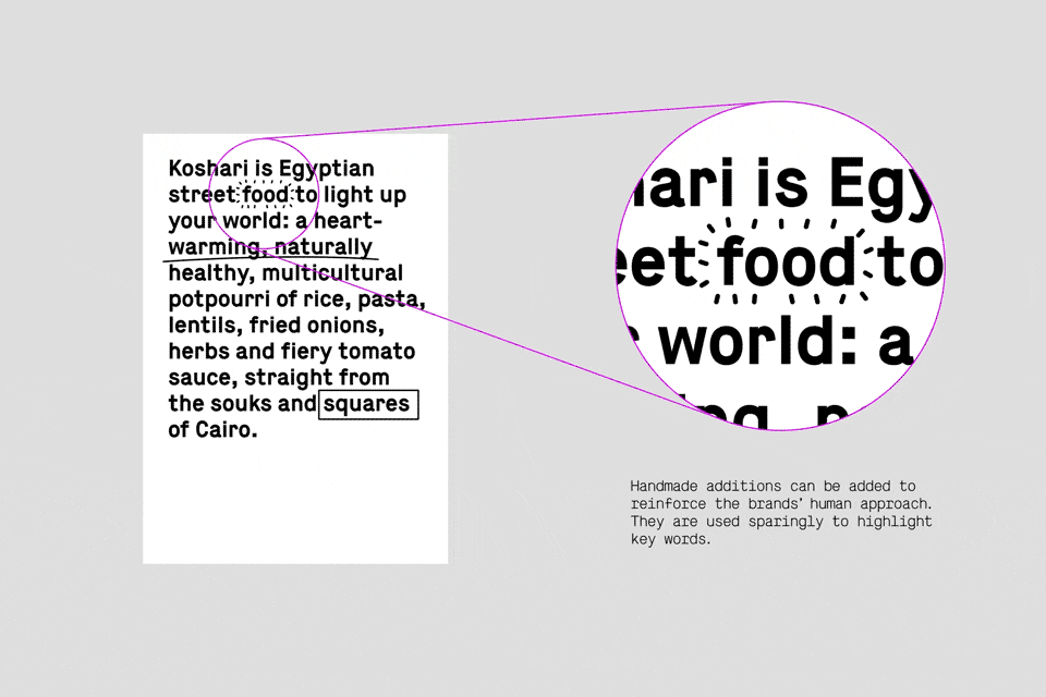
Lutz and Maison work in unison to create bold and distinct lettering with an industrial flavour. We use Lutz for headline copy, Maison for body.
Handmade additions are used sparingly to highlight key words, bringing a nice human touch.
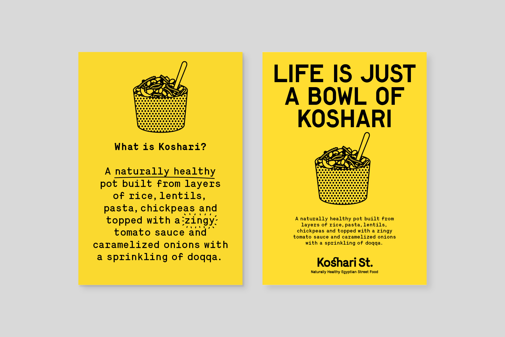

Colour
Koshari Street is recognisable through its predominantly yellow core palette, with the secondary palette providing flexibility in communications.
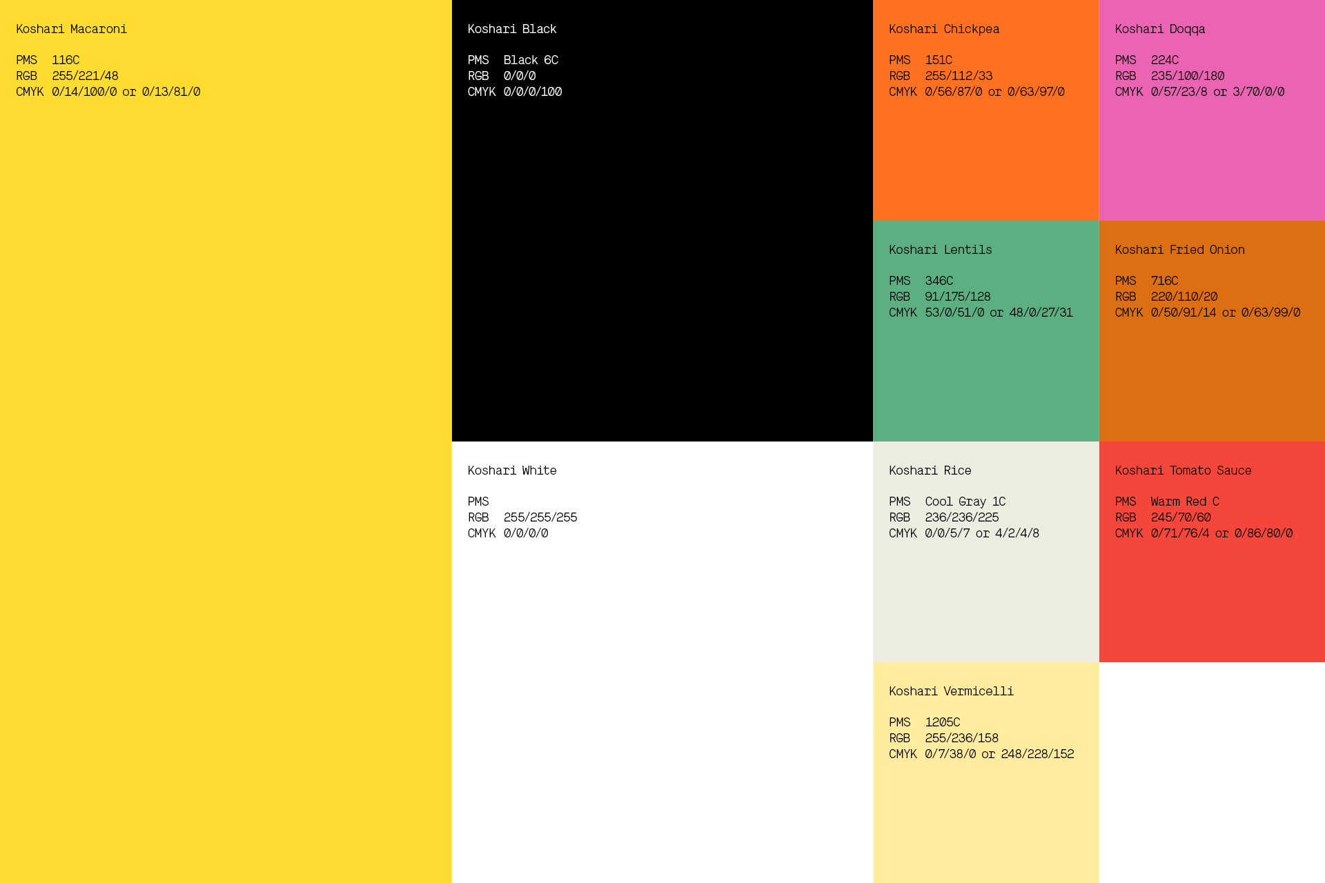
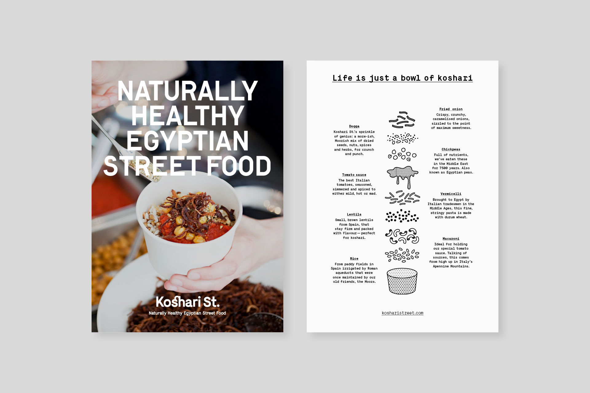
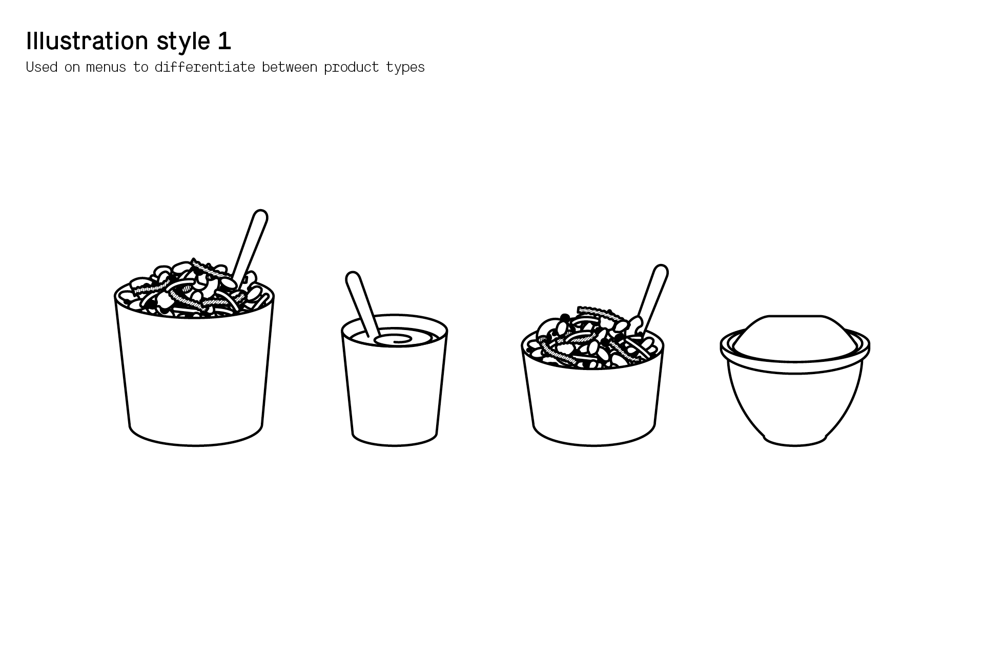
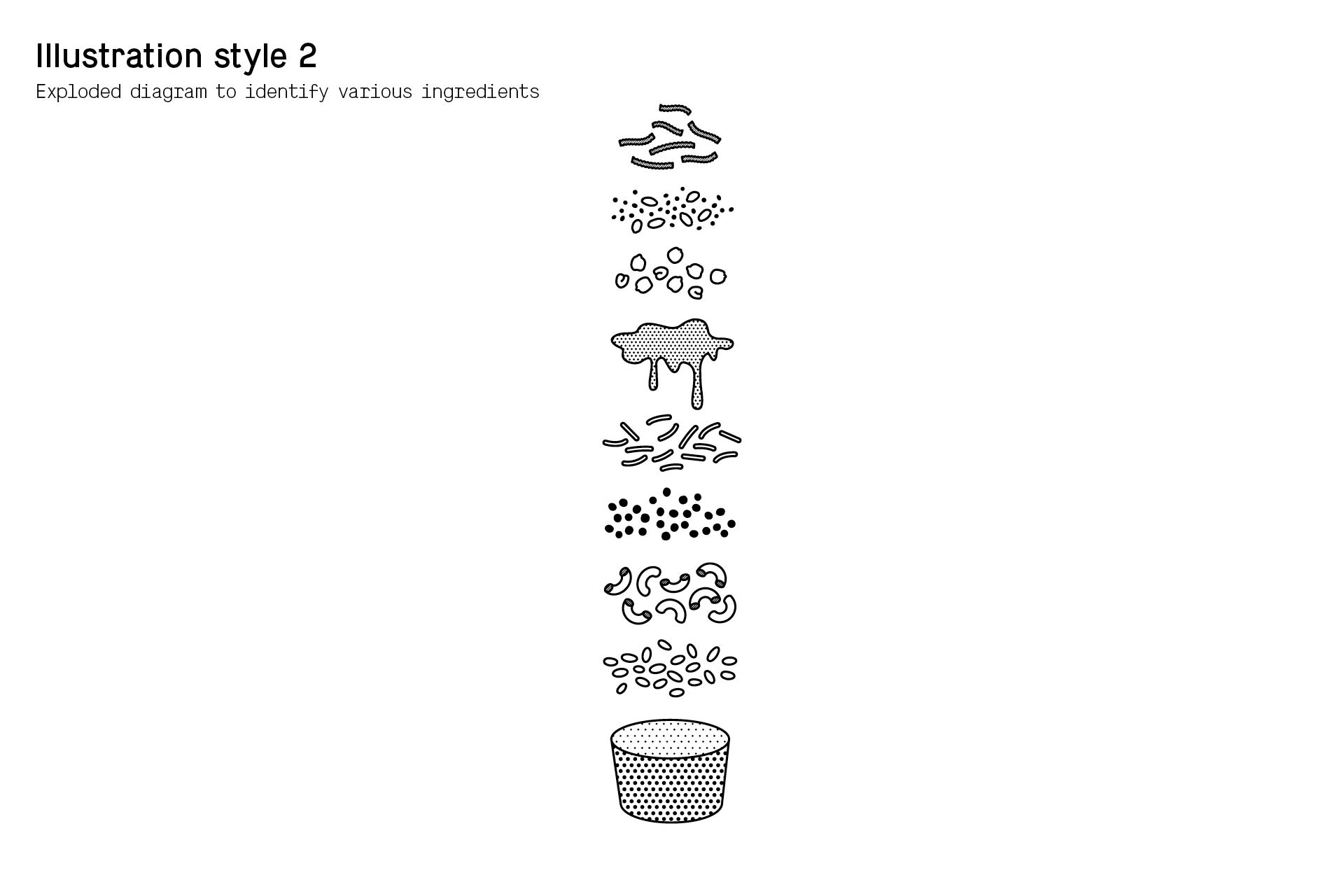
Illustration and graphic style
The illustration style is simple and informative. We use these illustrations to support written information, differentiate between products and explain key menu options.


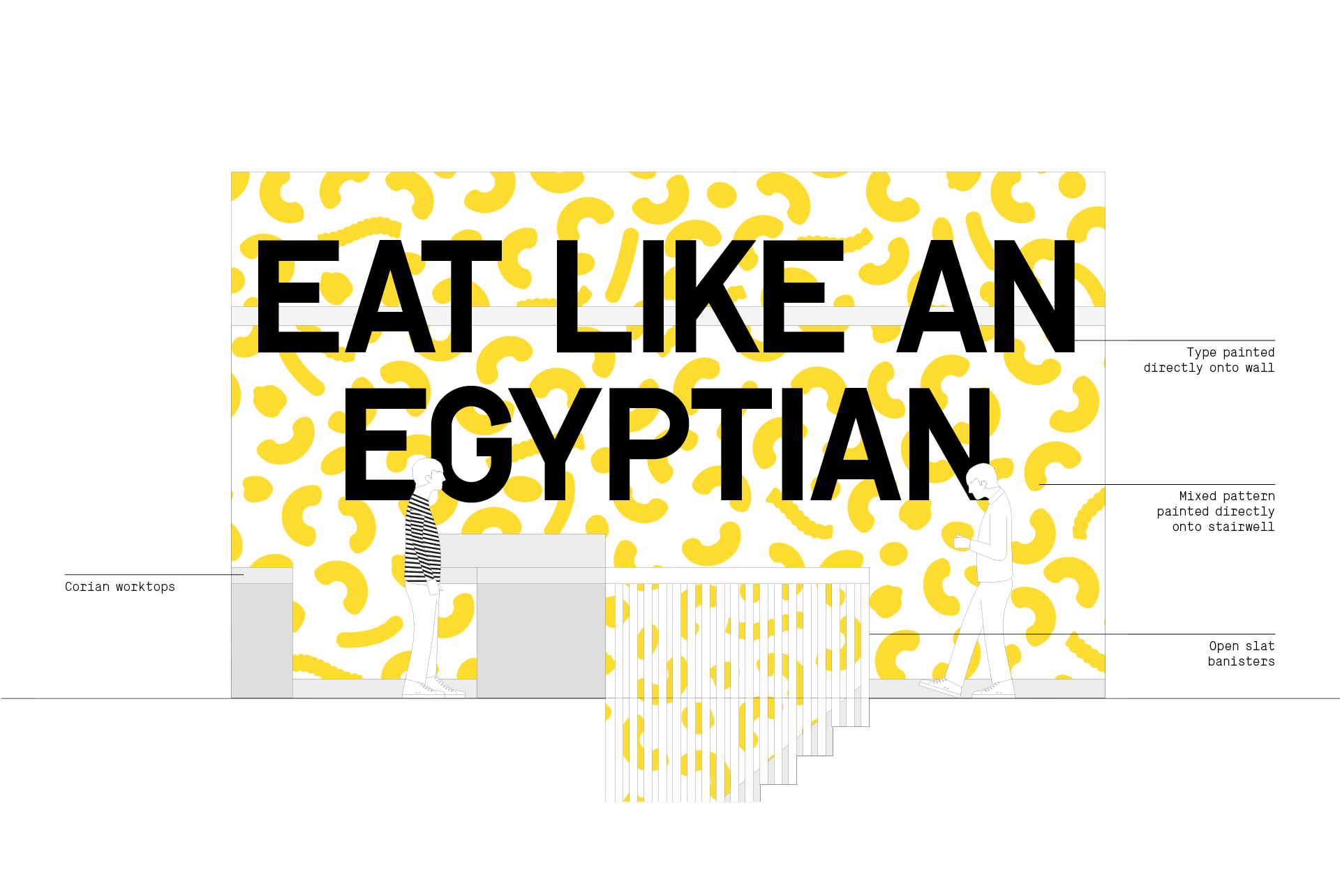
Brand application
The playful tone of voice and confident use of colour really come into their own in the restaurant, creating a friendly and welcoming interior; whilst the exterior signage provides great stand out on the street.
Brand guidelines
The guidelines are clear, concise and an inspiration for all future executions.