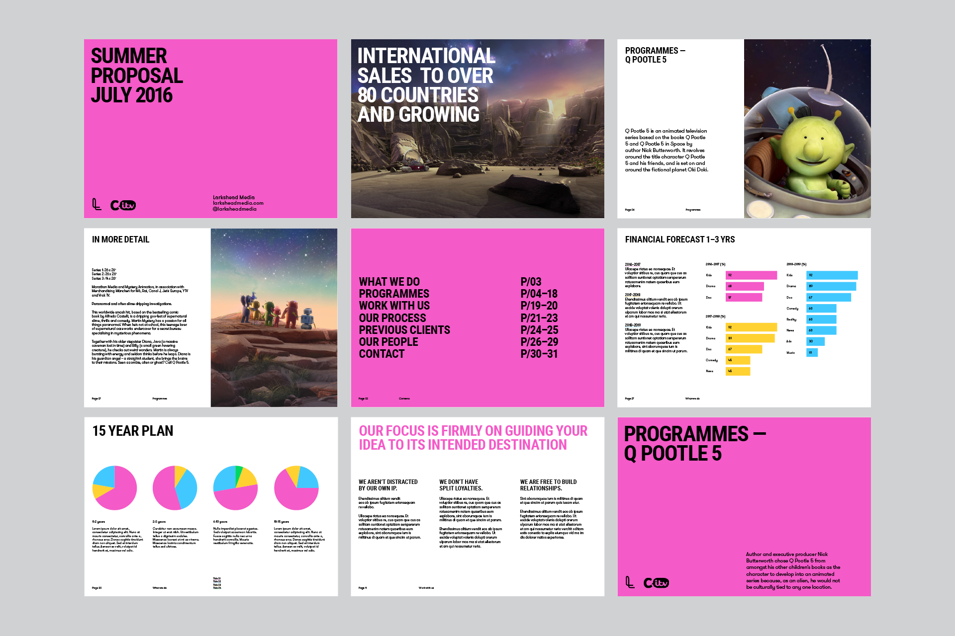
We are Proud Creative. We create work that makes our clients and everyone at the studio proud. It’s the reason for our name. Below is a case study of a branding project for the media service company Larkshead, who specialise in children’s television.
The business
Larkshead Media is founded by ex-Vice President and Director of Programming at Nickelodeon UK, Tim Patterson. Larkshead works across programme development, investment, programme brand strategy, sales, and international distribution, licensing and merchandising.
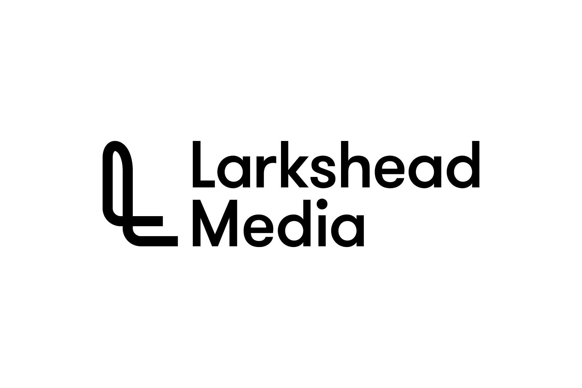
The thinking behind the identity
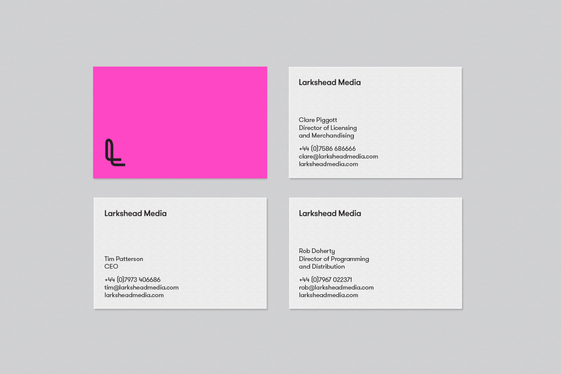
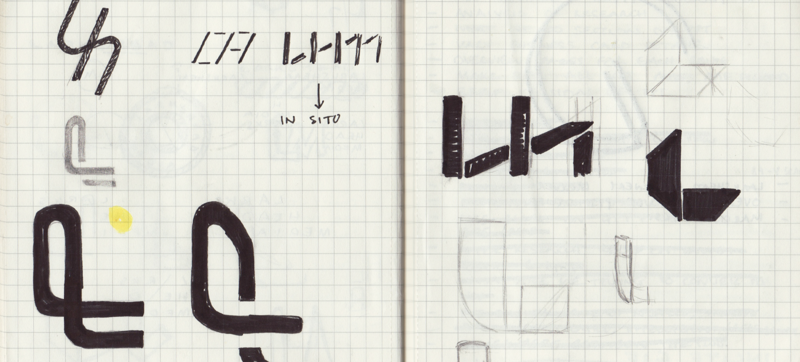
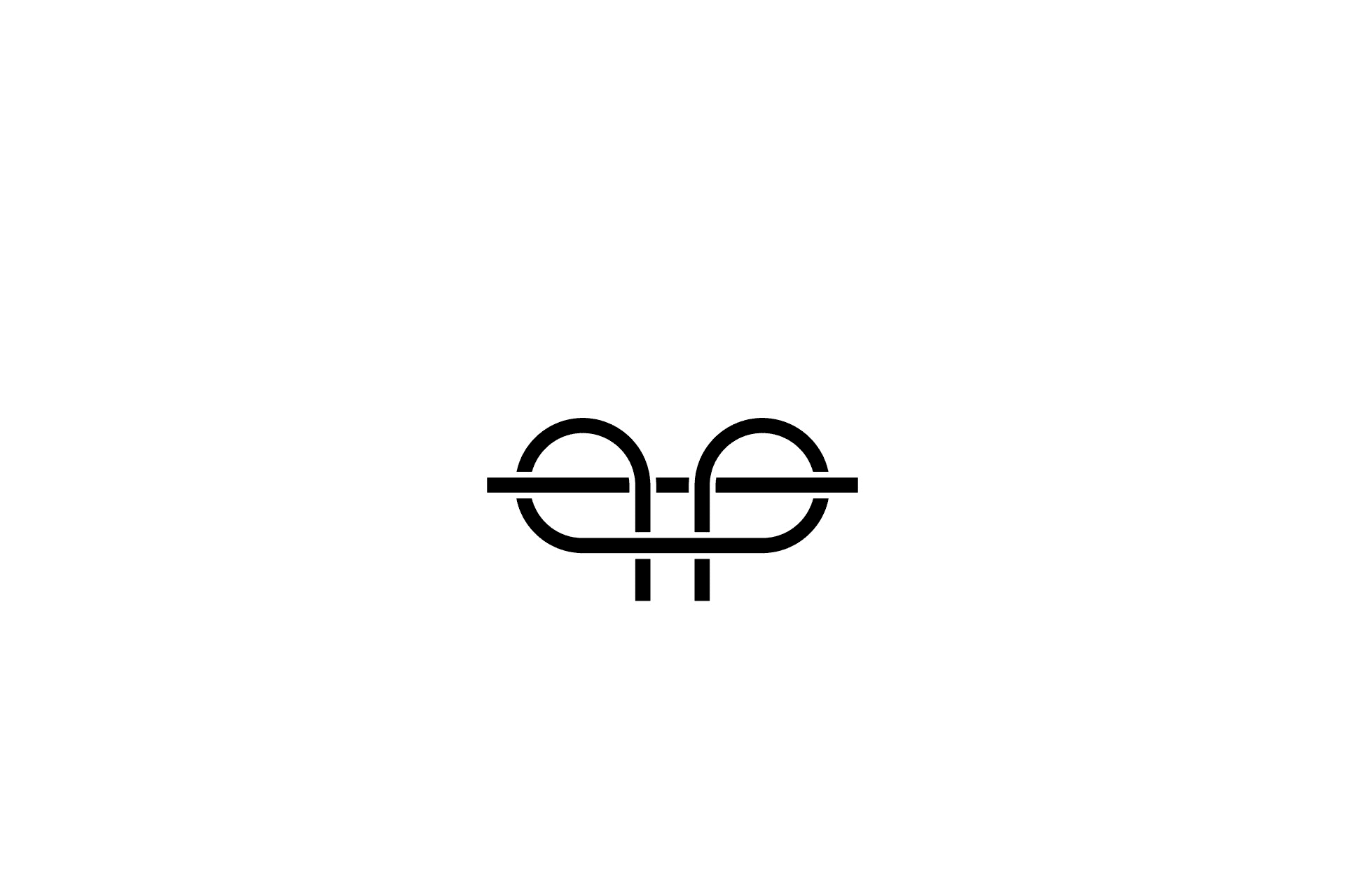
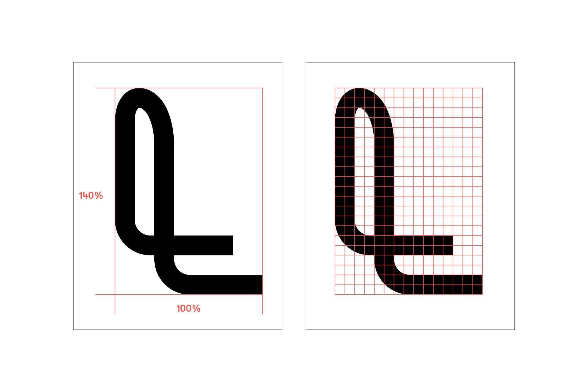
Larkshead is a type of hitch knot, sometimes referred to as a cow hitch. The idea of tying the identity to the idea of a knot is an obvious starting point. But in actual fact, the knot, although simple in many ways, creates quite tricky shapes to work with. Through iteration and development we worked towards a simplified form for the 'L' which hints at the knot connection, rather than being a slave to it.
Building a future proofed identity
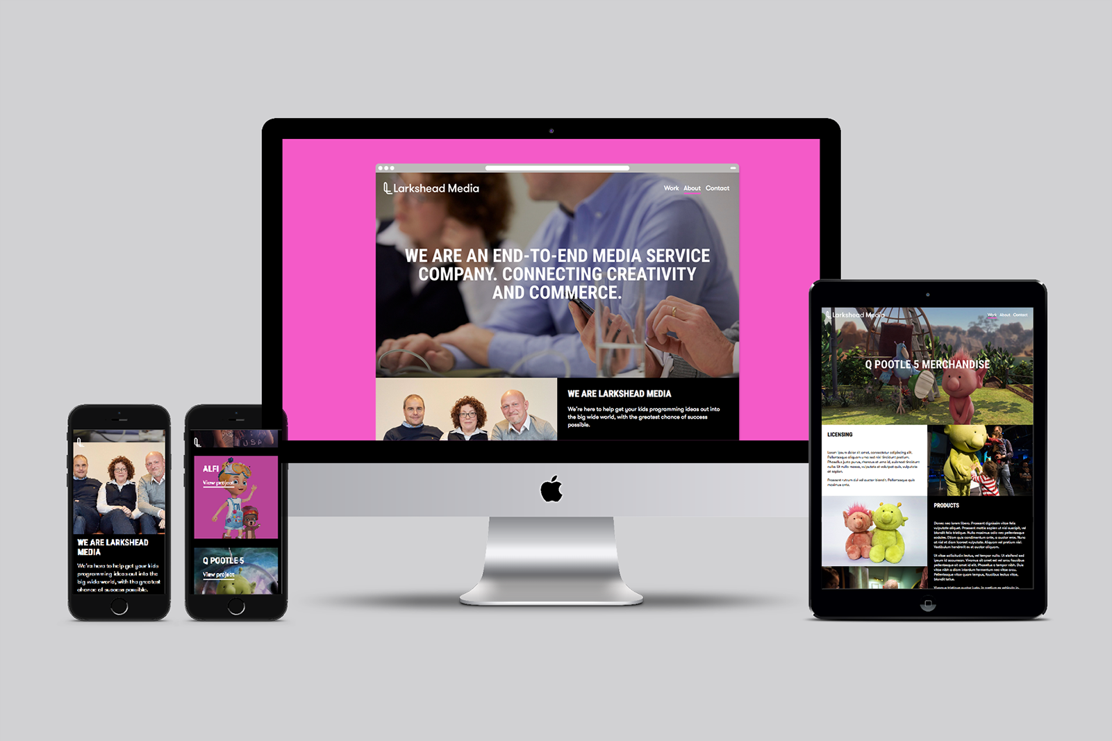
The CEO and investors in Larkshead are very ambitious. We've created a core logo structure that plans for success and puts the foundations in place for the brand to adapt and grow as the business does.
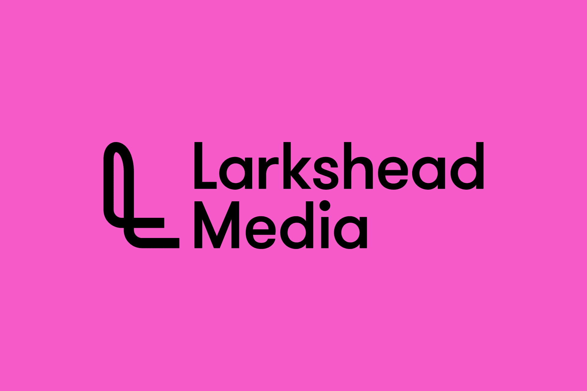
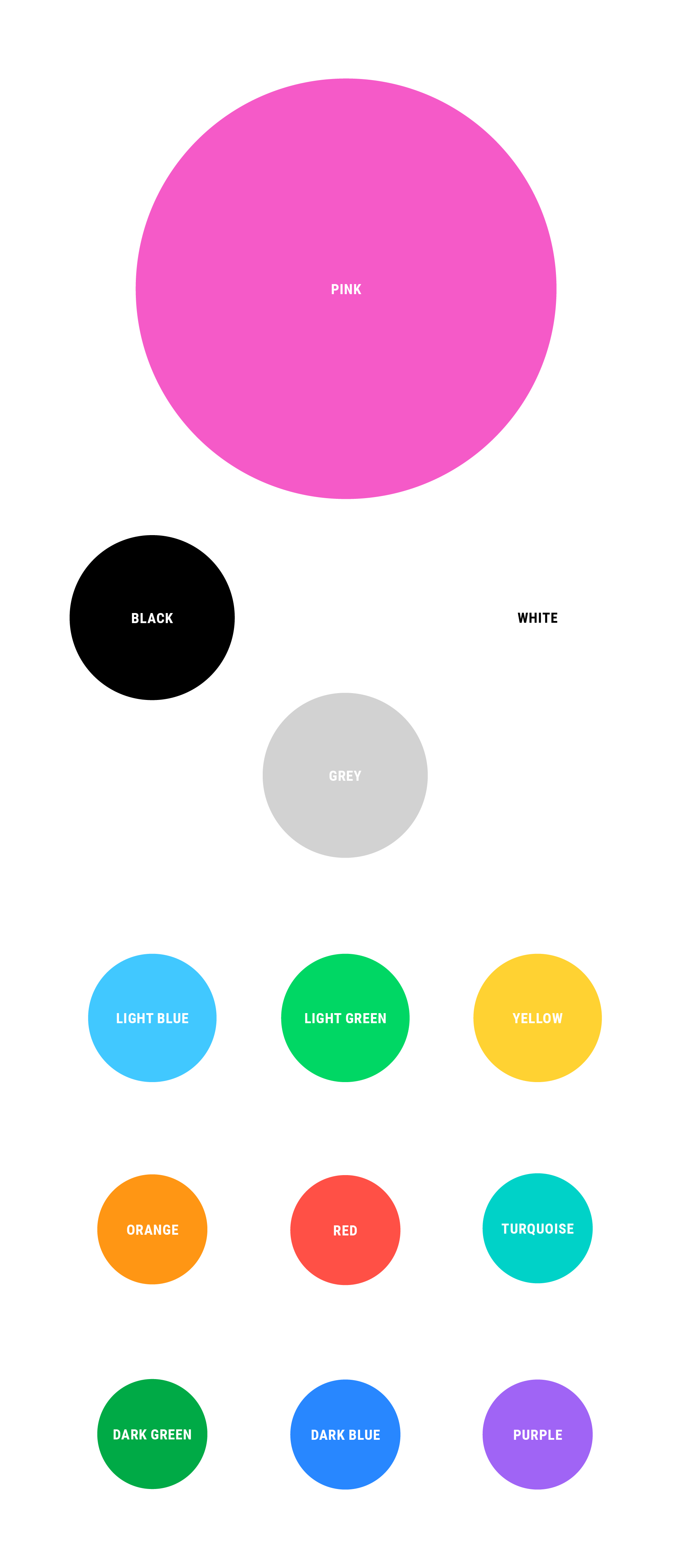
Colour
Larkshead exists in the visually busy world of kids TV content. We've specified a bold and confident approach to colour that ensures brand stand-out in relation to that content, with the bright pink often used as block colour.
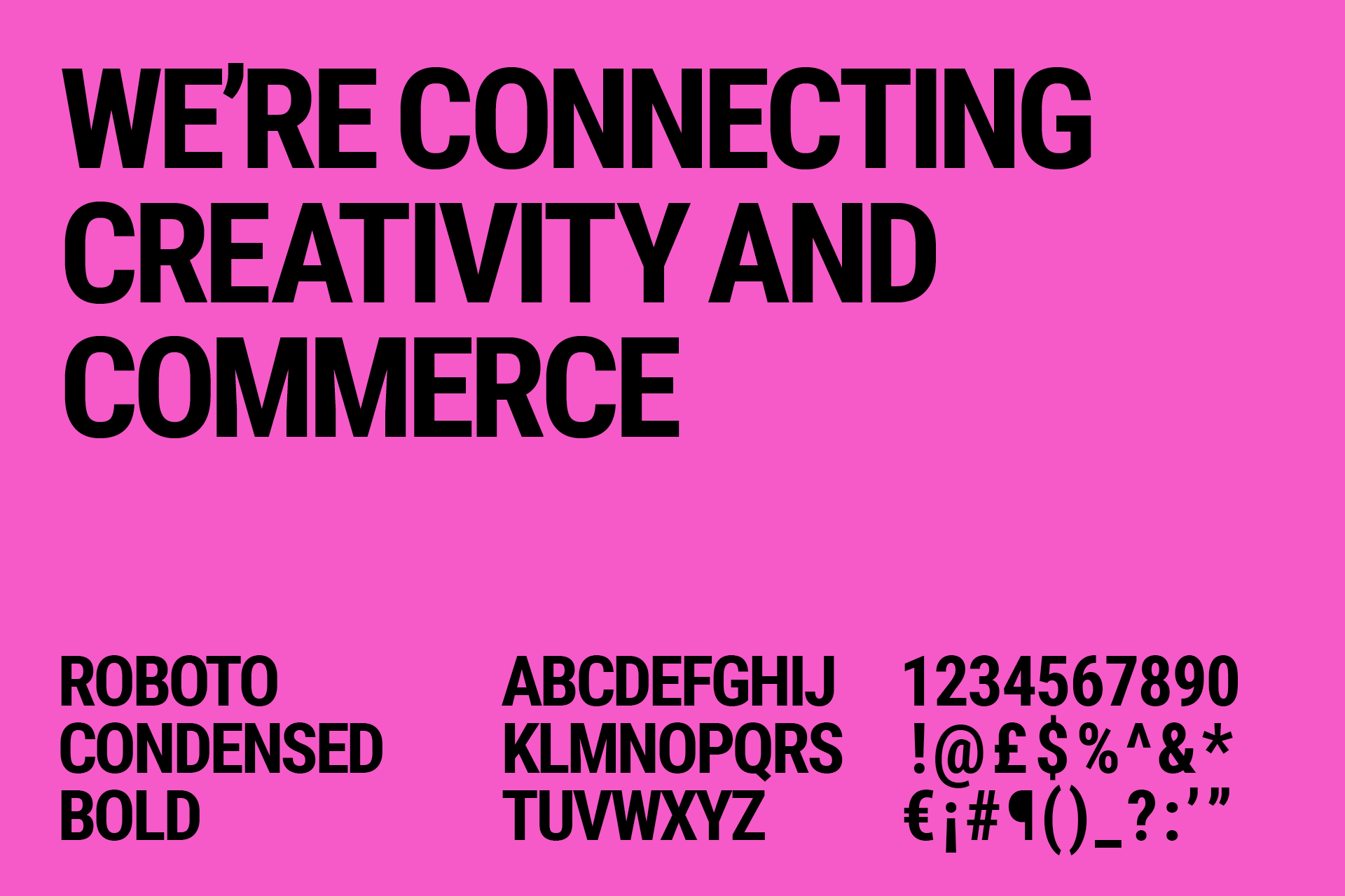
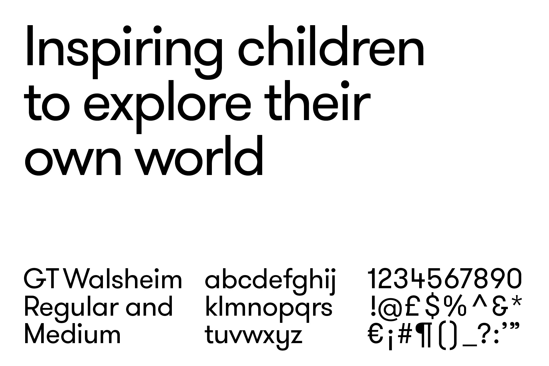
Typography
For headlines we use one of the really great free Google Font releases, Roboto Condensed. This is balanced and softened by GT Walsheim, which as Grilli Type say, is 'a friendly but precise typeface…(that) sports warm curves and wears a broad smile.' Exactly.