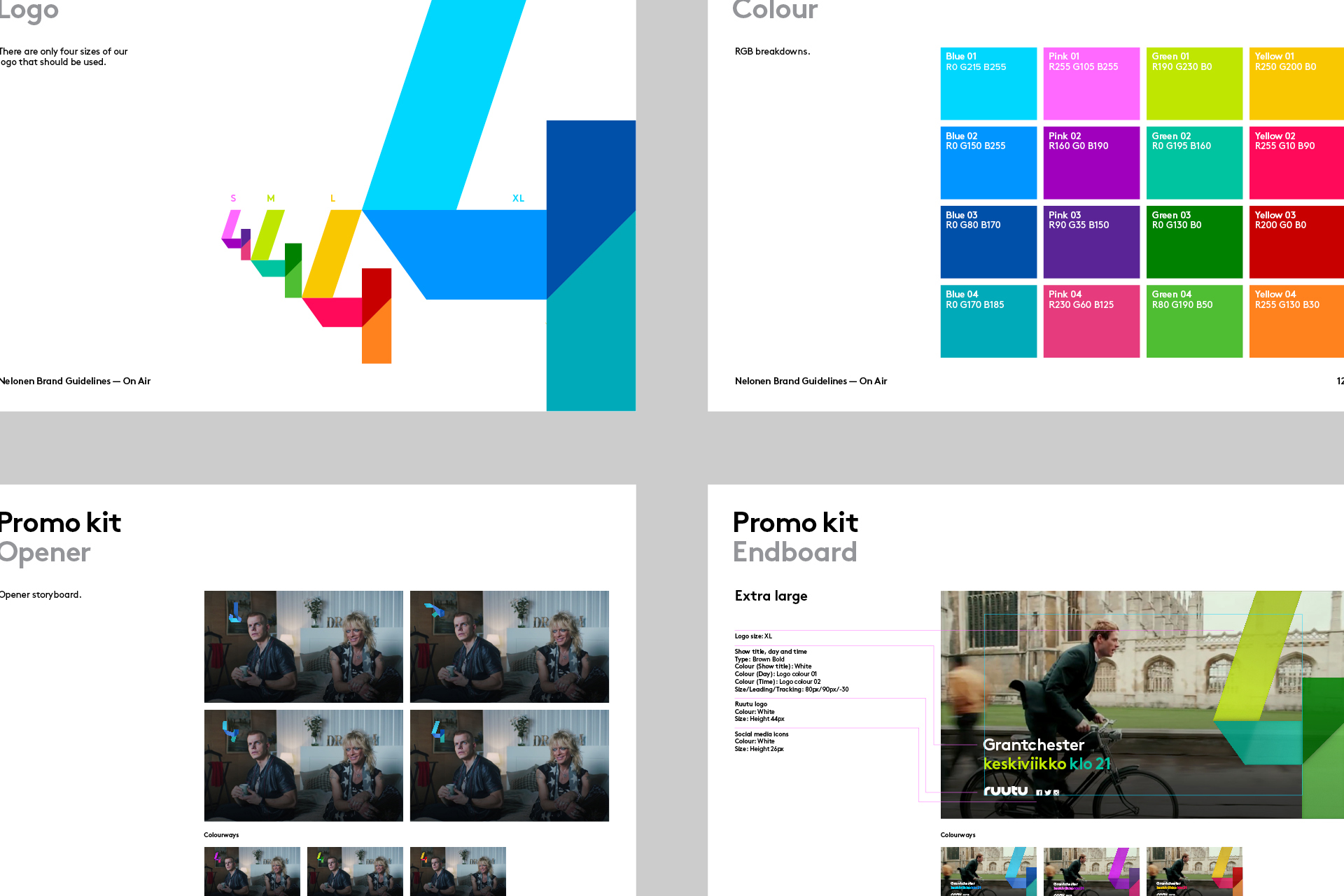
We are Proud Creative. We create work that makes our clients and everyone at the studio proud. It's the reason for our name. Below is a case study of a rebrand project for Finnish TV channel, Nelonen.
The business
Nelonen is a mainstream commercial Finnish broadcaster, seeking broad appeal. We won a four-way creative pitch for a complete ground up rebrand that was nine months in the making.

Concept development
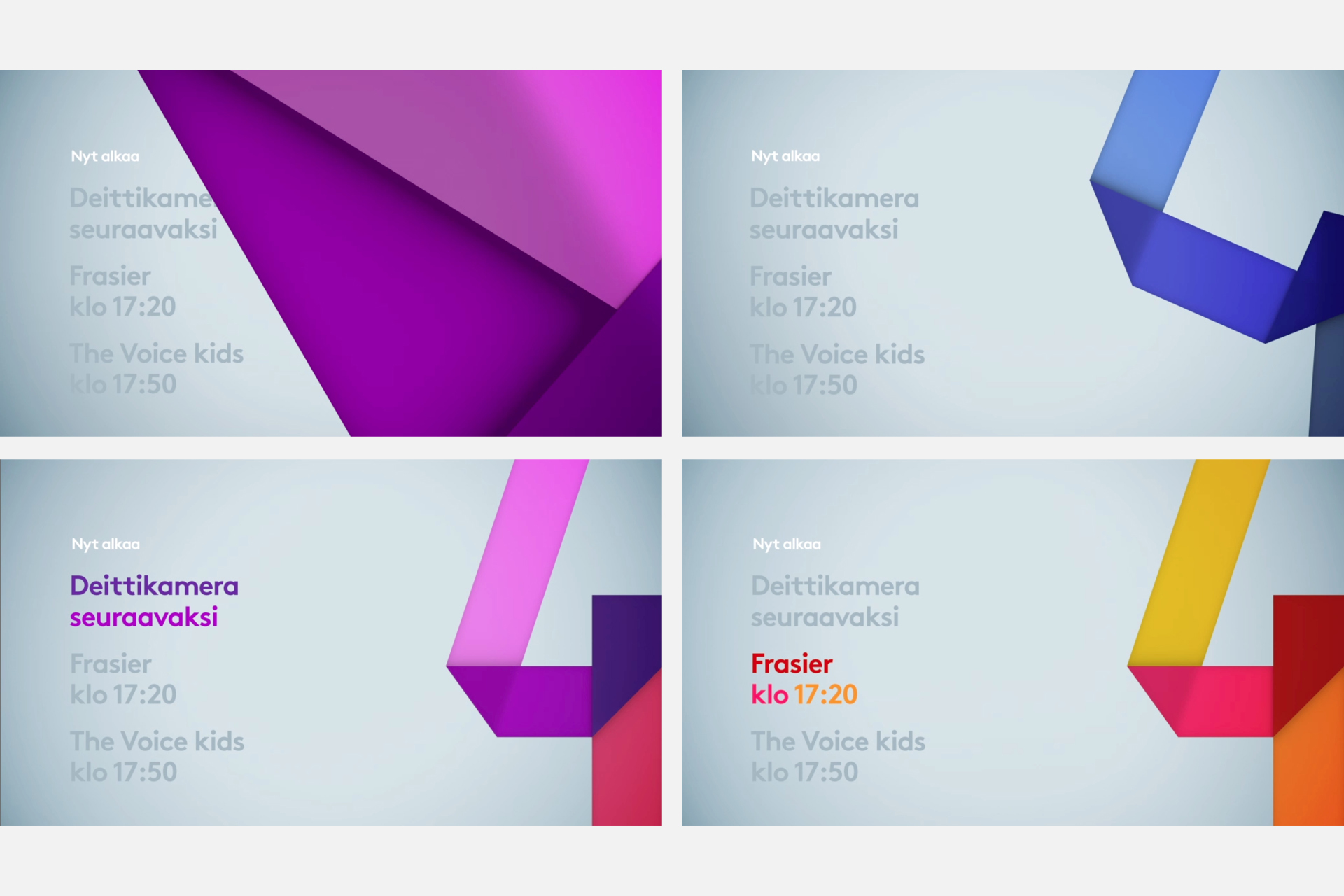
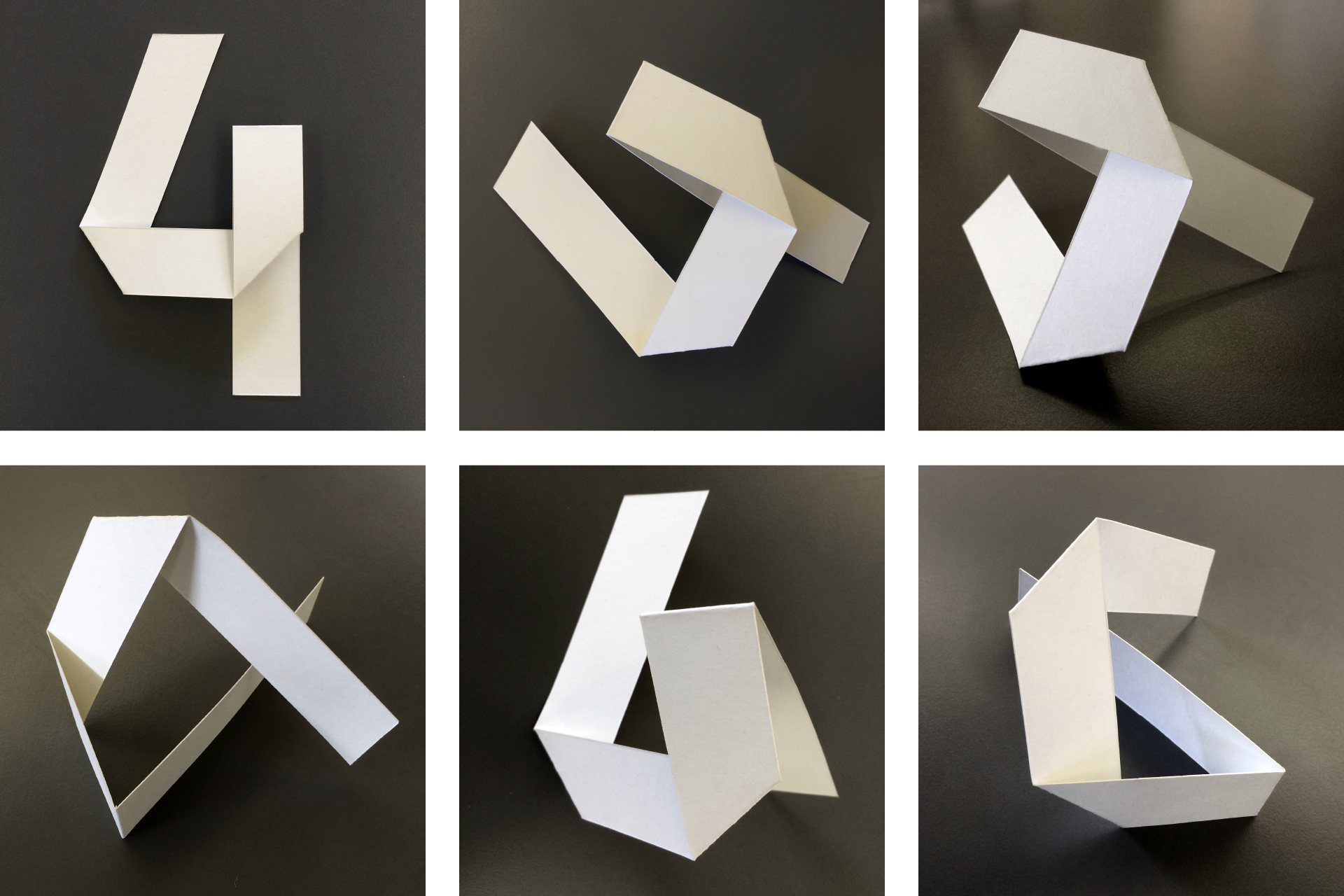
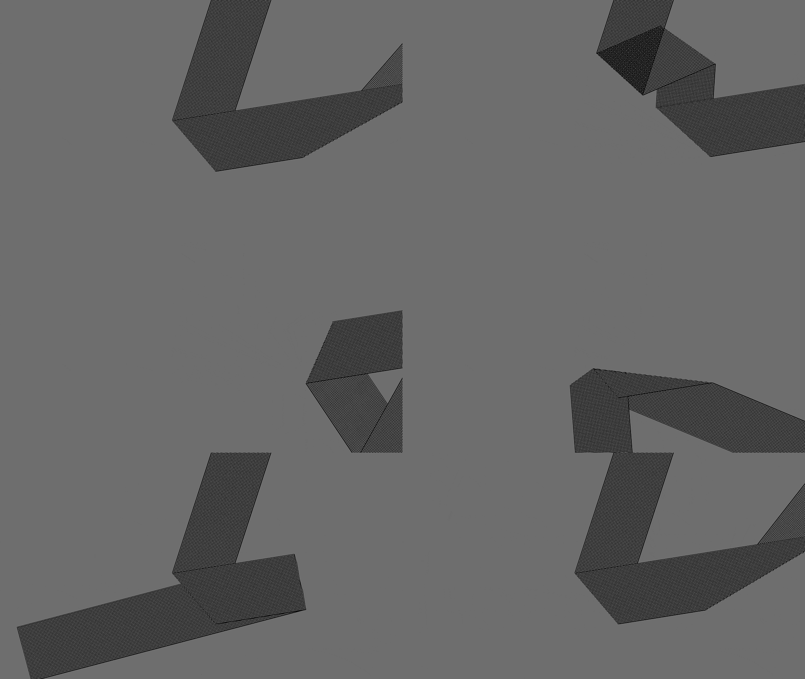
The logo design and animation was born of some initial tests where we played around with constructing the logo out of paper. When designing for broadcast, we think about motion as an integral part of the logo and core identity, which is really key to creating onscreen brands that have an inherent life to them.
Look and feel
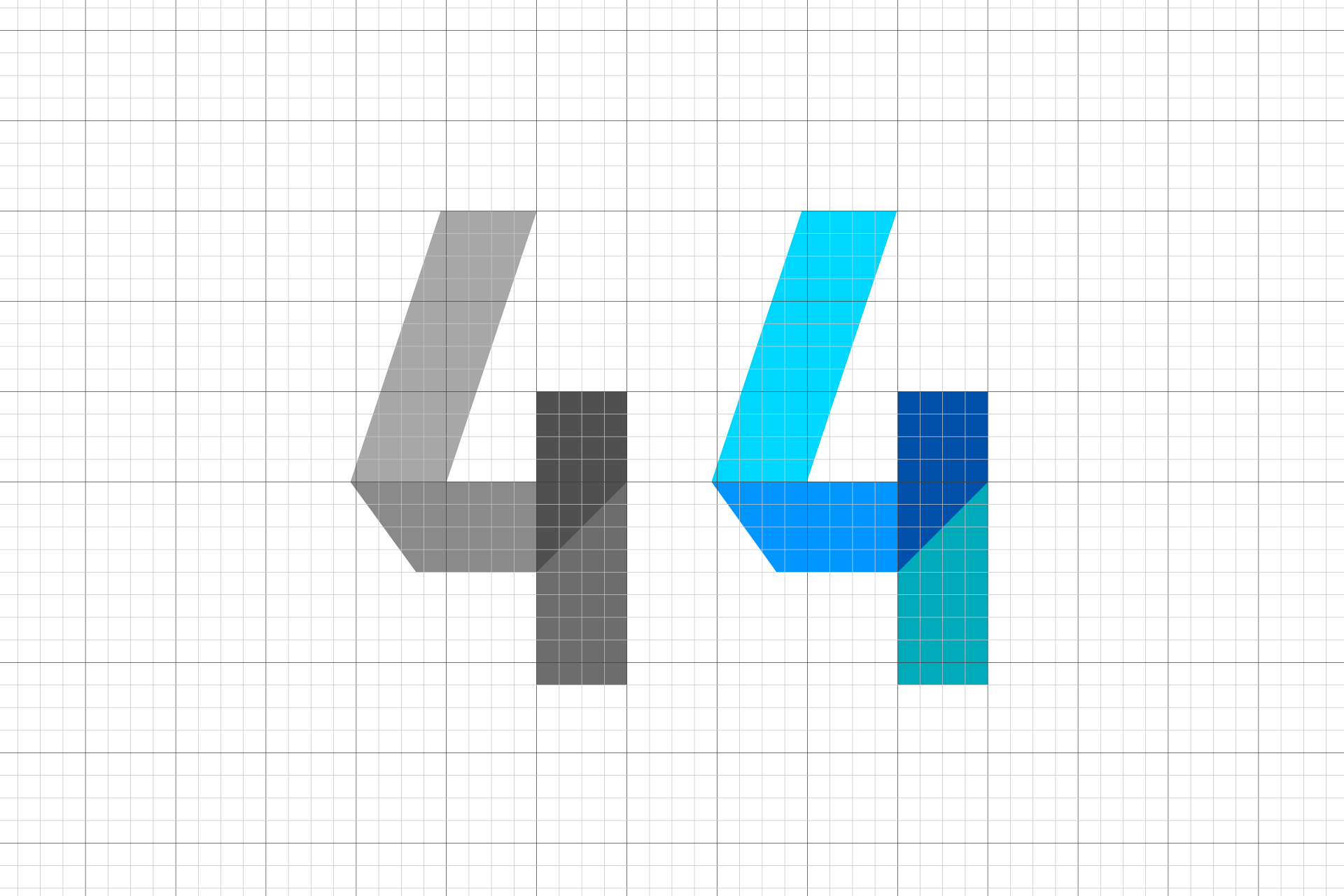
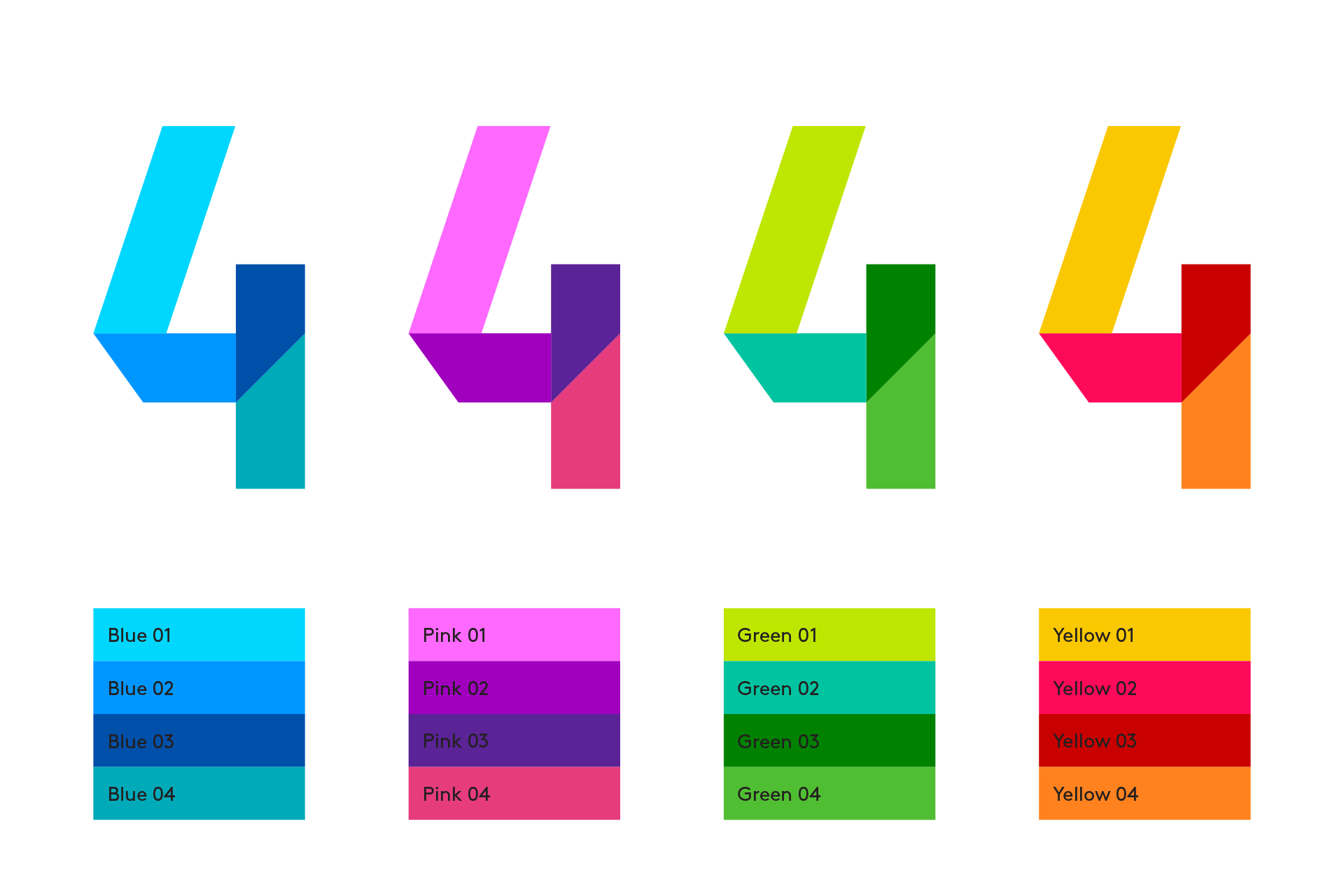
We built on the tactile and real movements the folds gave us, whilst taking the visual style into a slicker look and feel. We wanted to avoid any 'craft' cliches and pursued a confident use of colour that was deliberately playful in the the way that it can animate between the different options in the palette.
On-air
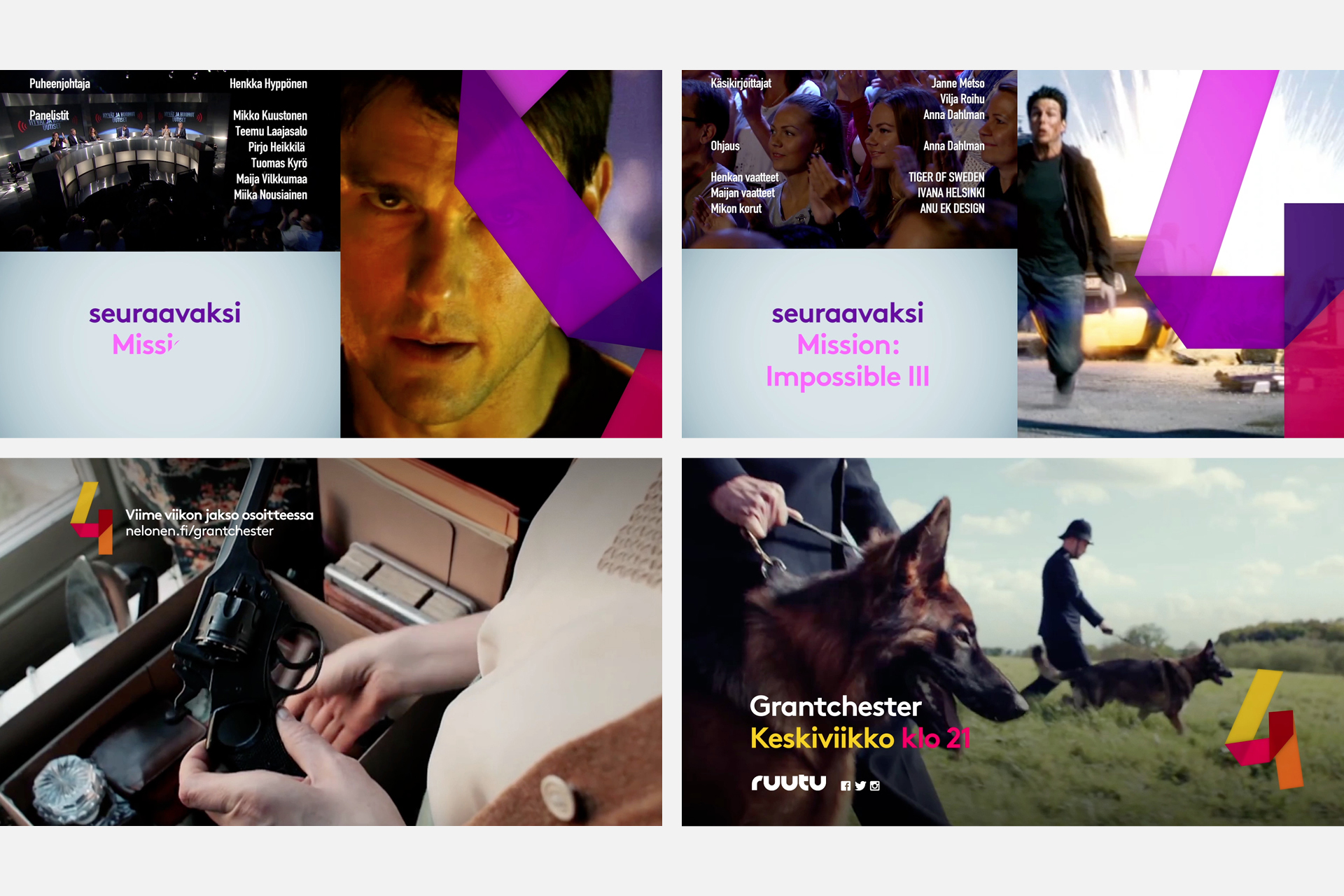
The logo is constantly alive and in motion. The animation style and vibrant palette are strong enough that you don't need to see the fully resolved logo to know you are in the world of Nelonen.
Off-air
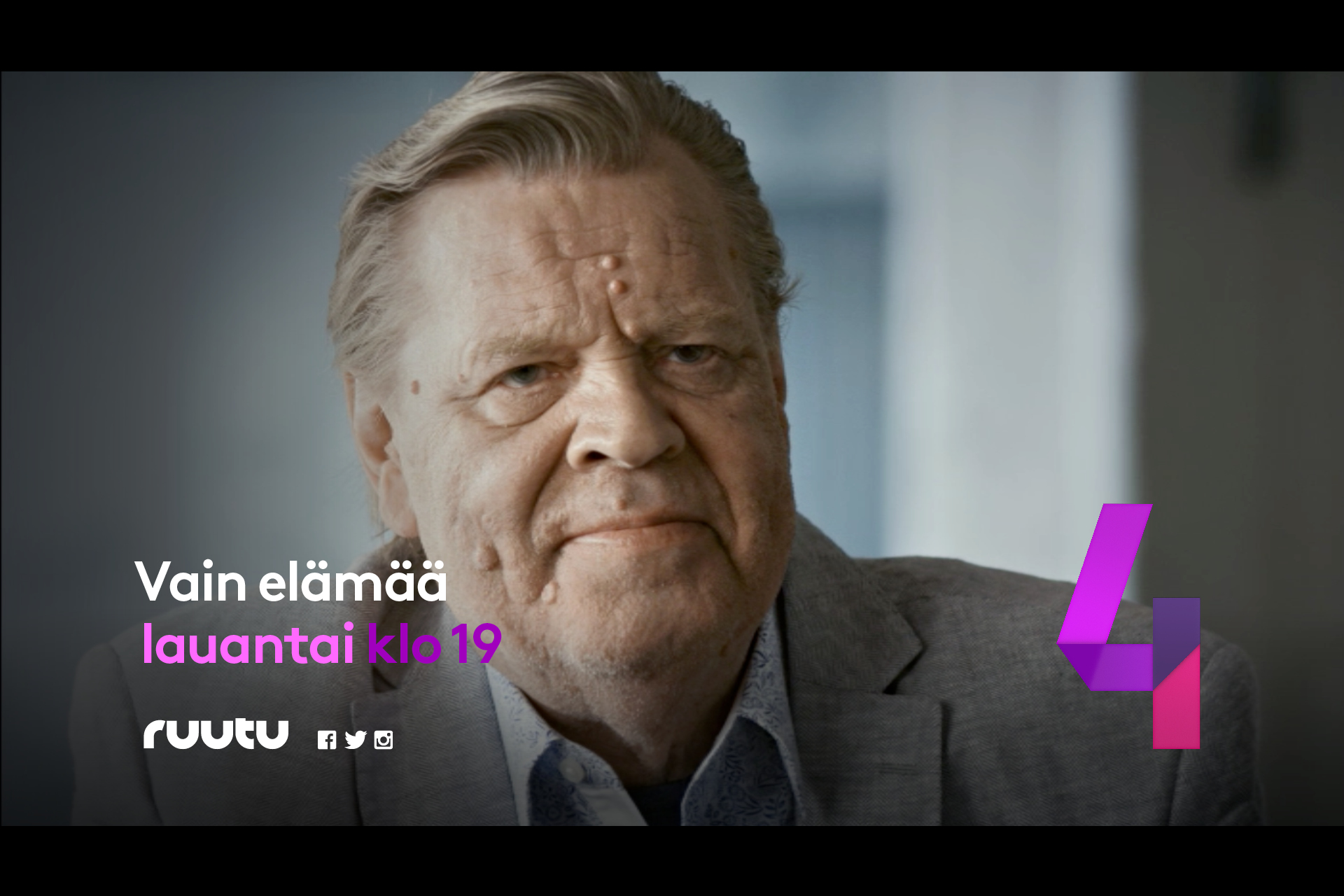
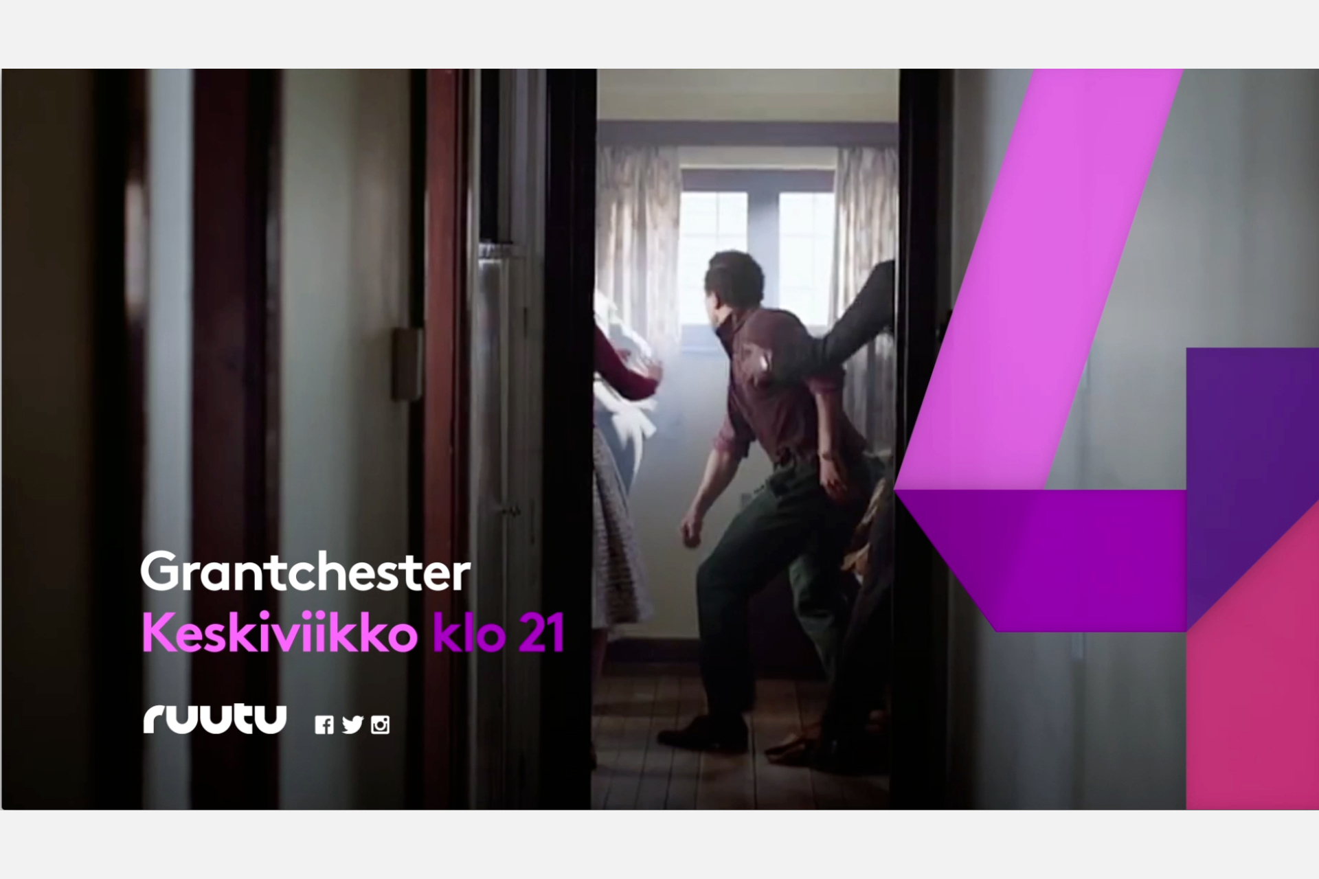
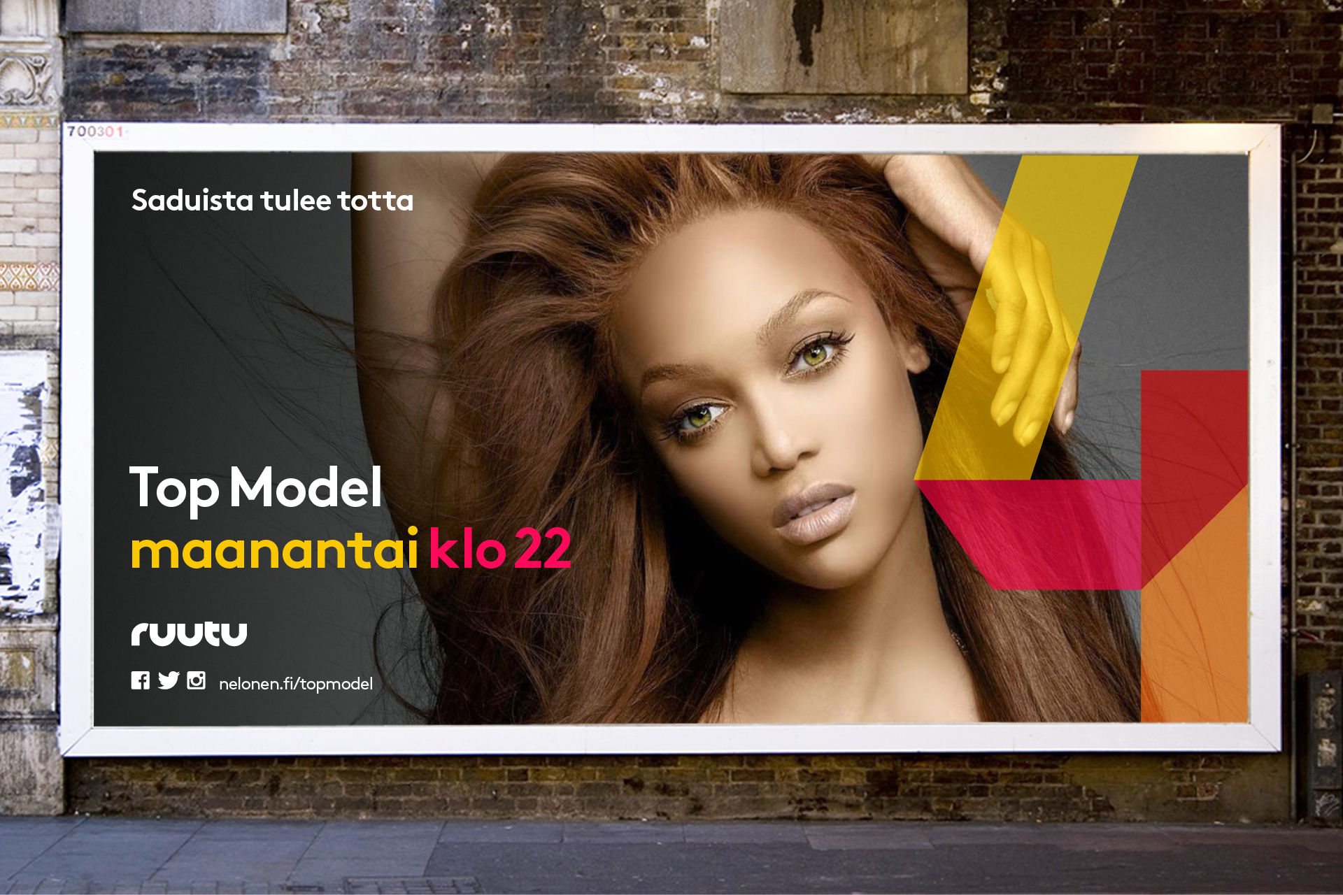
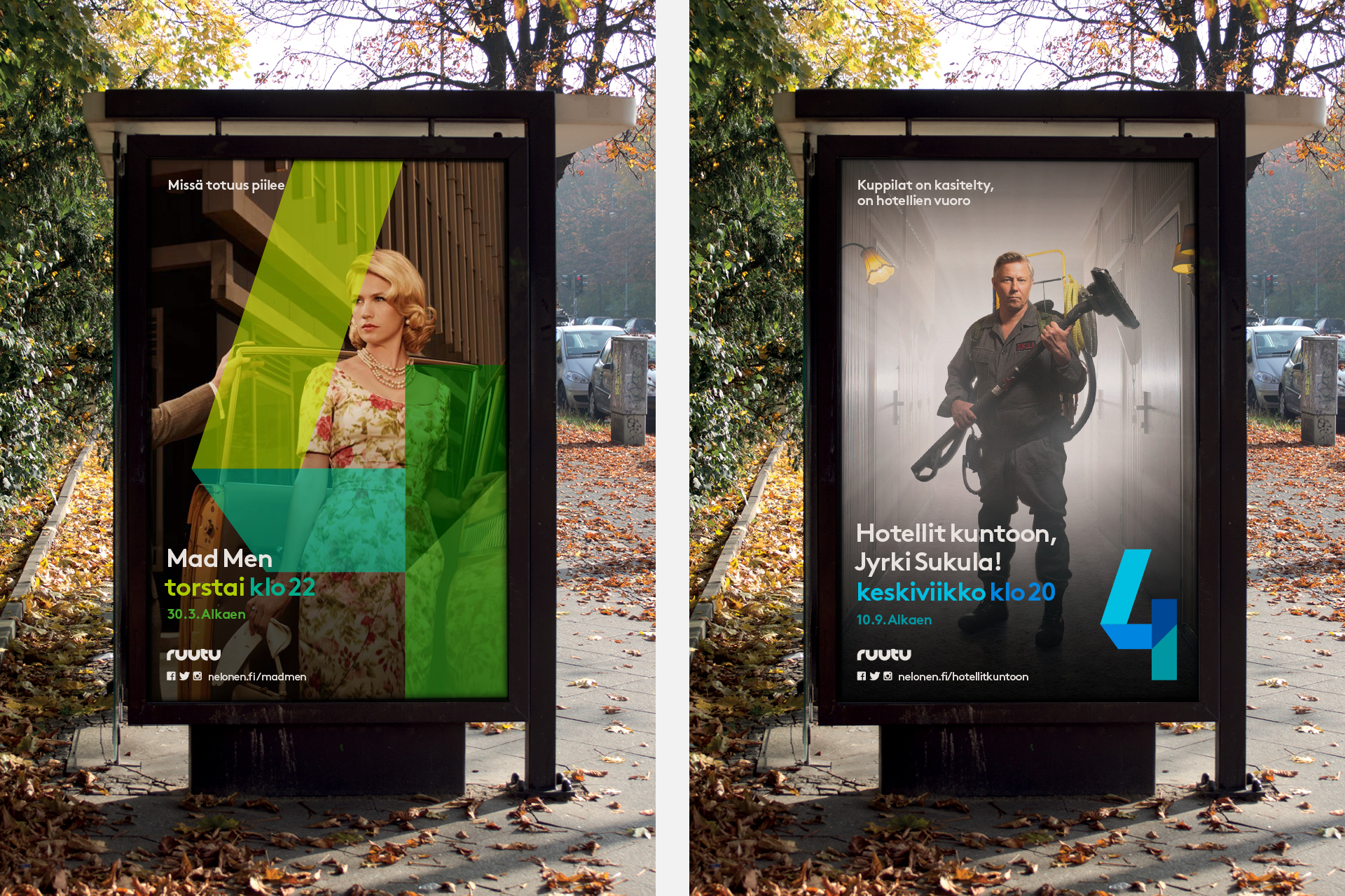
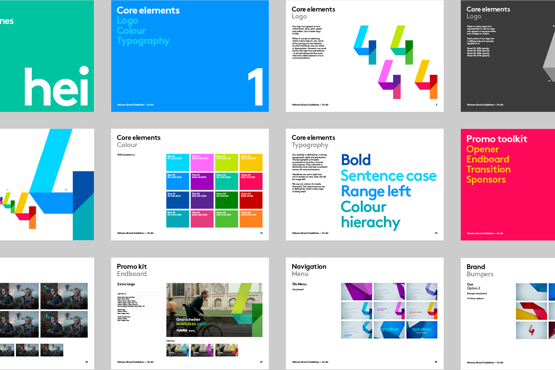
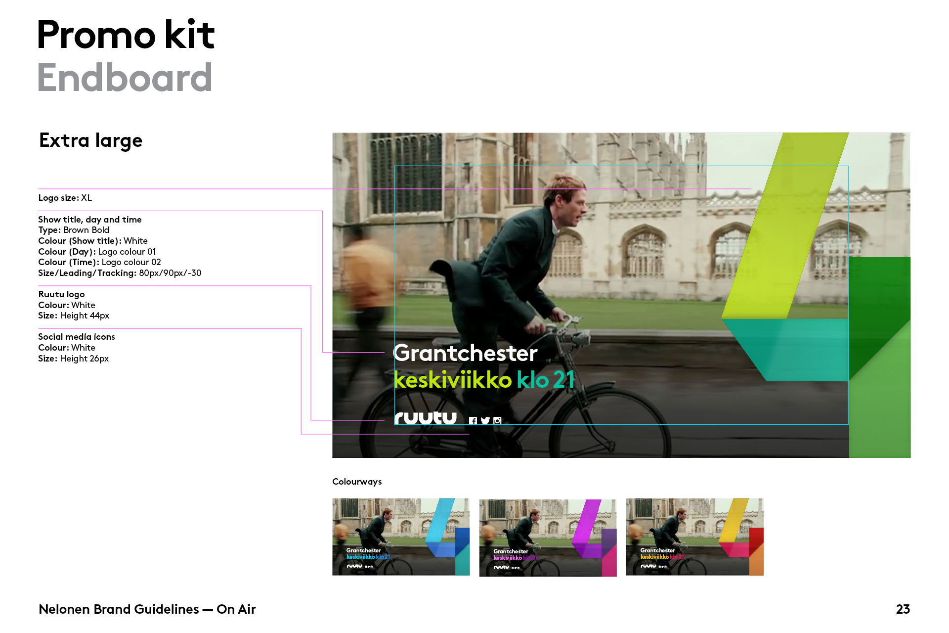
We use the logo with a multiply transparency, so that we achieve a balance between the vibrancy of the brand colours, and the need to retain sufficient show through of the content imagery. The templates allow for the size of the logo to be dialled up and down, dependent on the execution.

Idents - 'We are Nelonen'
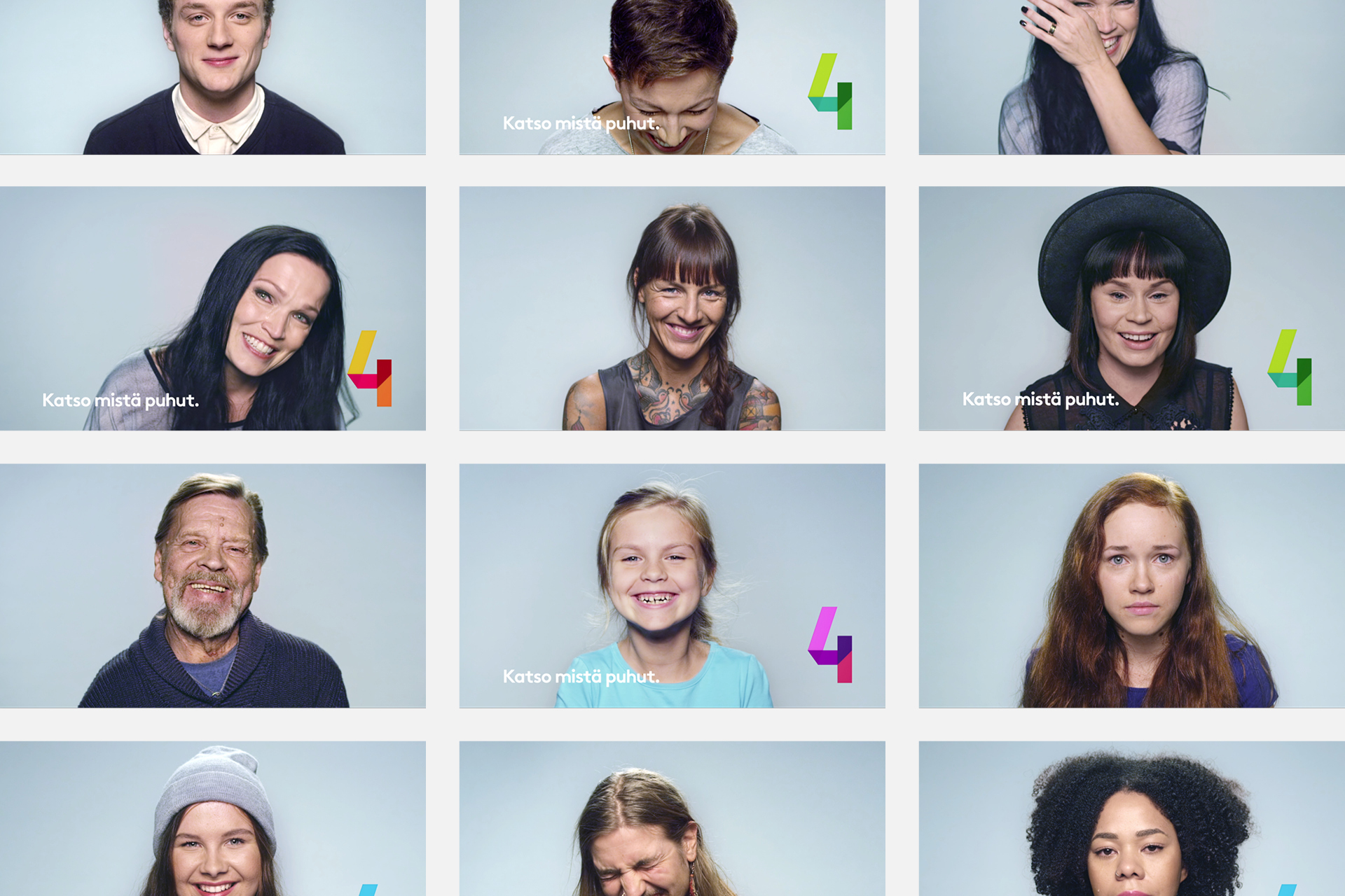
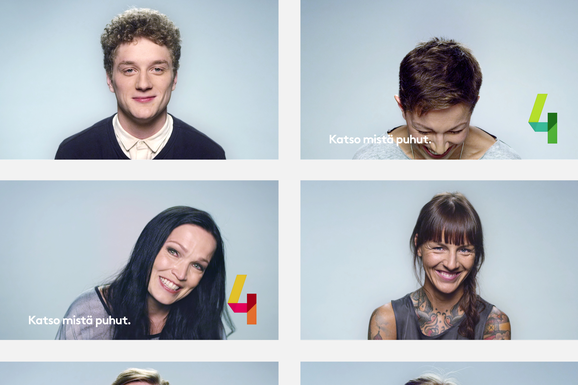
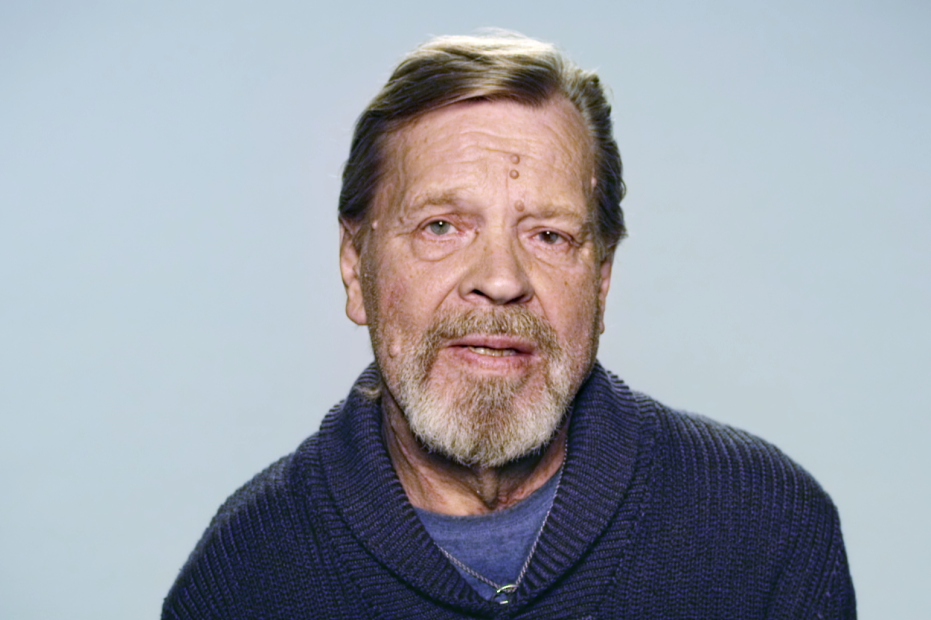
We wanted no acting in these spots and when choosing to work with legendary Finnish director, Dome Kurakoski, we knew we'd found someone who shared our vision. We were meticulous in our research and sensitive in how this was dealt with. Through the use of sound, pictures, moving image and conversation we drew the most amazing range of reaction and emotion from our cast.


