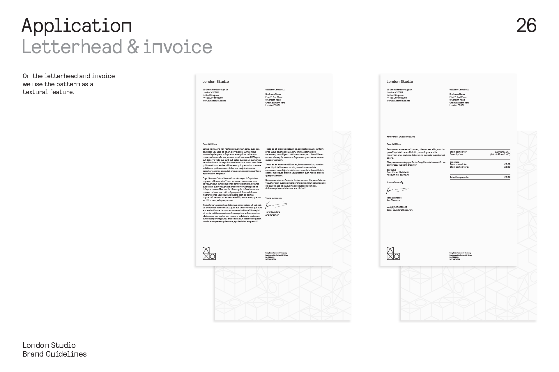
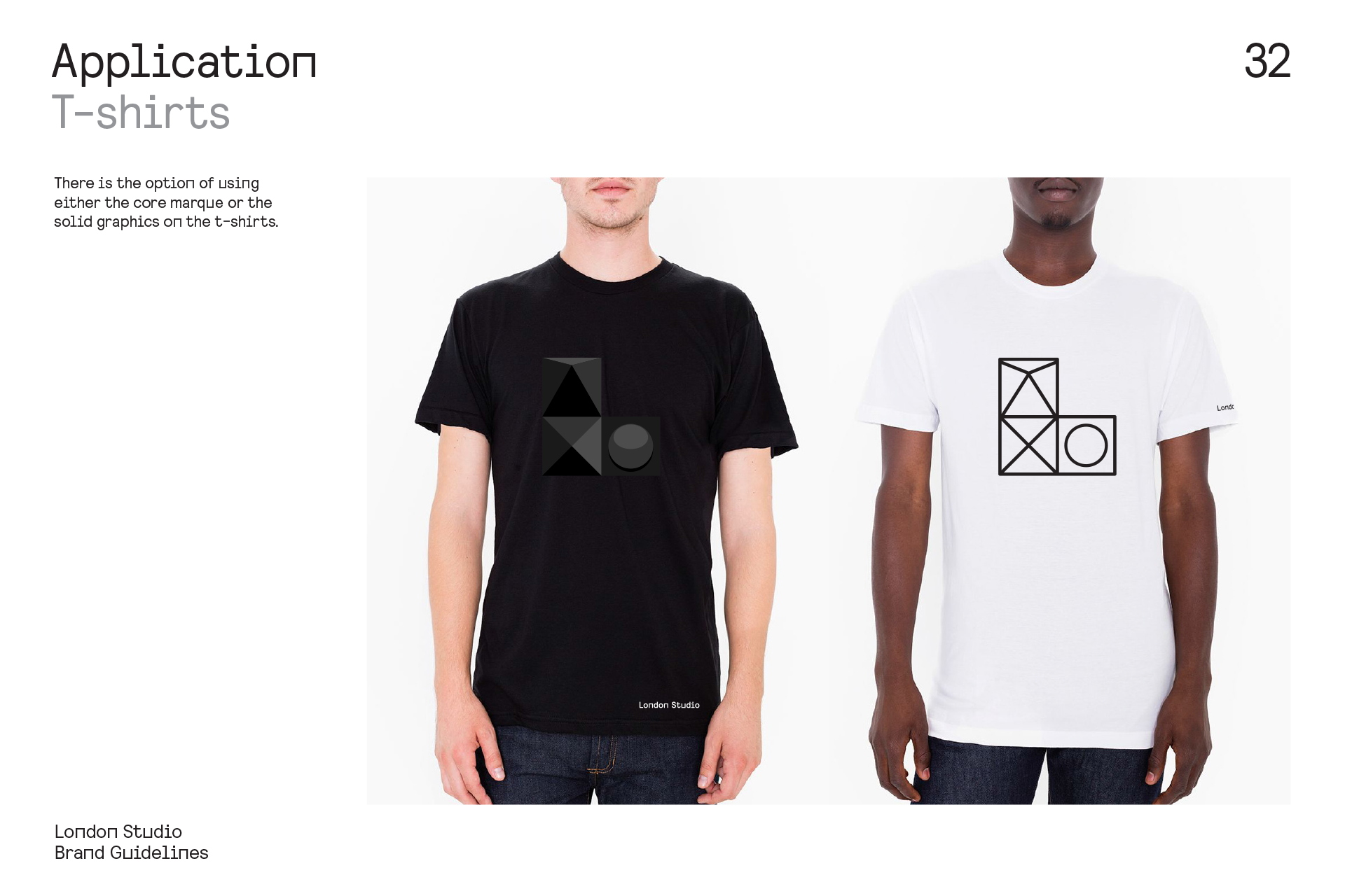
We are Proud Creative. We create work that makes our clients and everyone at the studio proud. It’s the reason for our name. Below is a case study of a rebrand project for Sony Playstation’s London Studio.
The client
London Studio creates games and experiences for the Playstation platform and is a member of Sony Computer Entertainment Worldwide Studios. The brief asked for a complete visual identity system with a personality strong enough to promote the studio identity and that of PlayStation. We talked early on about creating an identity with the flexibility to span different project streams, different types of content and different audiences, whilst retaining a cohesive sense of self.
The logo
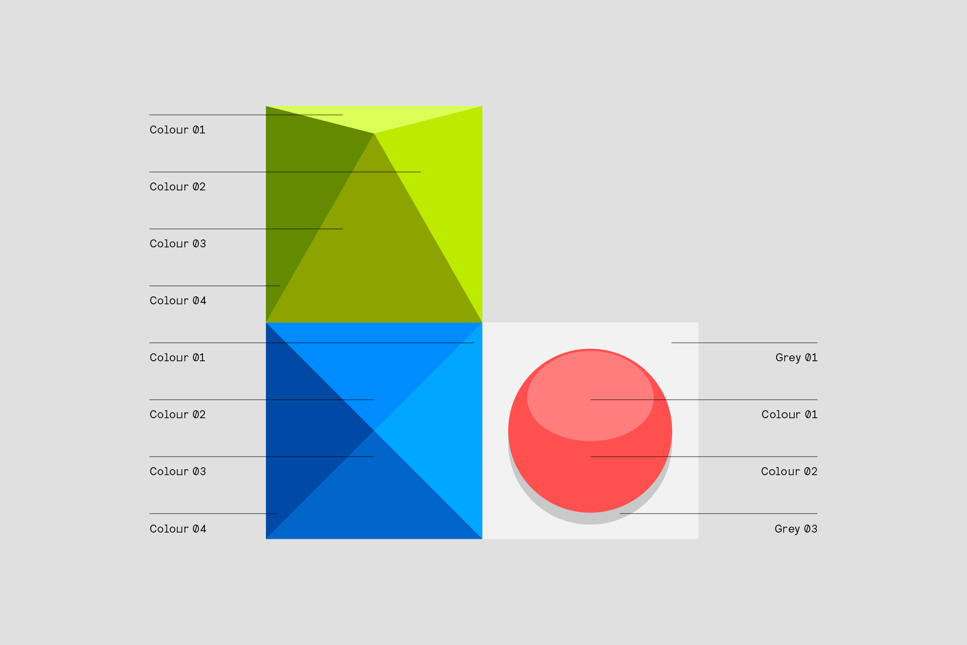
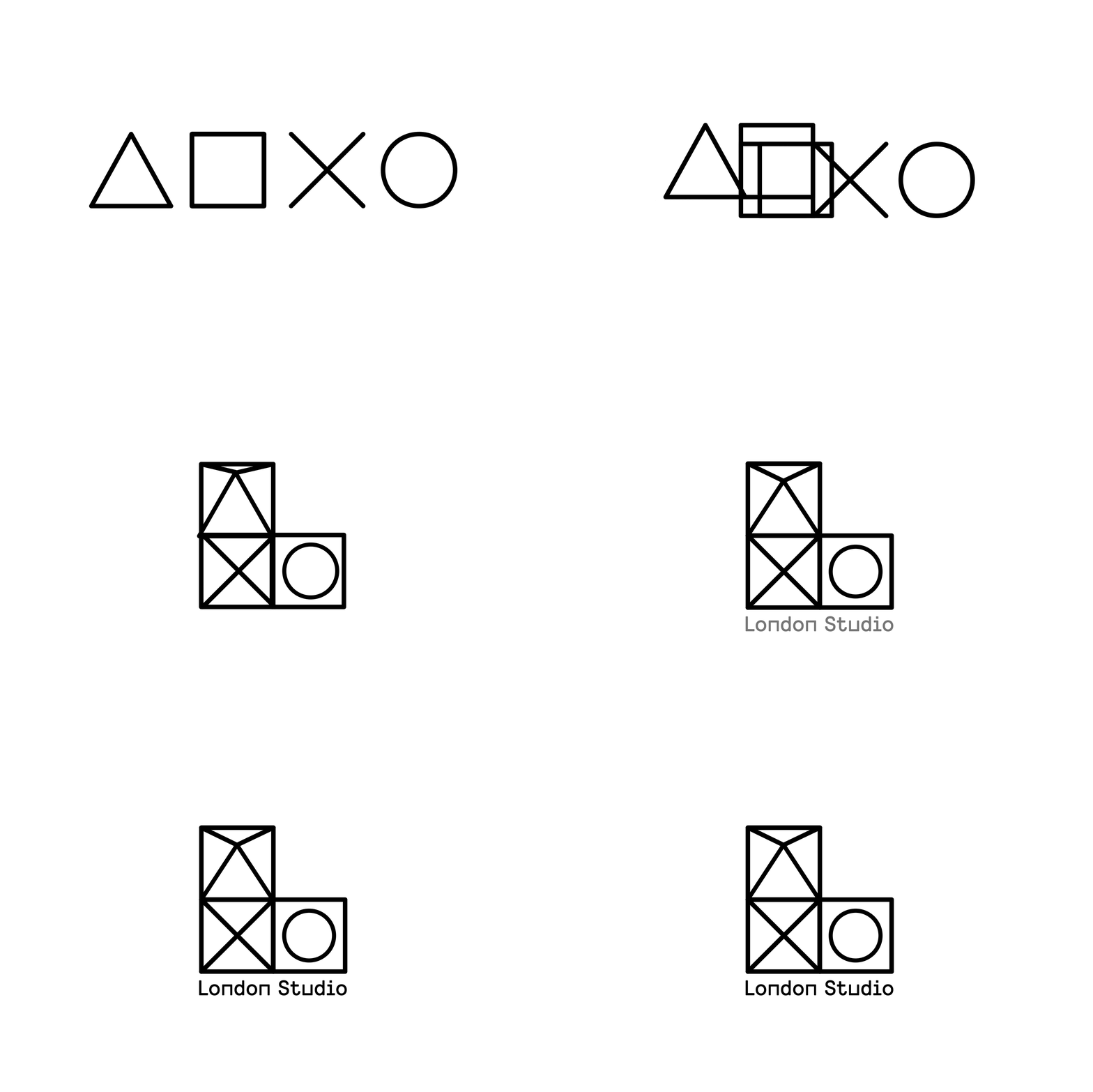
The Sony Playstation symbols are so iconic we had to be careful they didn’t come to dominate the London Studio identity. The result is a form that is born of the L of London studio, within which the symbols appear in an unusual configuration; the square hidden in plain site, by it’s use as the holding device.
A bespoke typeface
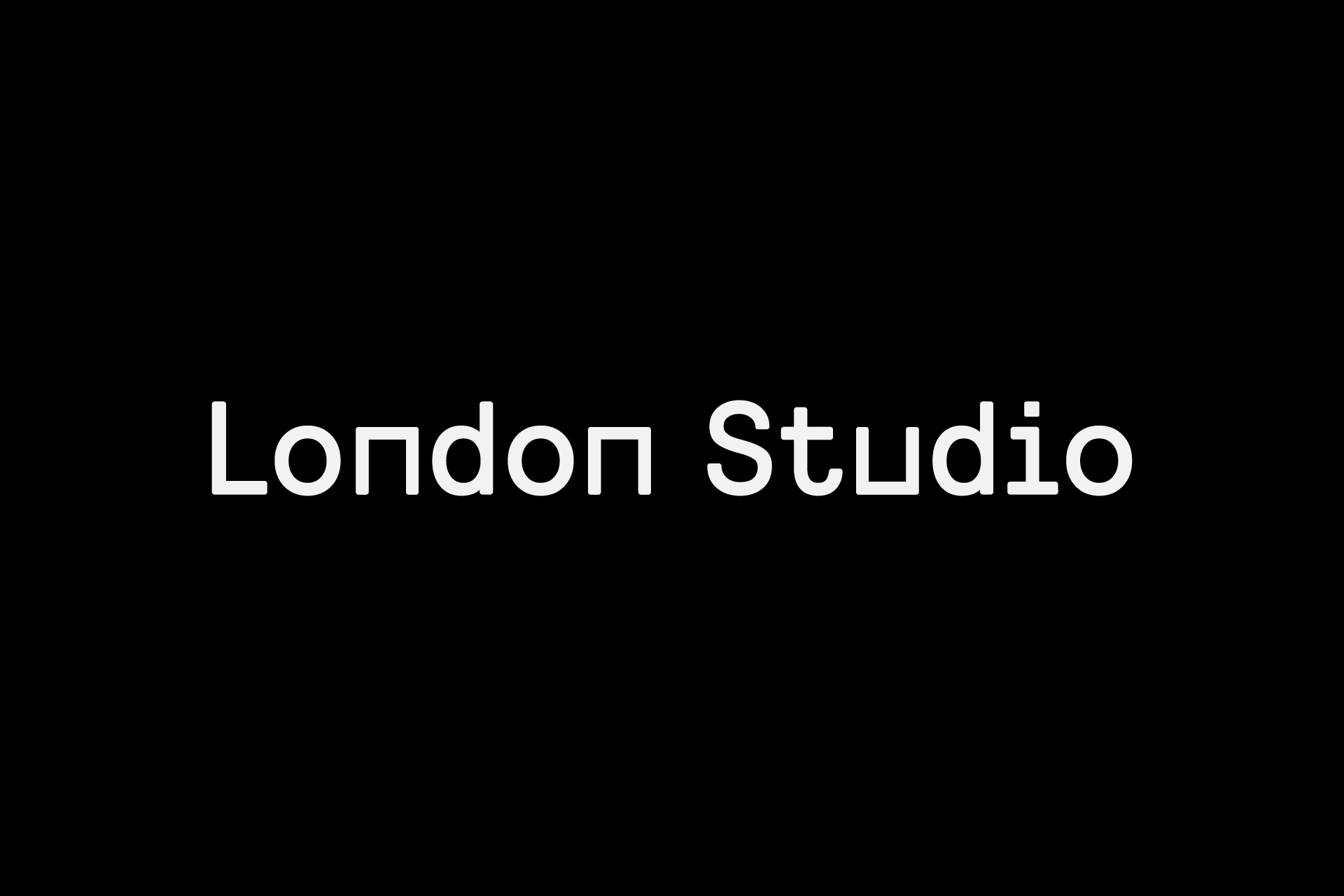
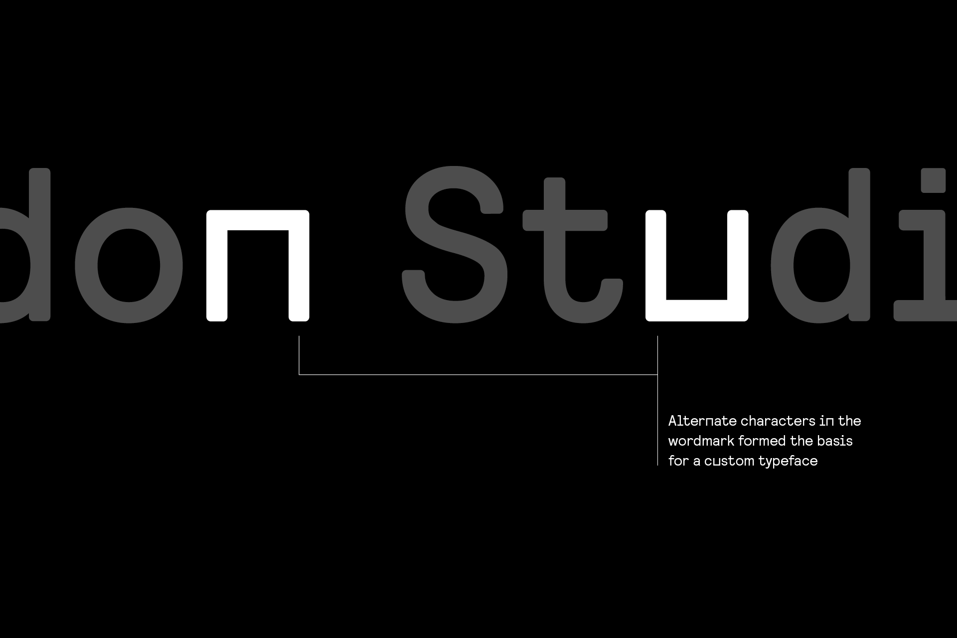
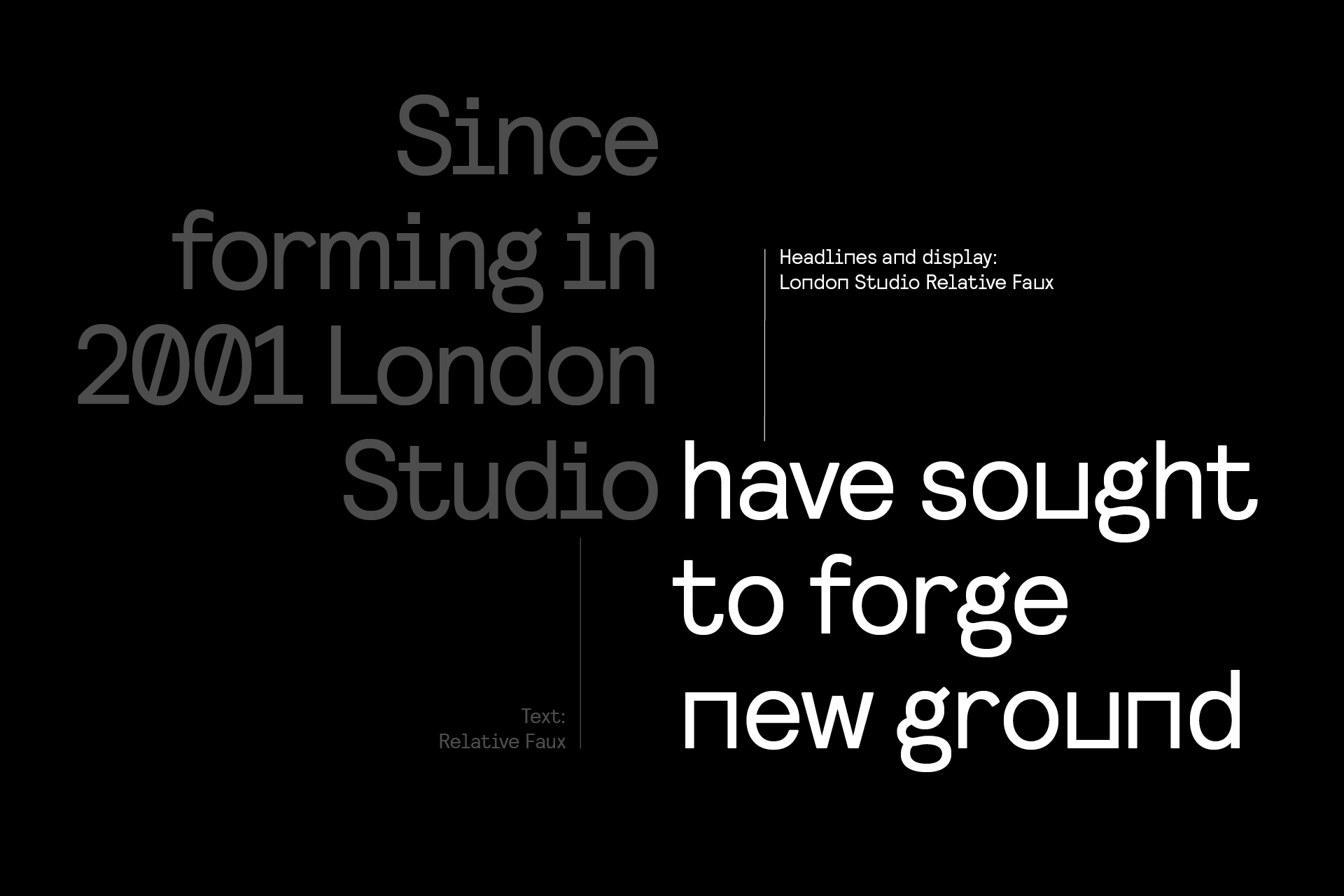
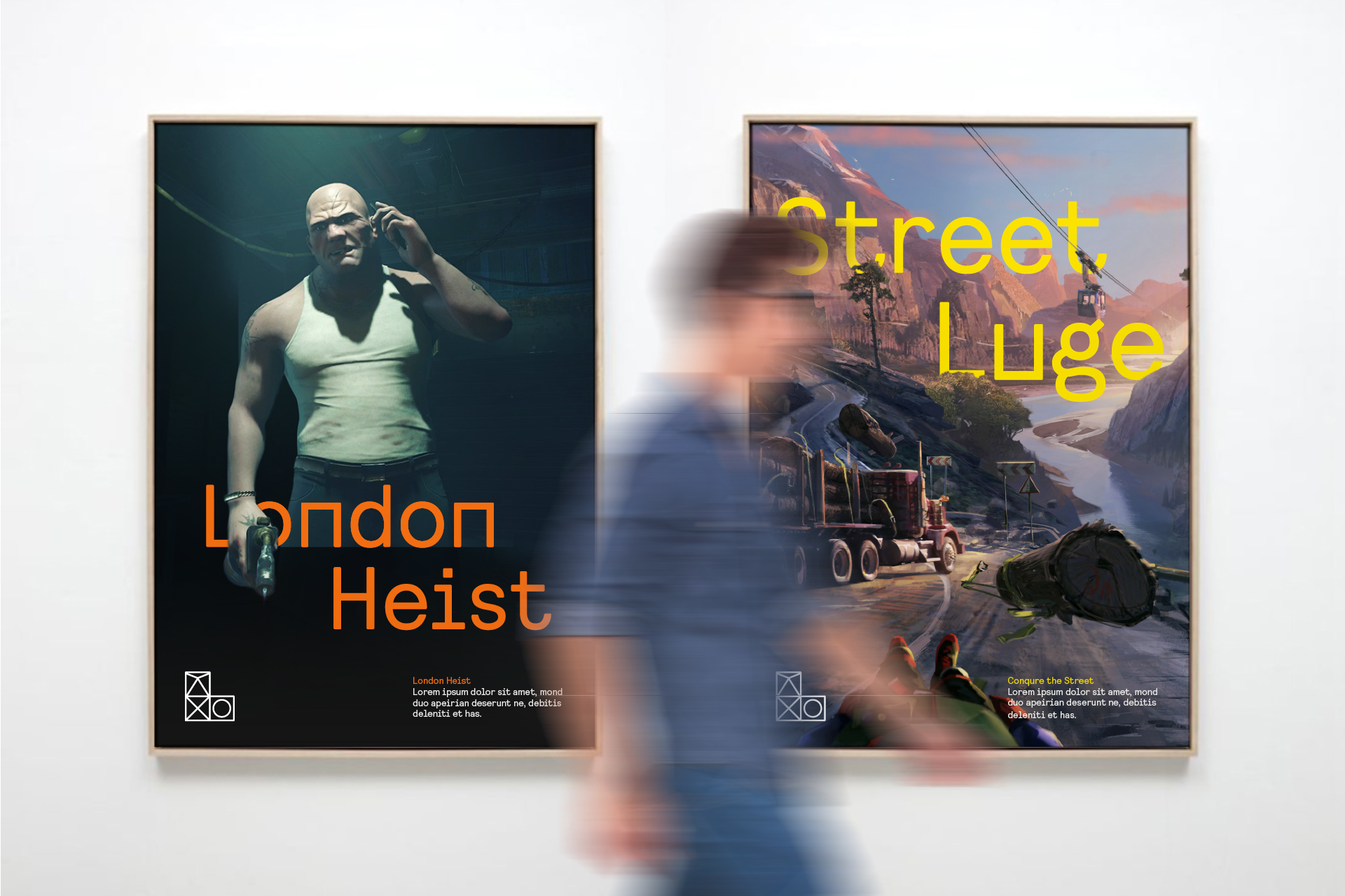
The wordmark is based on a redrawing of Relative Faux. We squared o the ‘n’ and the ‘u’ to create an ownable and distinctive mark and then worked with Edd and Anthony at Colophon to translate this into a bespoke typeface called London Studio Relative Faux.
The logo in motion
We knew the basic logo mark needed to work as a badge, but it also had to come alive in animation: whether that be in-game as an opener, or as part of studio presentations, showreels or demos.
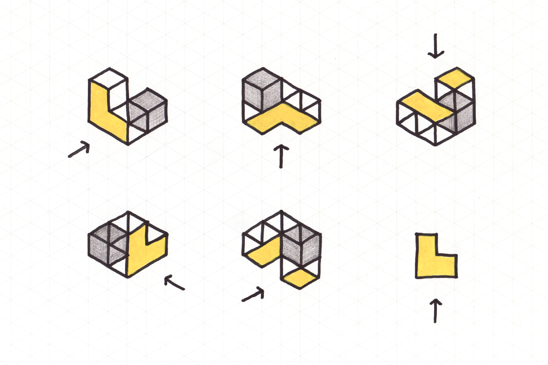
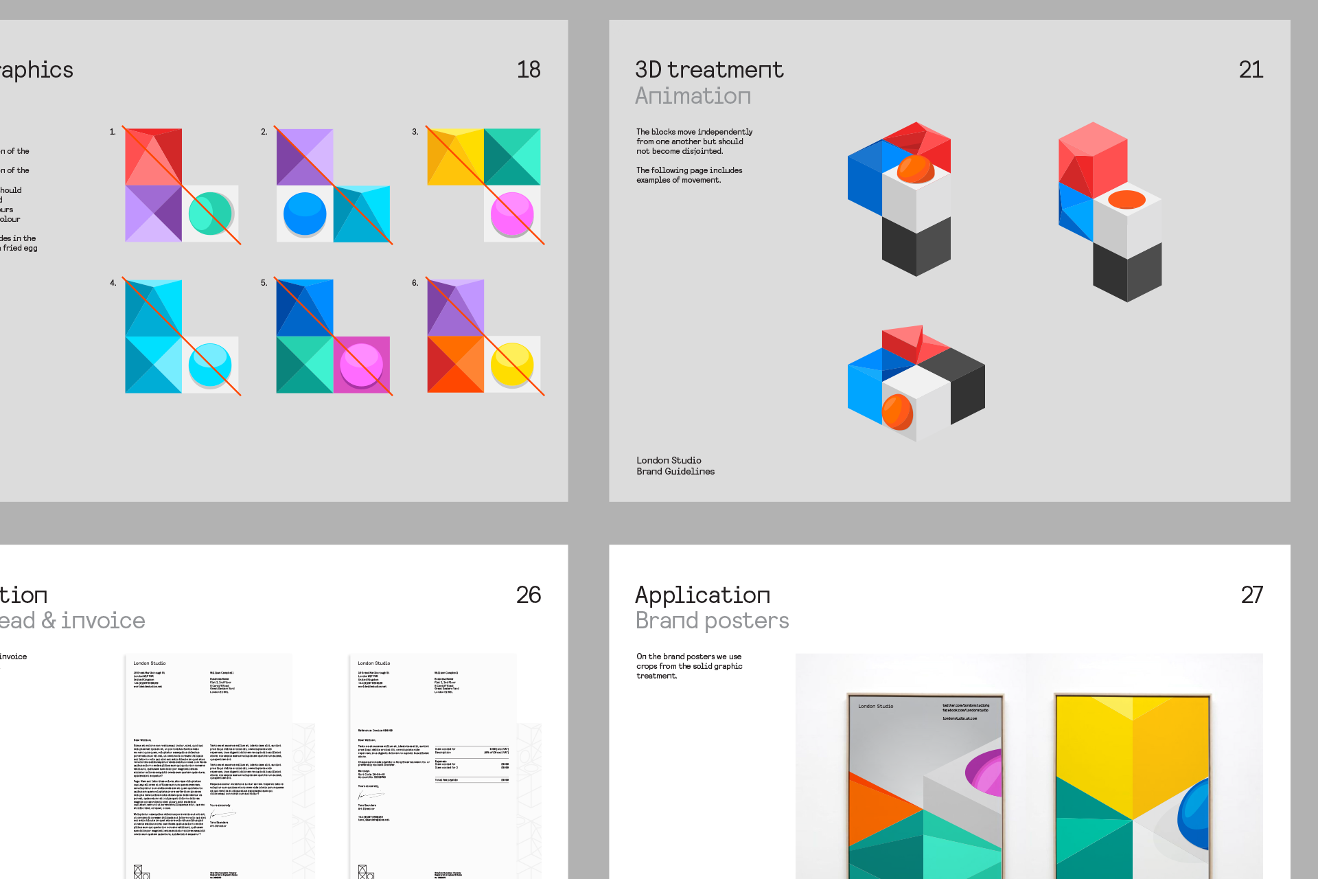
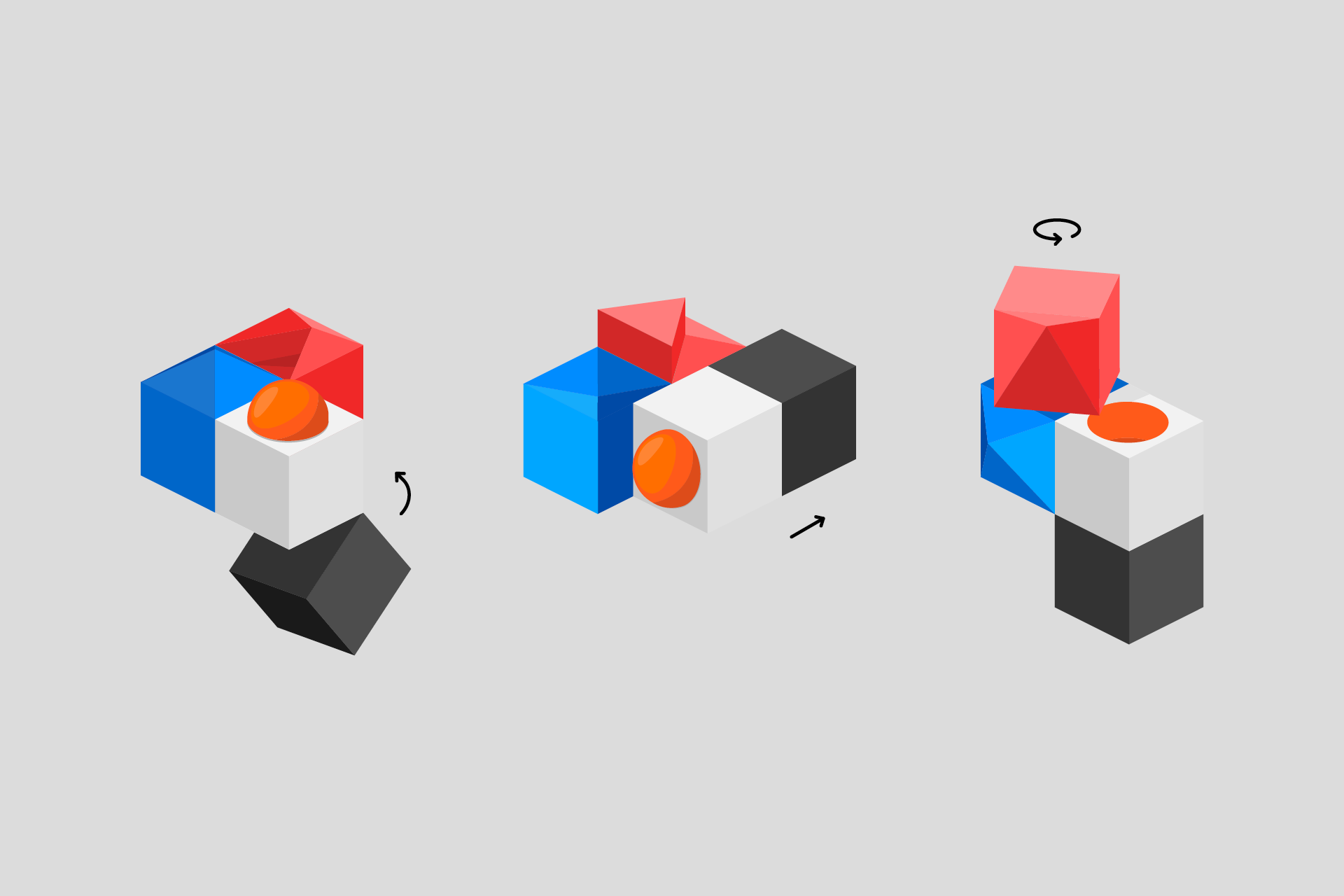
In 3D and motion we created a system that introduces a fourth cube. This creates intrigue and mystery, whilst allowing for the L to be created from a variety of angles, depending on the camera’s point of view. The basic forms can hinge, rotate and slide.

Logo use, logo crops and patterns
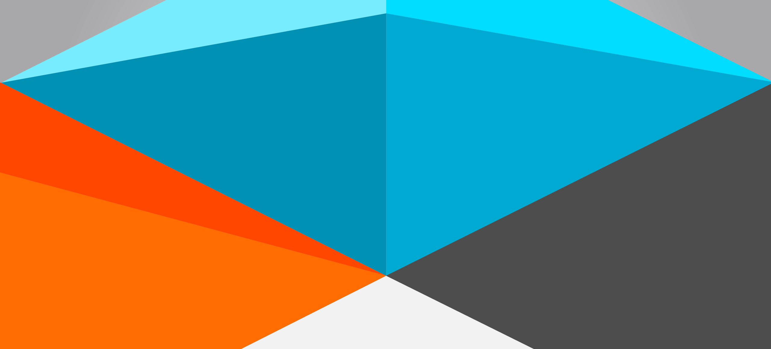
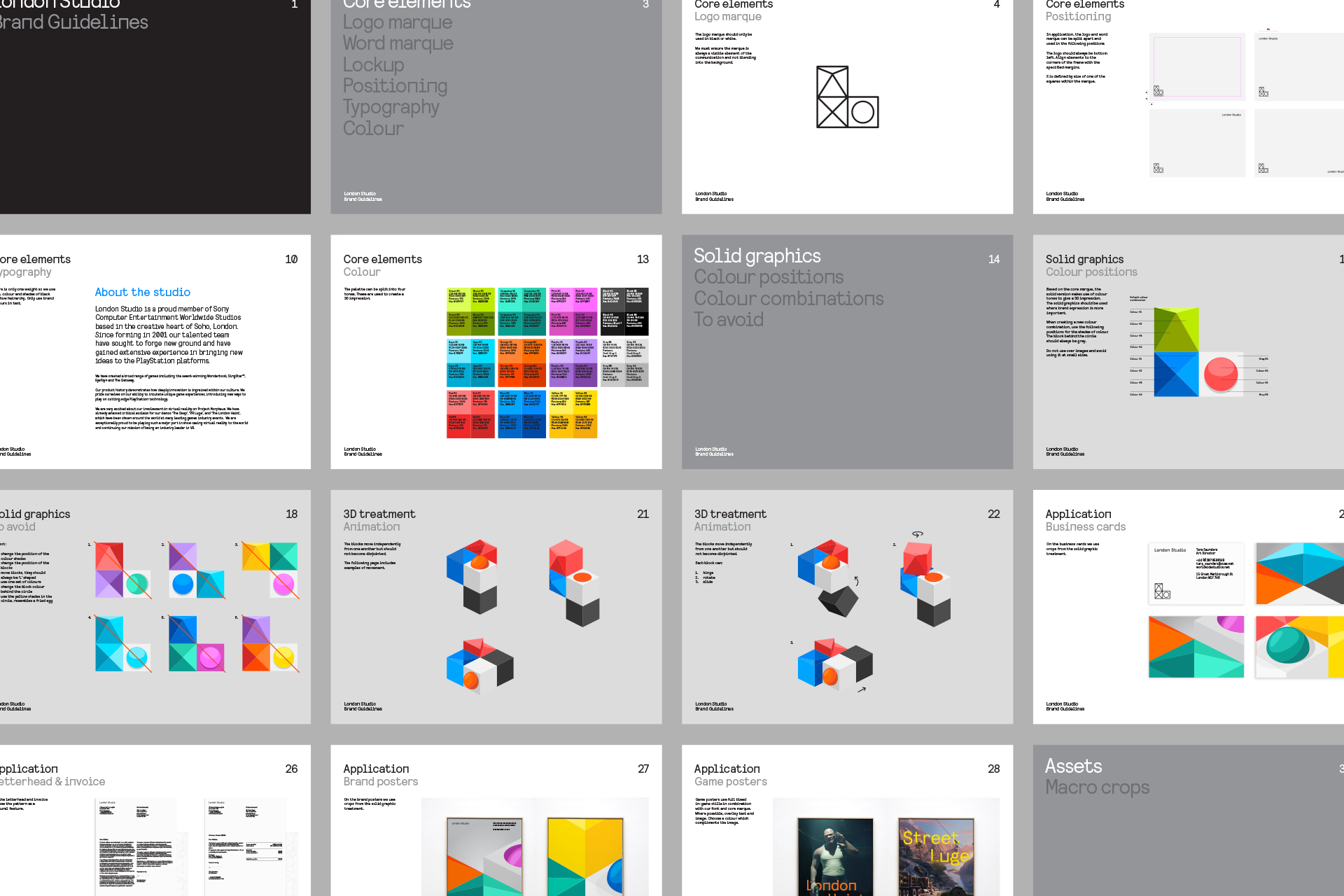
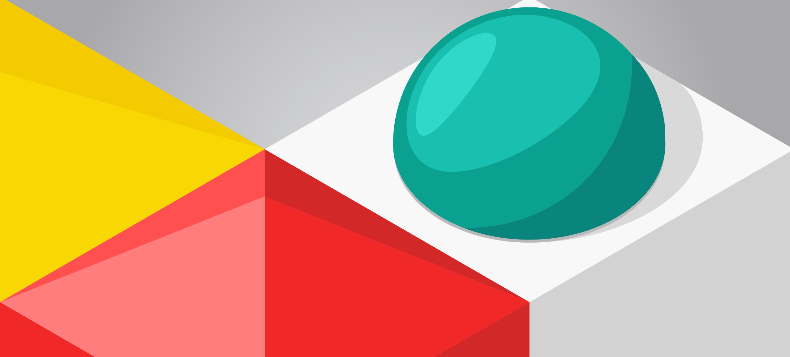
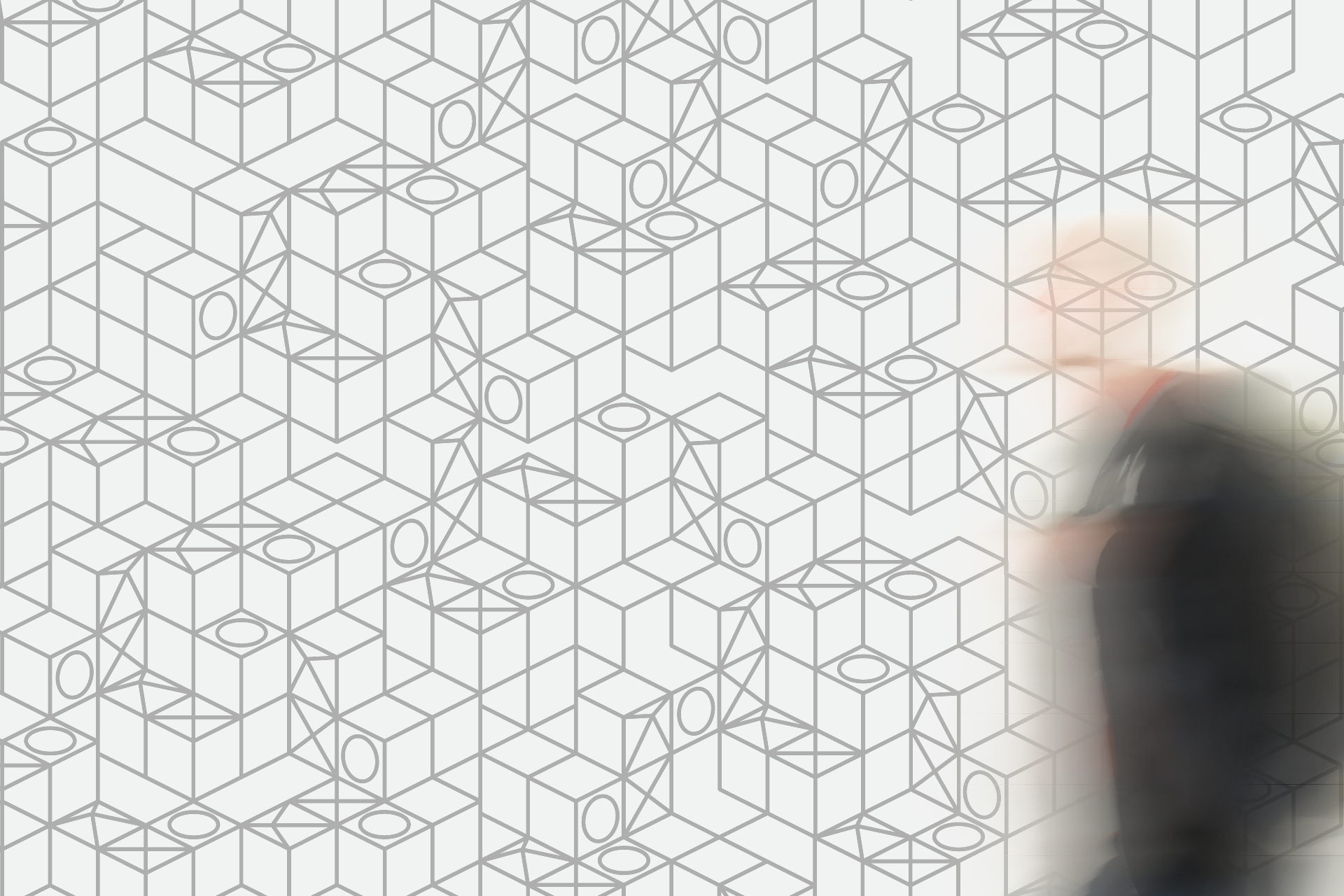
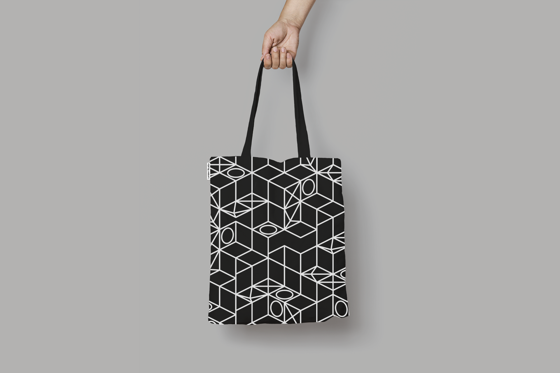
The wireframe logo is used when the content is king — so the logo is a badge. When the studio identity wants to be given greater prominence we created a colourful system of logo crops and for added flexibility we created a repeat pattern from the isometric blocks.
Colour use and guidelines
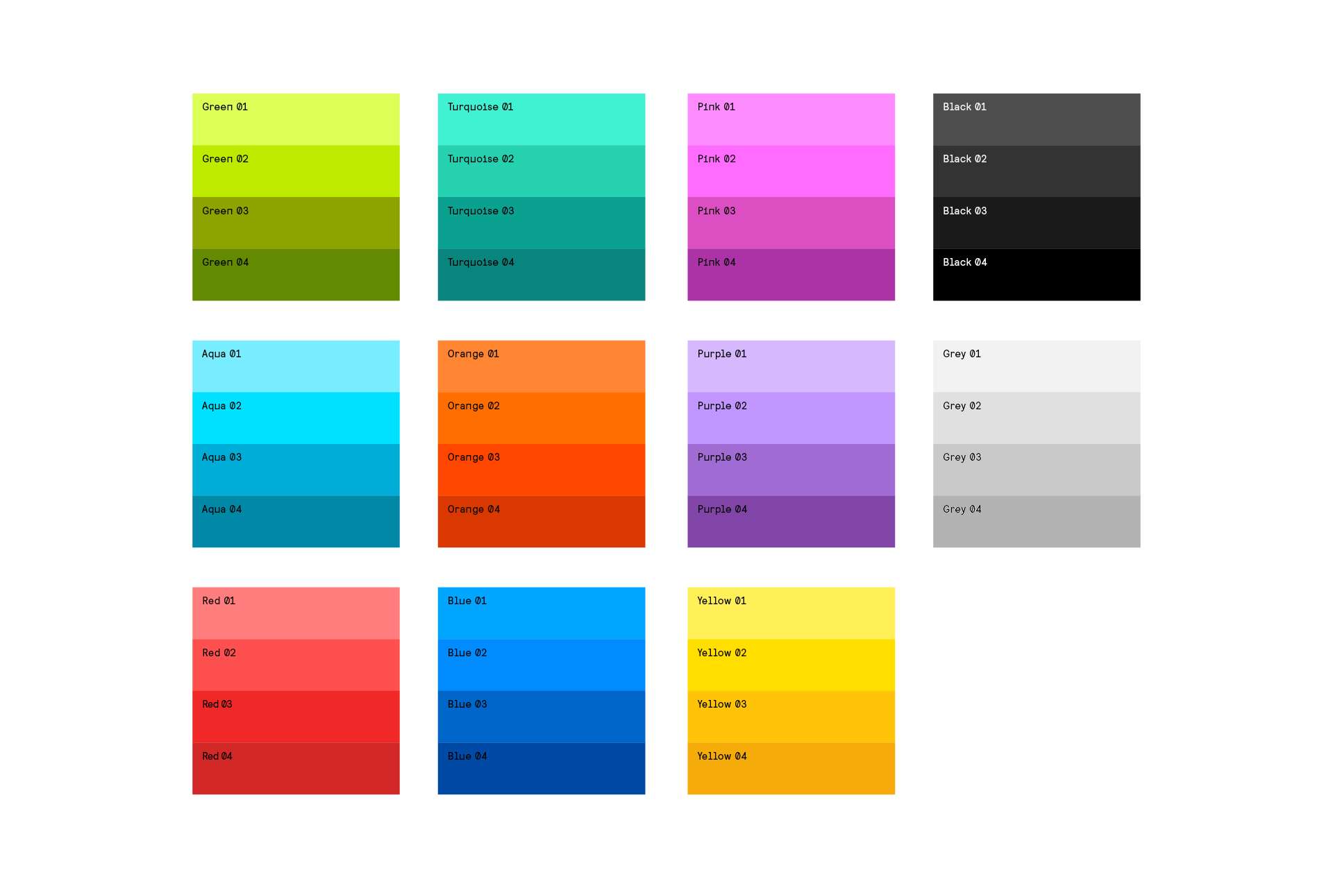
We created a warm and optimistic palette, with lots of flexibility in it’s use. Each core colour comes as a set of four, from dark through to light, to support the graphic illustrations style. Whilst we gave clear rules for how the dark-to-light tones should be applied, the choice of colour combinations is completely open, and can be guided by application or content.
