We are Proud Creative. We create work that makes our clients and everyone at the studio proud. It’s the reason for our name. Below is a case study of a recently completed identity project for Syntropy, in collaboration with Everyone Associates.
The business
Syntropy’s work is about visual storytelling and animation. Fundamentally it’s about organizing information into a narrative to explain complicated processes, ideas and events. This takes genuine scientific and engineering understanding, together with significant technical knowledge: setting them apart from studios with a purely advertising and marketing focus.
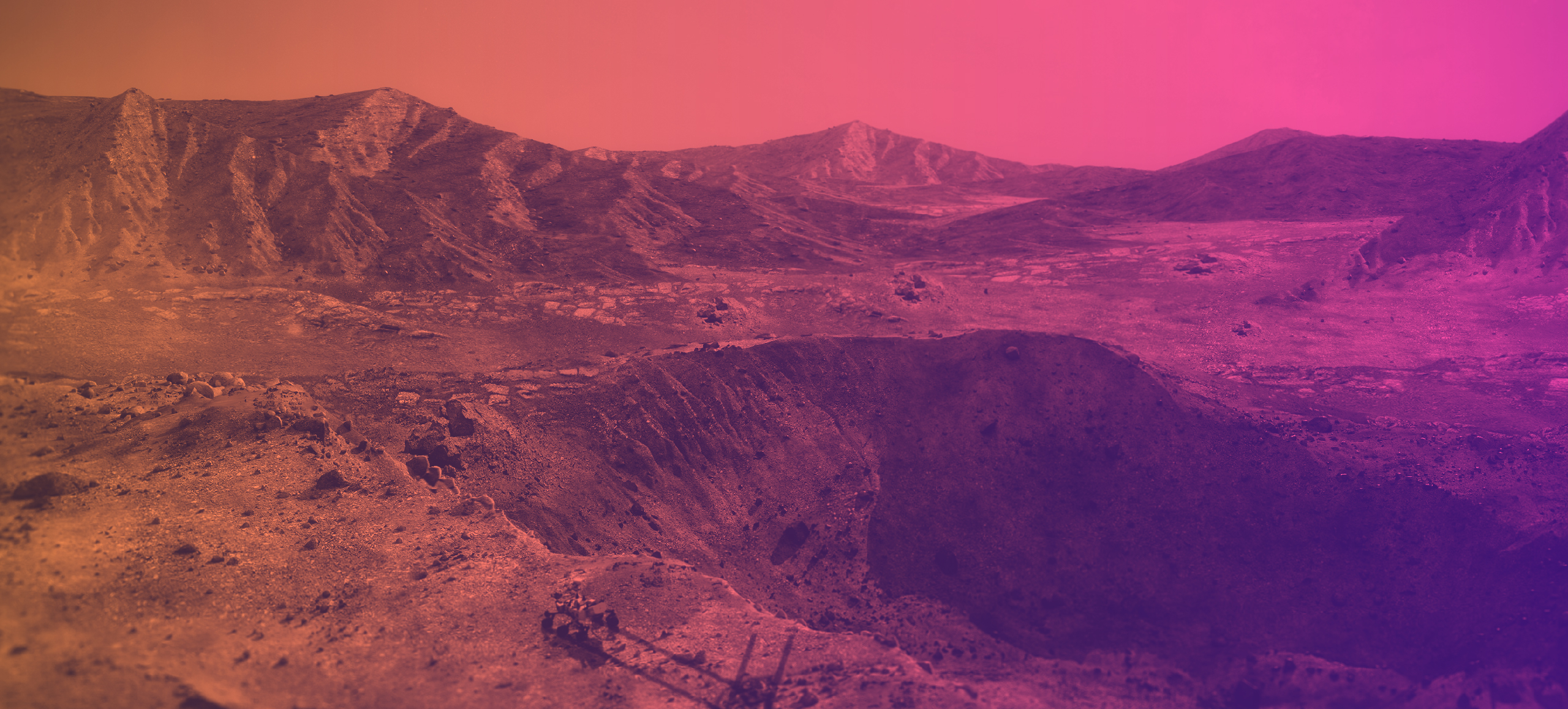
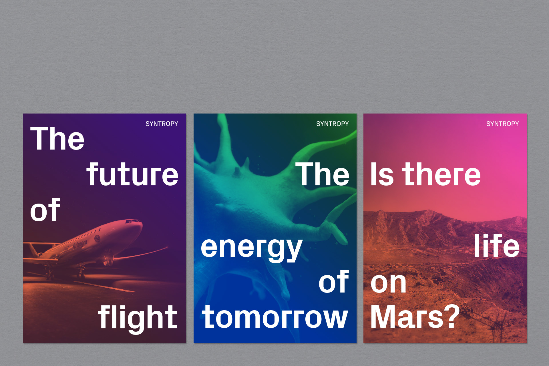
The main areas of business are science, medicine, aerospace and technology.
The thinking behind the concept
Whilst not a widely understood term, syntropy can be defined as a force which causes living things to reach ‘higher and higher levels of organization, order and dynamic harmony.’ We created an identity that plays on this meaning and comes with an inbuilt sense of movement. At it’s core we wanted an identity with two key states: entropy (or chaos), which reorders itself through syntropy (order & harmony) — a metaphor for Syntropy’s work processes, and supportive of the name.
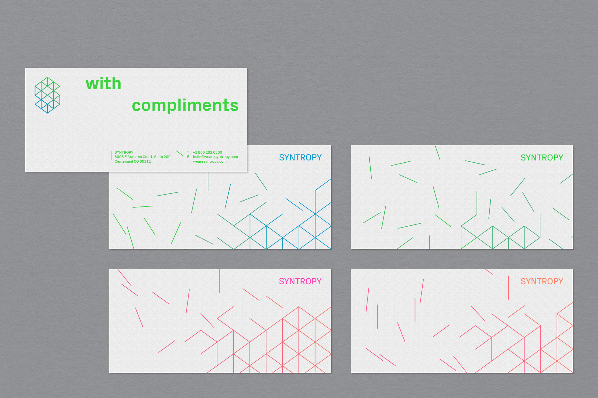
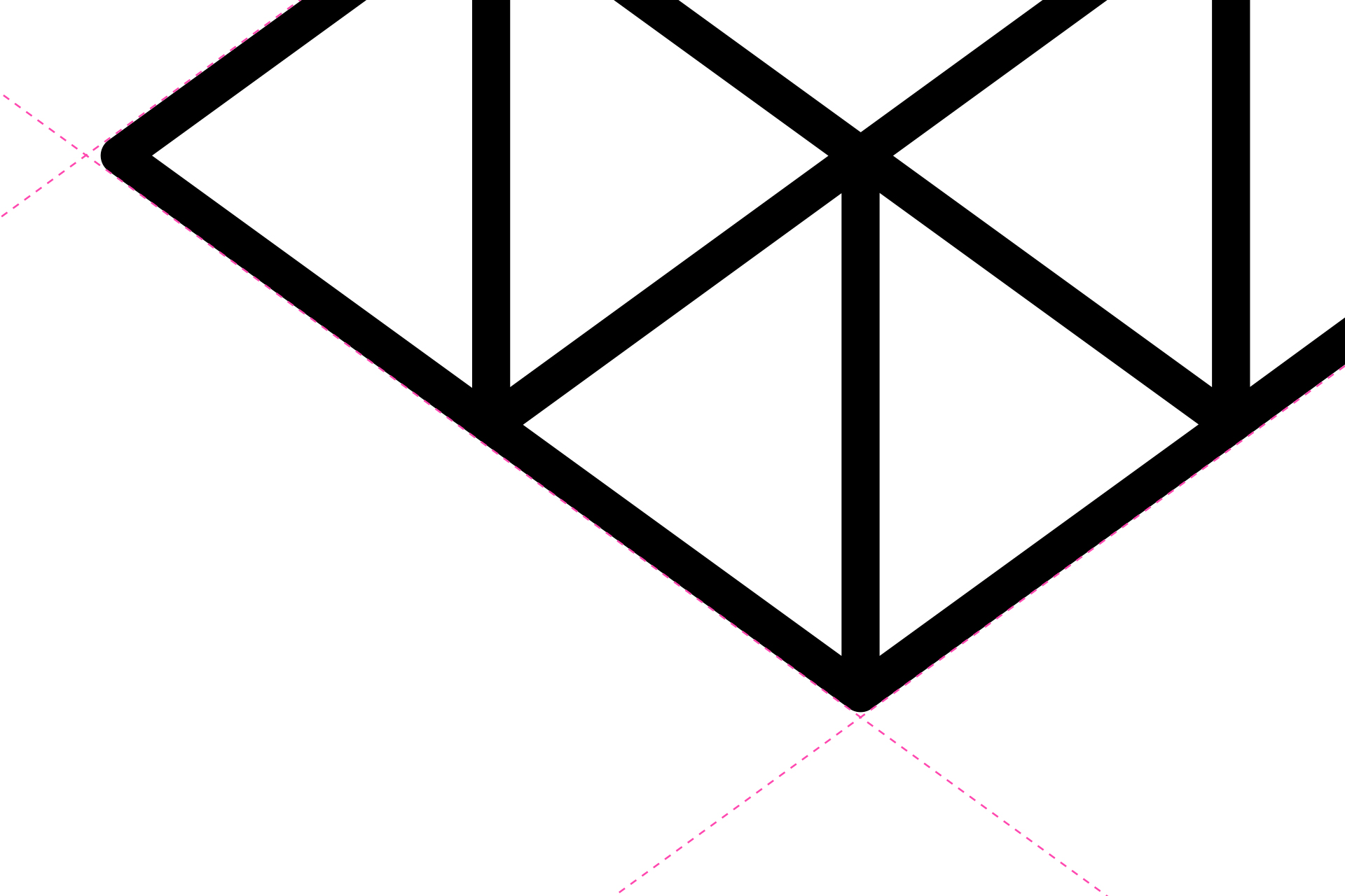
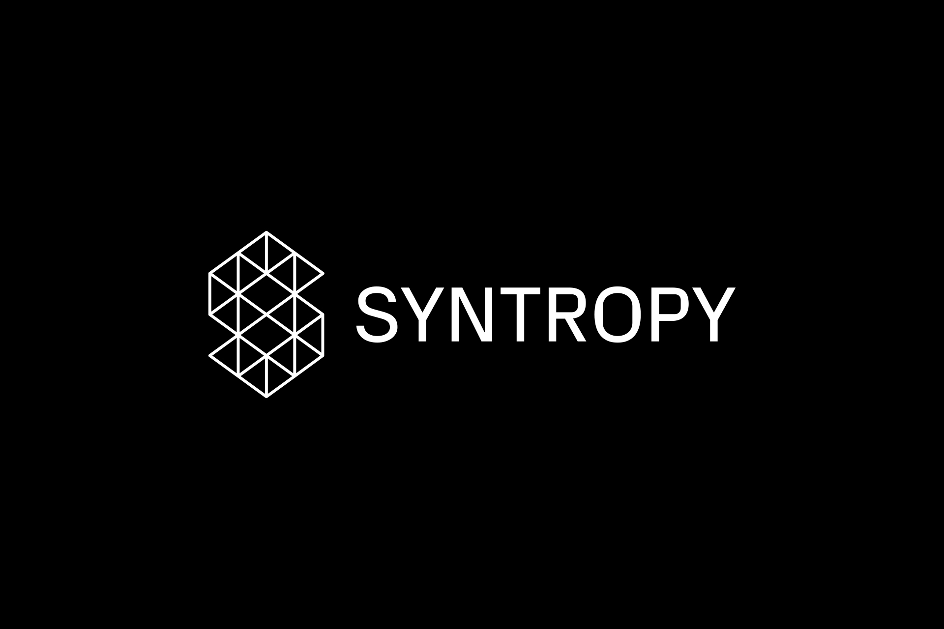
The logo
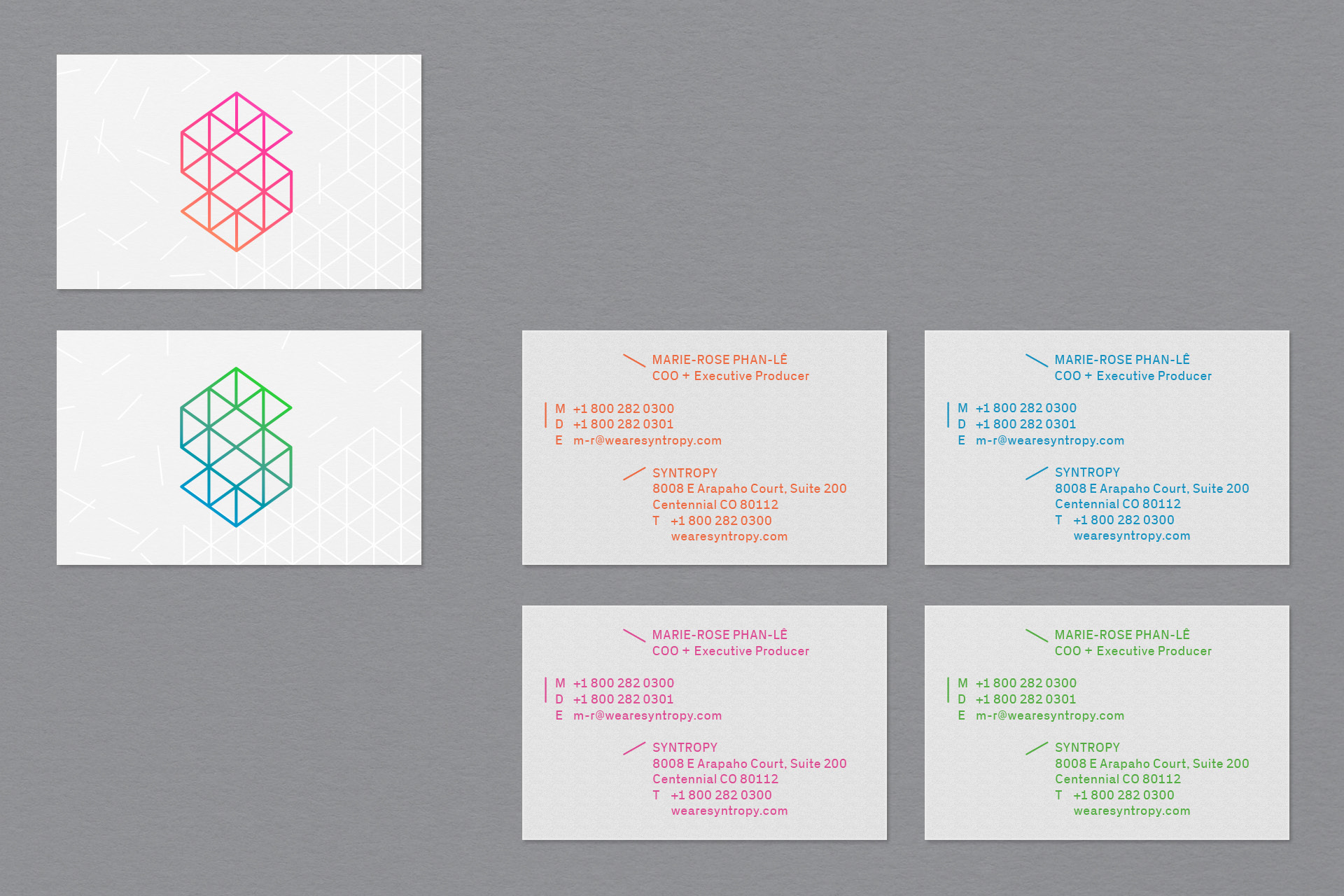
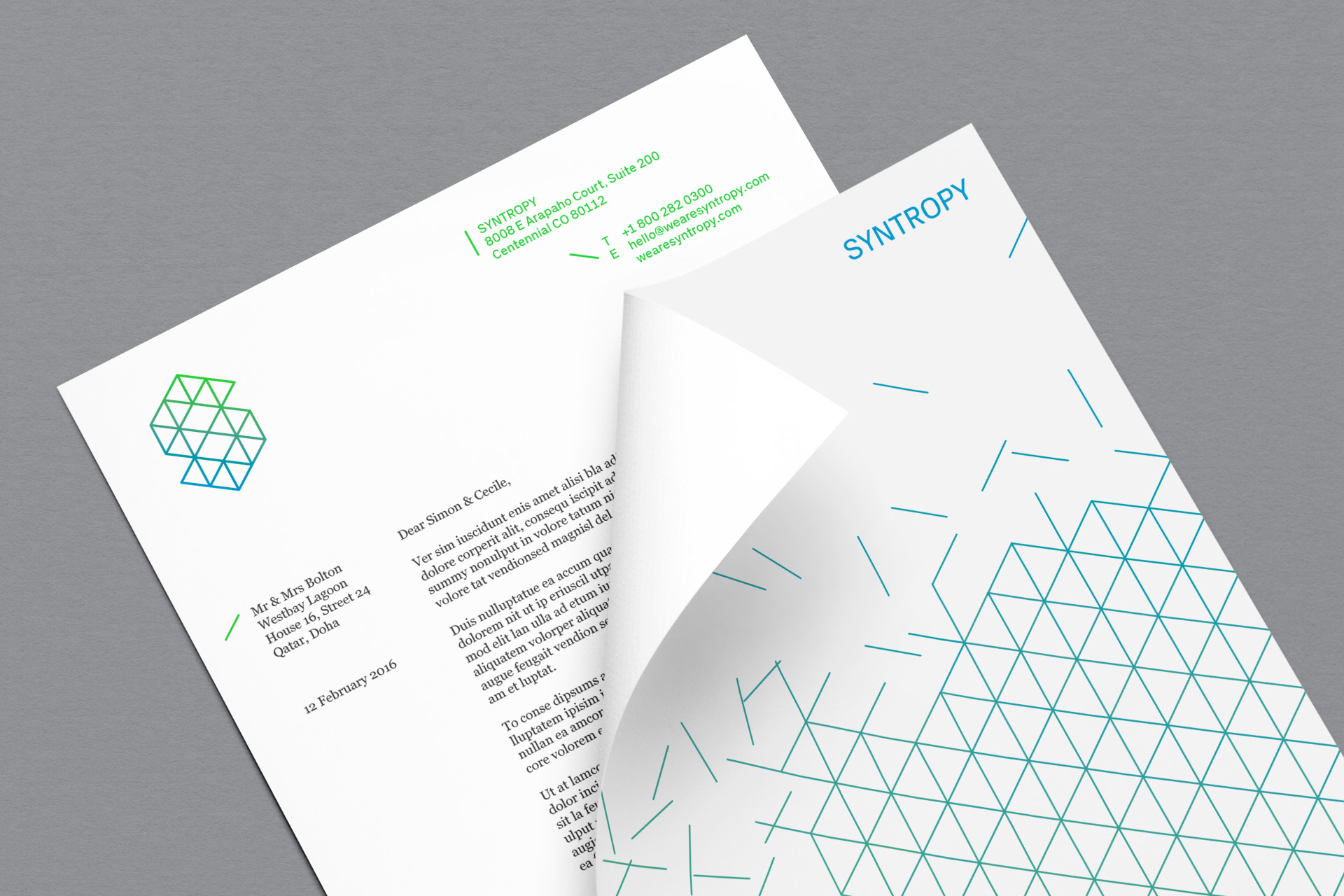
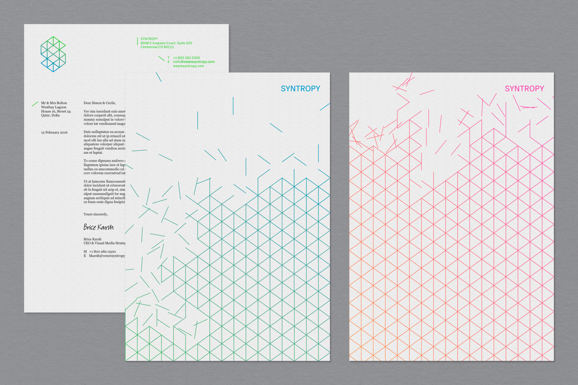
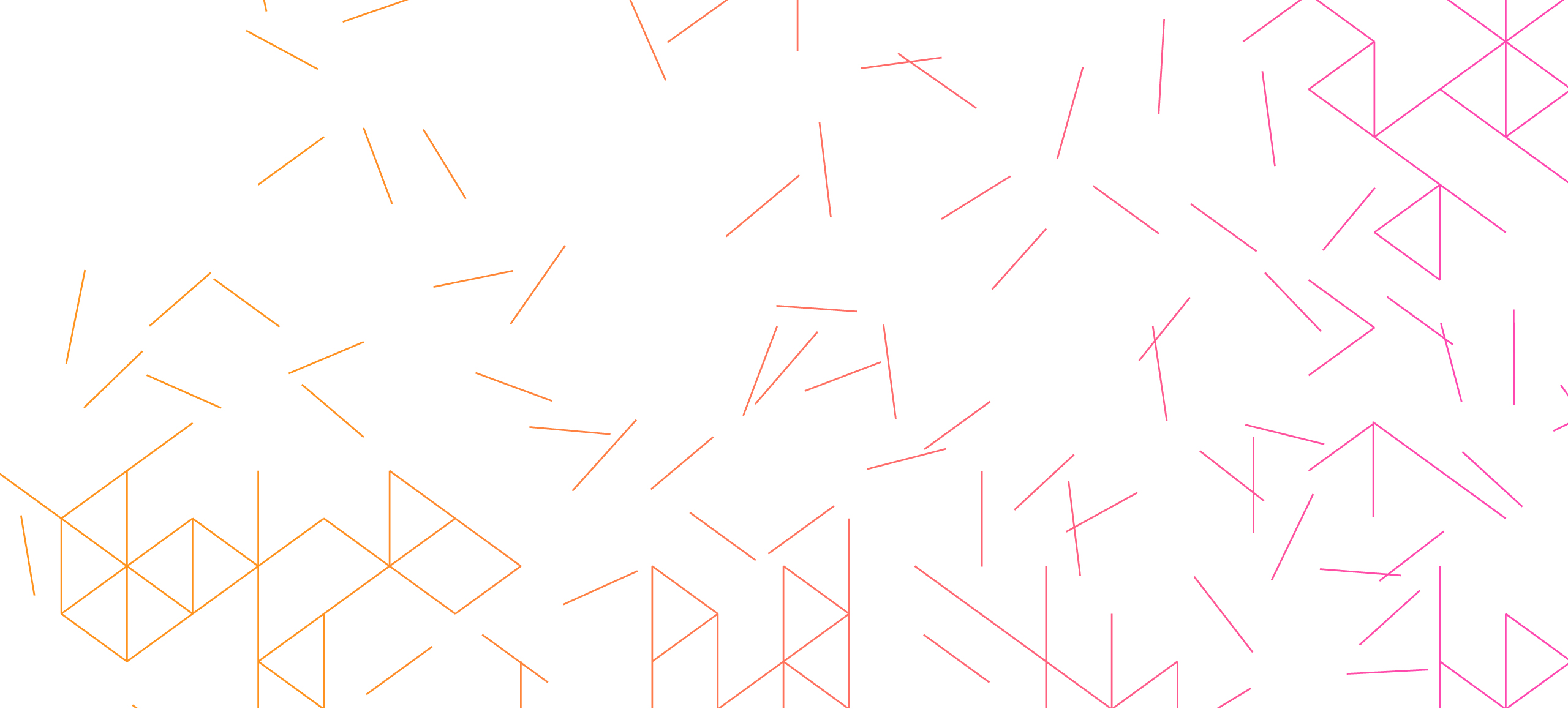
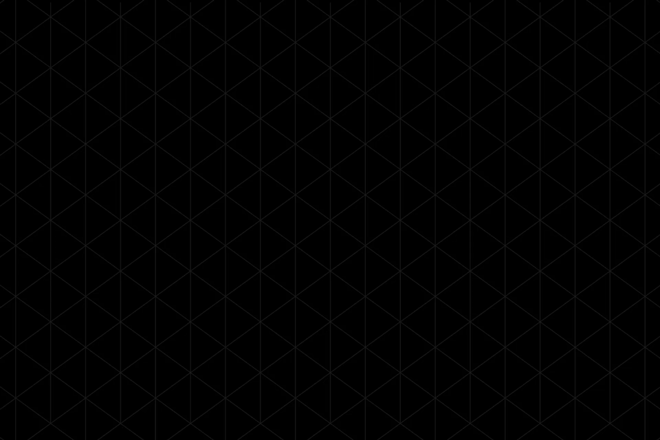
The logo is born of an underlying isometric grid. We break up and disrupt the grid to give flexibility and movement, but in the logo itself the grid comes together to create order amongst chaos. The uppercase wordmark is set in PX Grotesk — a wonderfully drawn typeface from Optimo.
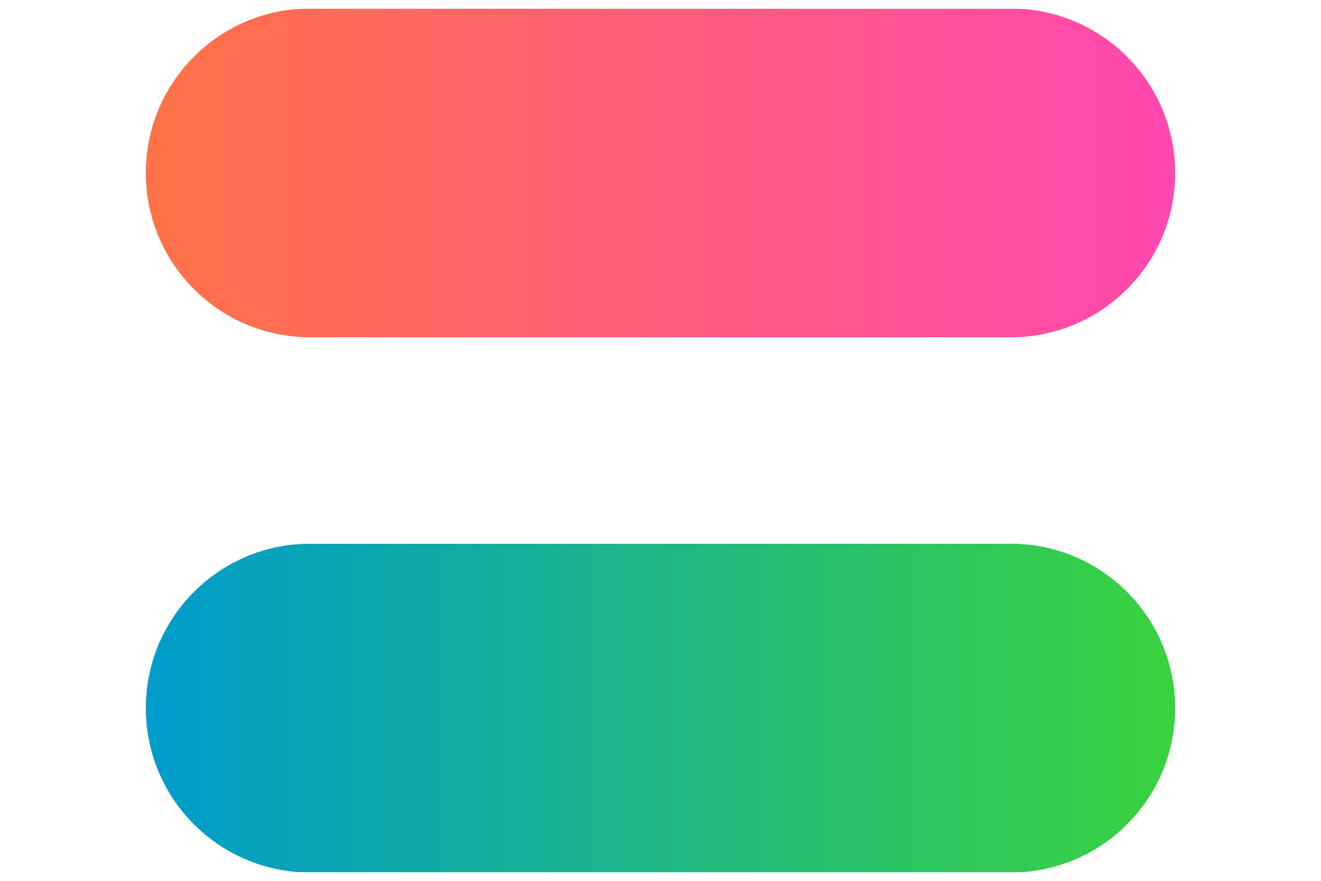
Pattern
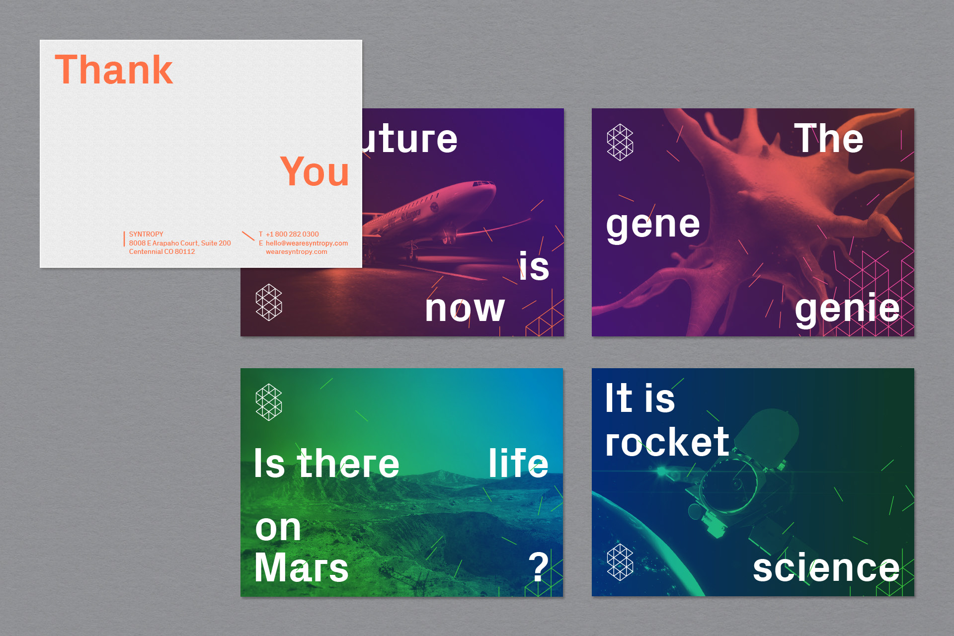
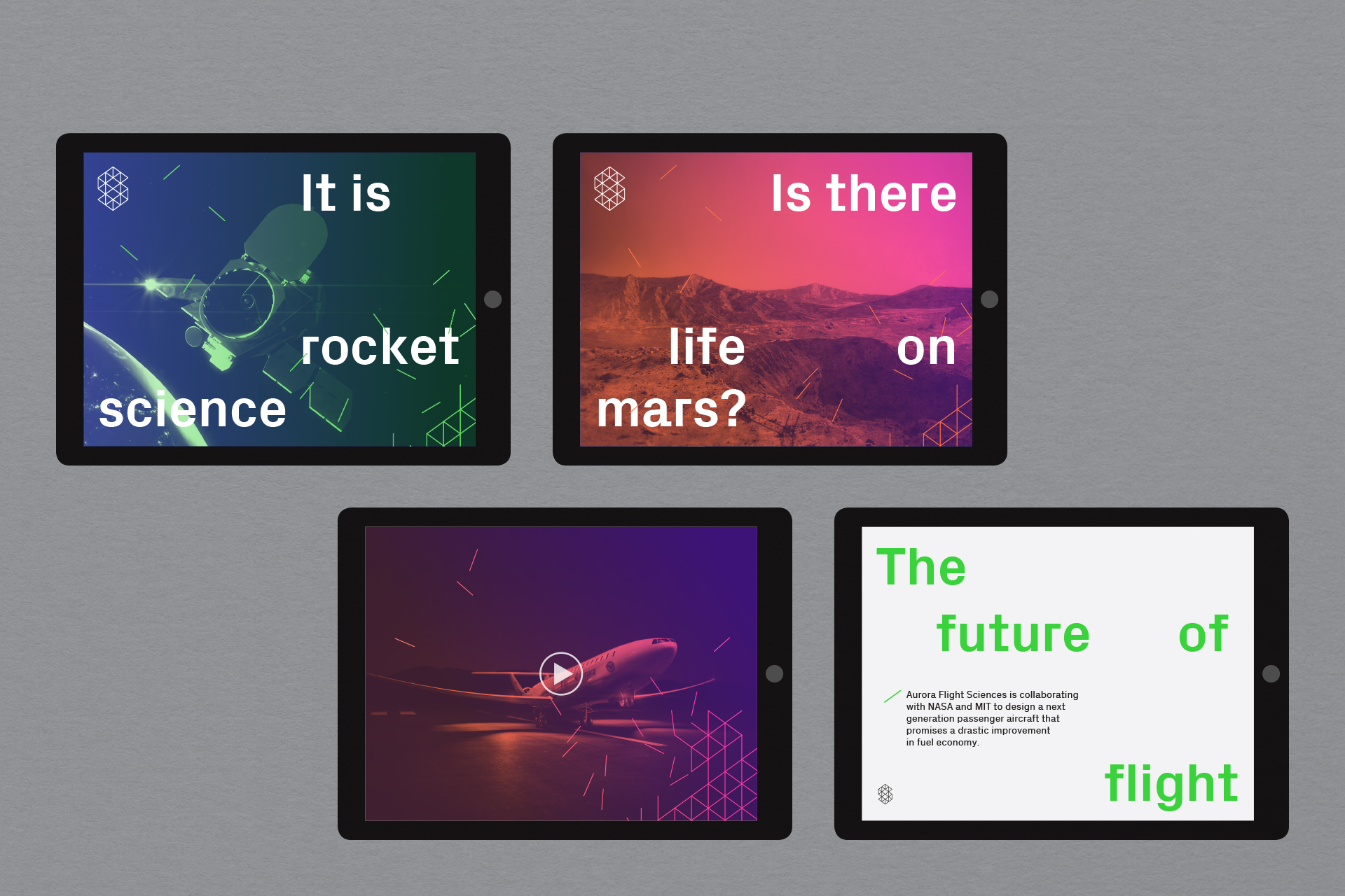
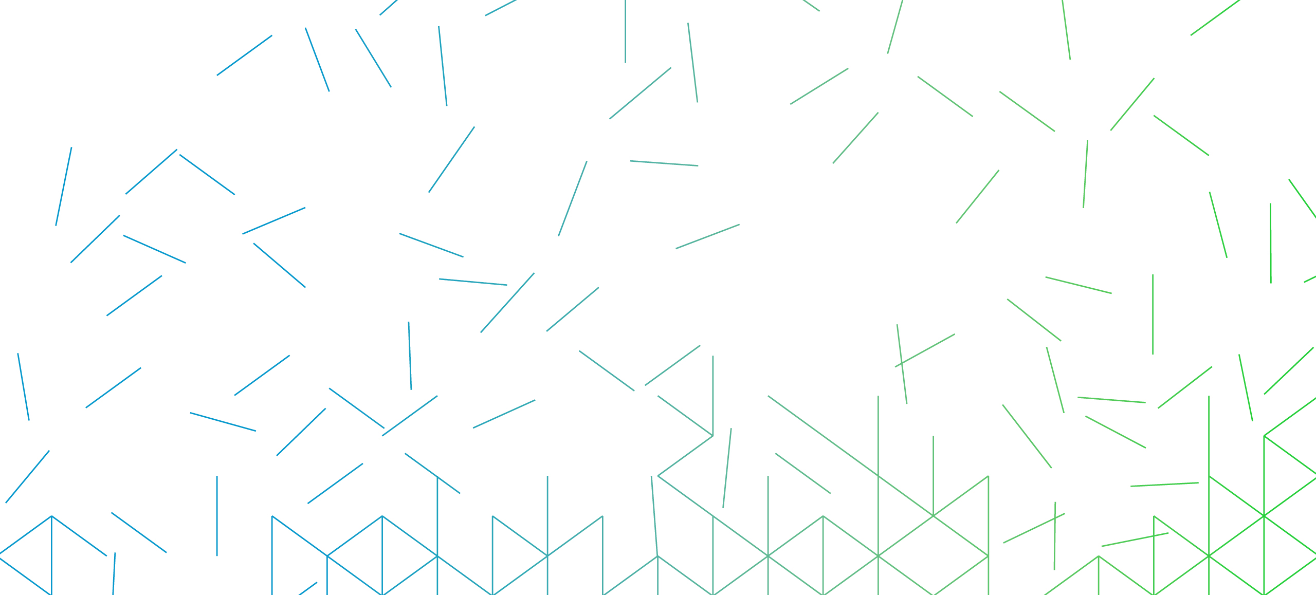
The modular isometric grid helps communicate a sense of motion and change, even in static and printed executions. The grid is broken apart and warped in animation, and delivered as a series of patterns that work both in isolation and over imagery.
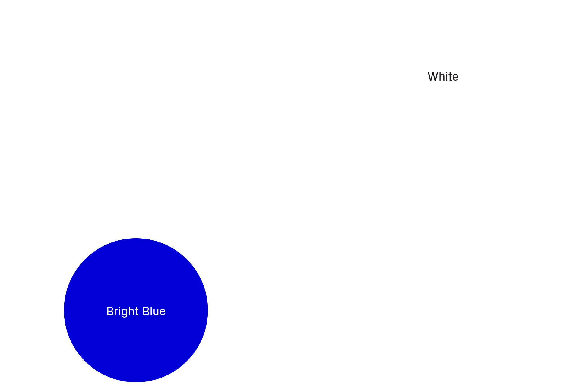
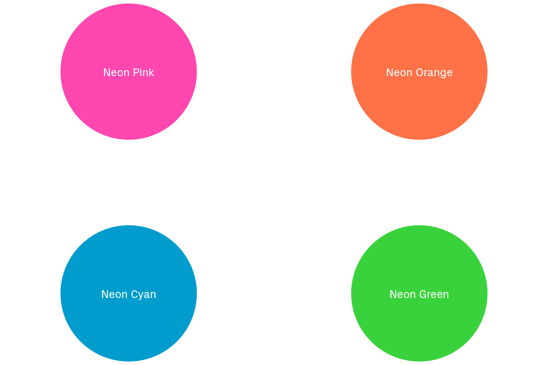
Colour
The palette is vibrant; almost electric. The identity works in contrast to the highly polished three dimensional look and feel of Syntropy’s work, and colour plays a large part in creating this relationship between brand and content.
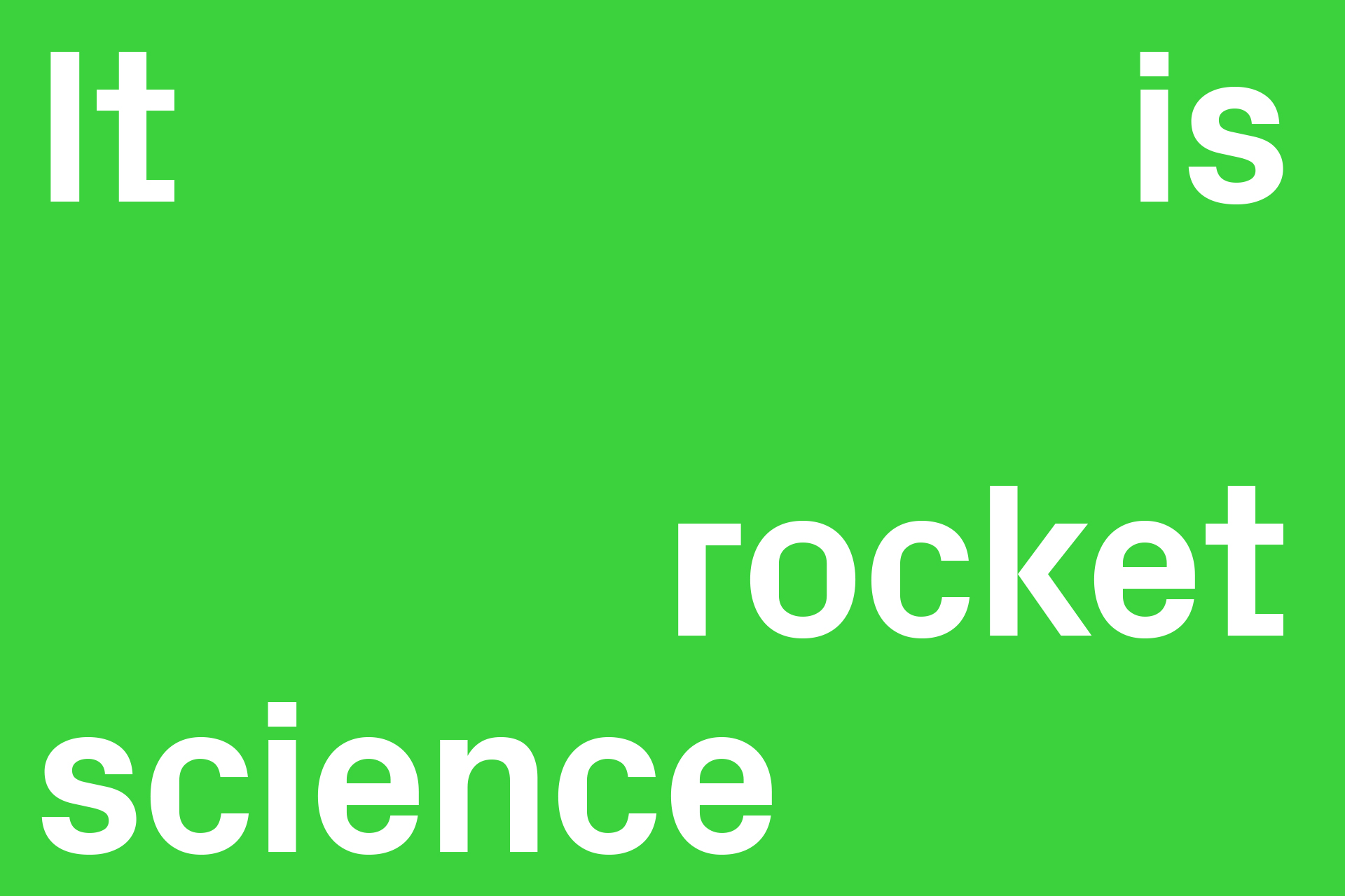
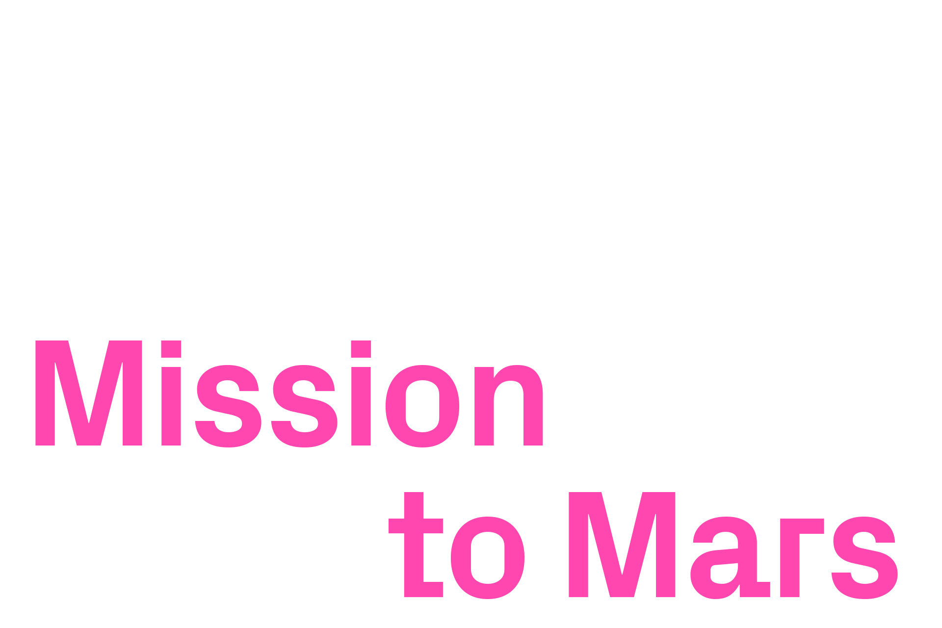
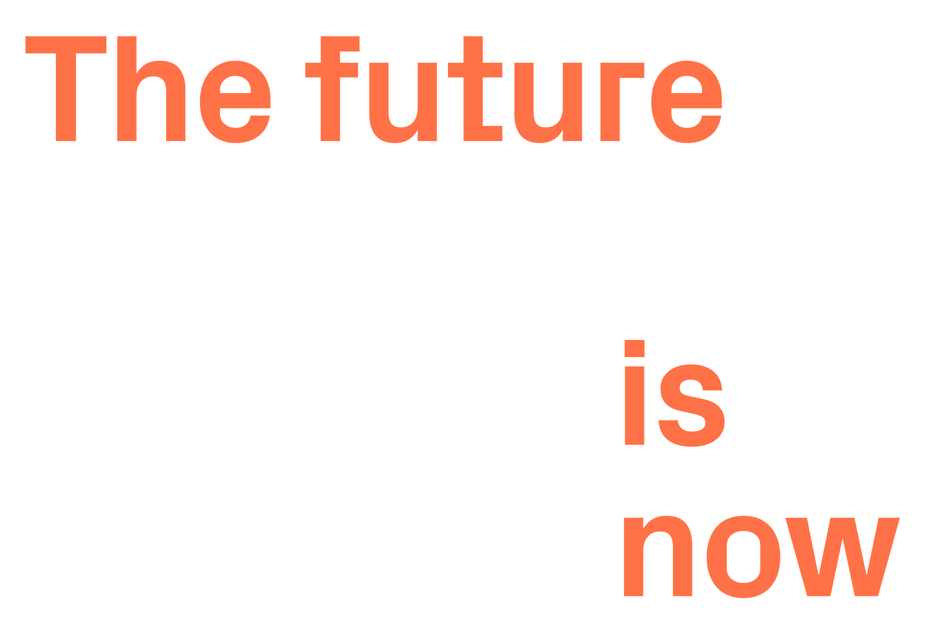
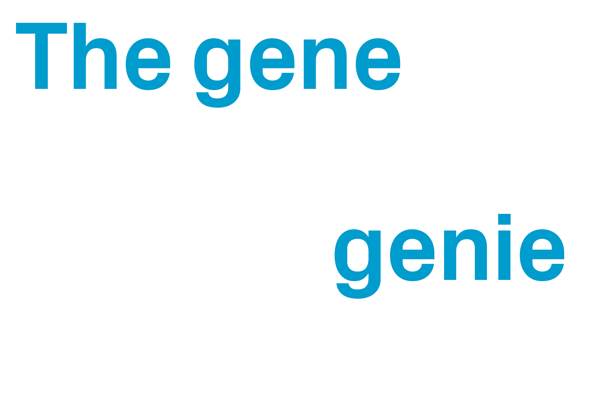
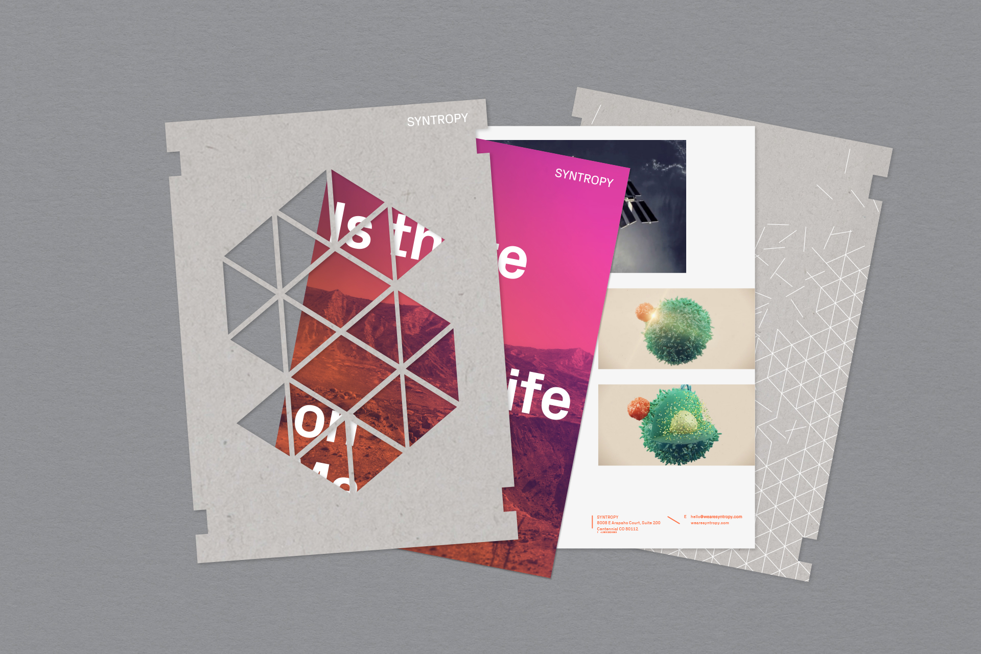
Not one tagline — but a flexible copy style
Rather than a single tagline we provided various copy lines to support the business. This gives a very flexible way of communicating both brand and positioning across different sectors. PX Grotesk is used in sentence case for display copy, where we go big on the type to really celebrate the distinctive and ownable letterforms. This is coupled with a playful layout style that splits copy lines across an execution.